Apologies for the lack of posts over the last week or so, I have alternately been on holiday or sick while spending other time on my annual Christmas card. This will also be the last post for 2017 as I am on holiday until the new year. But before I go, I want to take a look at the election night graphics for the Alabama US Senate special election yesterday.
I am going to start with the New York Times, which was where I went first last night after returning from work. What was really nice was there graphic on their homepage. It provided a snapshot fo the results before I even got to the results page.
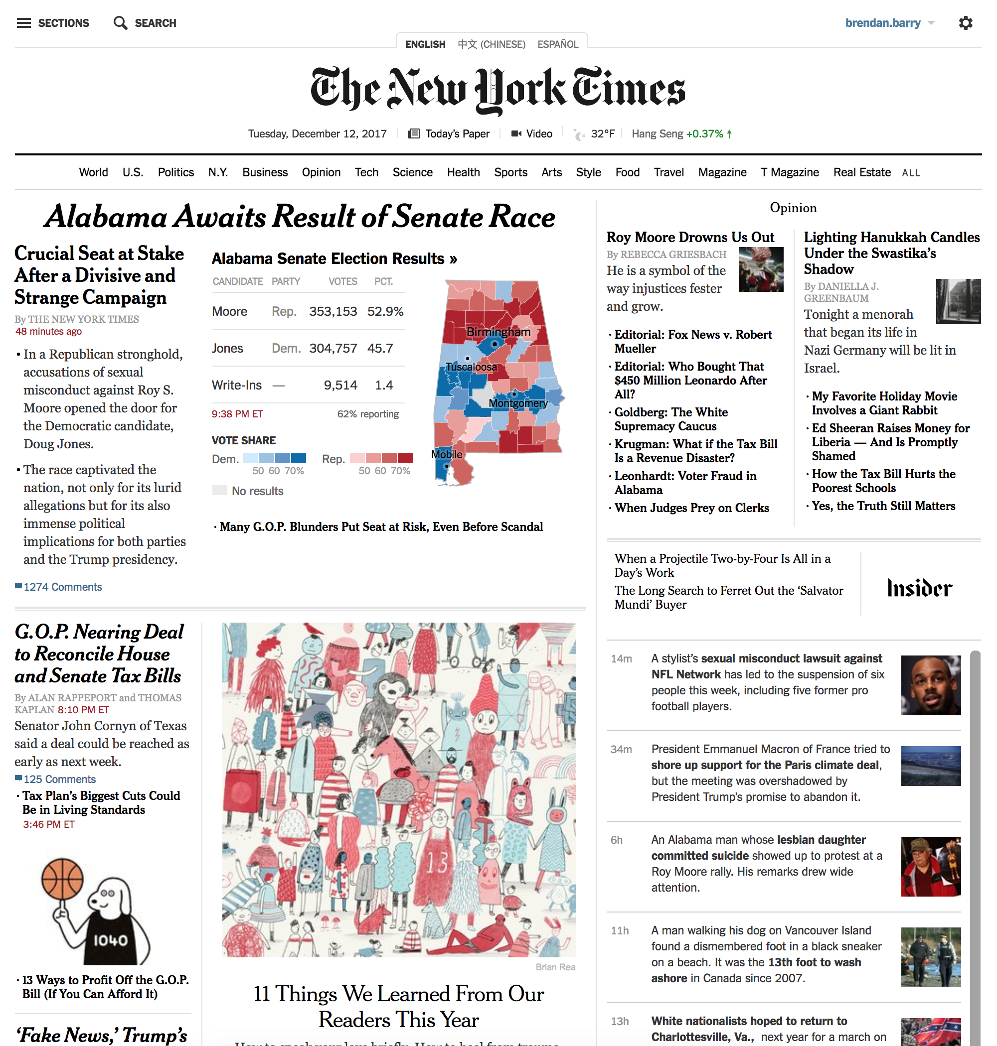
The results page then had the standard map and table, but also this little dashboard element.
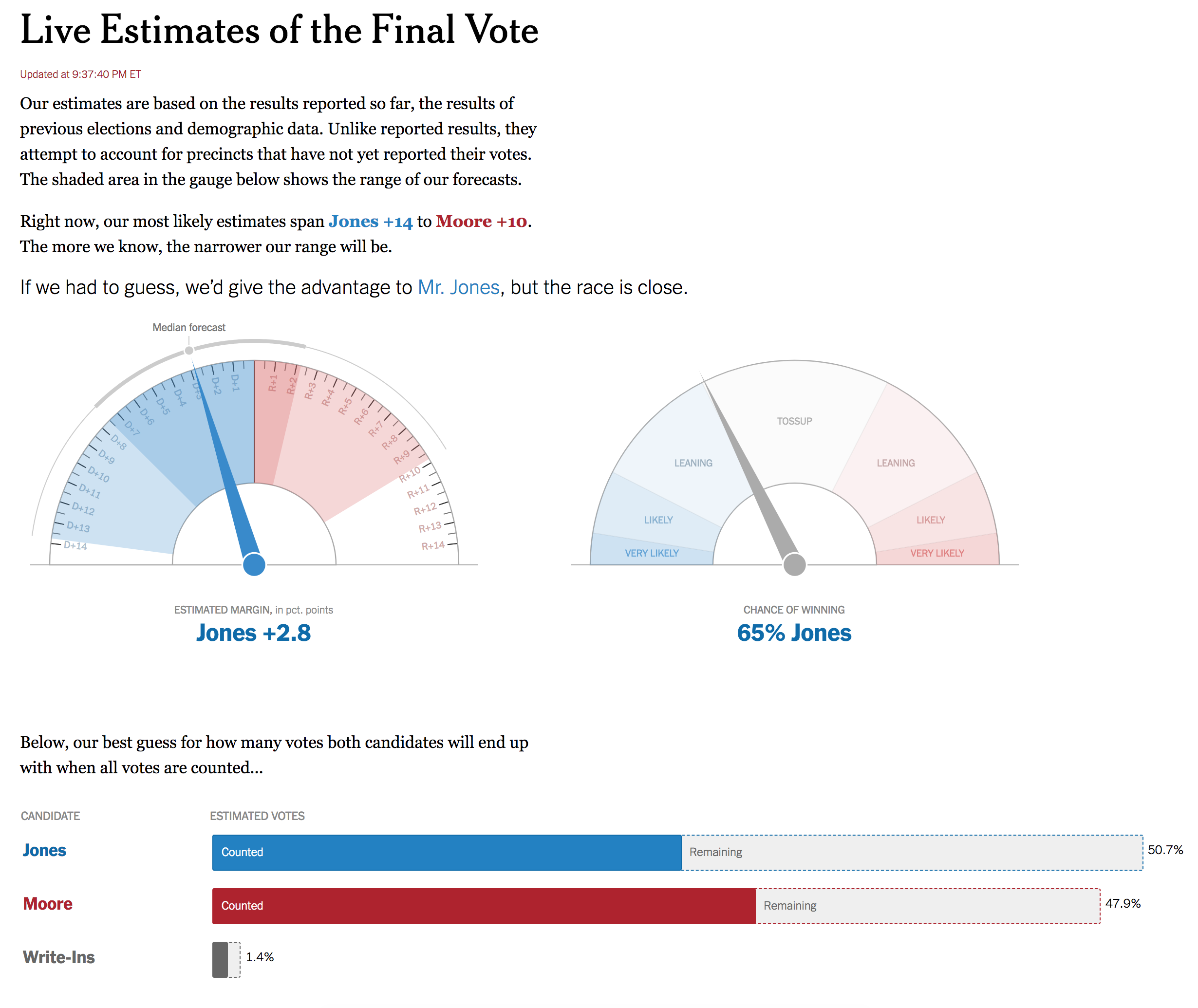
We all know how I feel about dashboard things. To put it tersely: not a fan. But what I did enjoy about the experience was its progression. The bars below filled in as the night progressed, and the range in the vote-ometers narrowed. But that same sort of design could be applied to other graphics representing the narrowing of likely outcomes.
The second site I visited was the Washington Post. Like the Times, their homepage also featured an interactive graphic, another choropleth map.
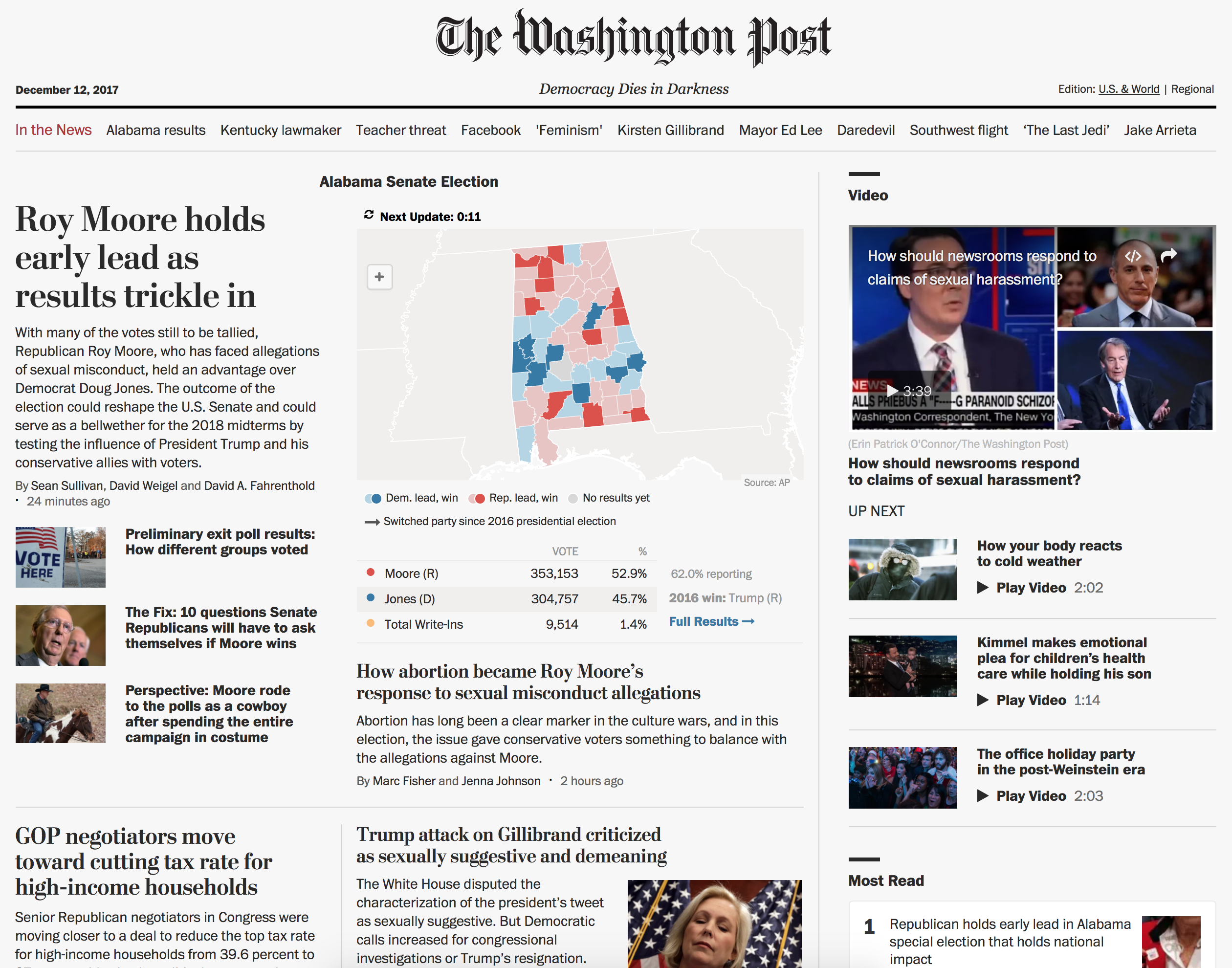
There are two key differences between the maps. The Times map uses four bins for each party whereas the Post simplifies the page to two: leading and won. The second difference is the placement of the map. The Post’s map is a cropping of a larger national map versus the Times that uses a sole map of the state.
For a small homepage graphic, bits of both work rather well. The Times cuts away the unnecessary map controls and neighbouring states. But the space is small and maybe not the best for an eight-binned choropleth. In the smaller space, the Post’s simplified leading/won tells the story more effectively. But on a larger space that is dedicated to the results/story, the more granular results are far more insightful.
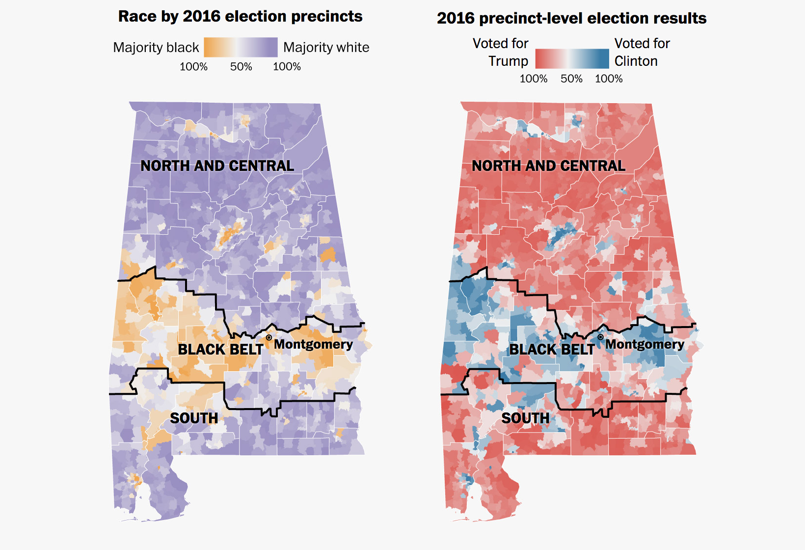
On a quick side note, the Post’s page included some context in addition to the standard results graphics. This map of the Black Belt and how it correlates to regions of Democratic votes in 2016 provides an additional bit of background as to how the votes played out.
Credit for the piece goes to the design teams of the New York Times and the Washington Post.
Leave a Reply
You must be logged in to post a comment.