I know I have said it before, but I like the increasing number of graphics-led articles published by Politico. Many policy and politics stories are driven—or should be driven—by data. But, myself included, we cannot hit it out of the park at every plate appearance. And that is what we have from Politico today, actually last week.
The graphic focuses on the healthcare industry and its need for a larger labour force in coming years as the baby boomers continue to age and start to retire. If their own doctors retire along with them, who will be their new doctors?
But there are two components of the graphic on which I want to focus. The first is the projection of the number of registered nurses (RNs) in 2024 compared to a 2014 baseline.
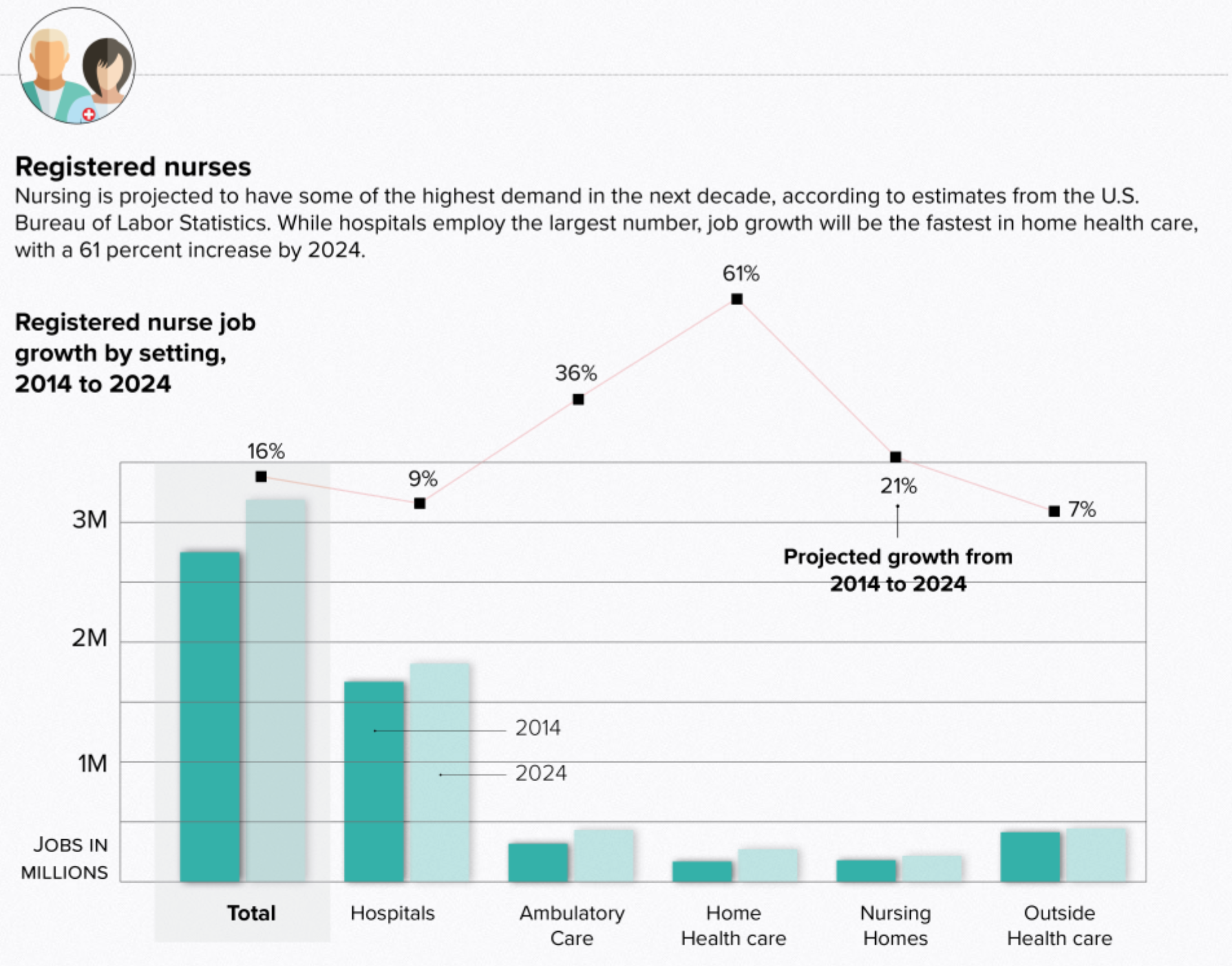
The story focuses on the future condition, but that colour is set to the lighter green thus drawing the reader’s eyes to the 2014 data point. Flipping those two colours would shift the focus of the chart to the 2024 timeframe, which would better match the text above.
Then we have the design decision to include a line chart for the growth rate, presumably total, for each category of RN from 2014 to 2024. The problem is that the chart itself does not sit on any baseline. While I do not care for the dual axis chart, that format at least keeps an axis legend on the right side of the chart. (You still have the problem of implying certain things based on what scale you choose to use relative to the first data series.) Here, because there is no chart lines associated with the growth data, I wonder if a table below the x-axis labels would be more efficient? Home health care, a very small category, will have the highest growth (a small change from a small base will beat the same small change or even slightly bigger changes from a far larger base) but the eye has the furthest to travel to reach the 61% number from the top of the bars or the labelling.
The other component I wanted to discuss is the scatter plot that compares the number of jobs to their average salary.
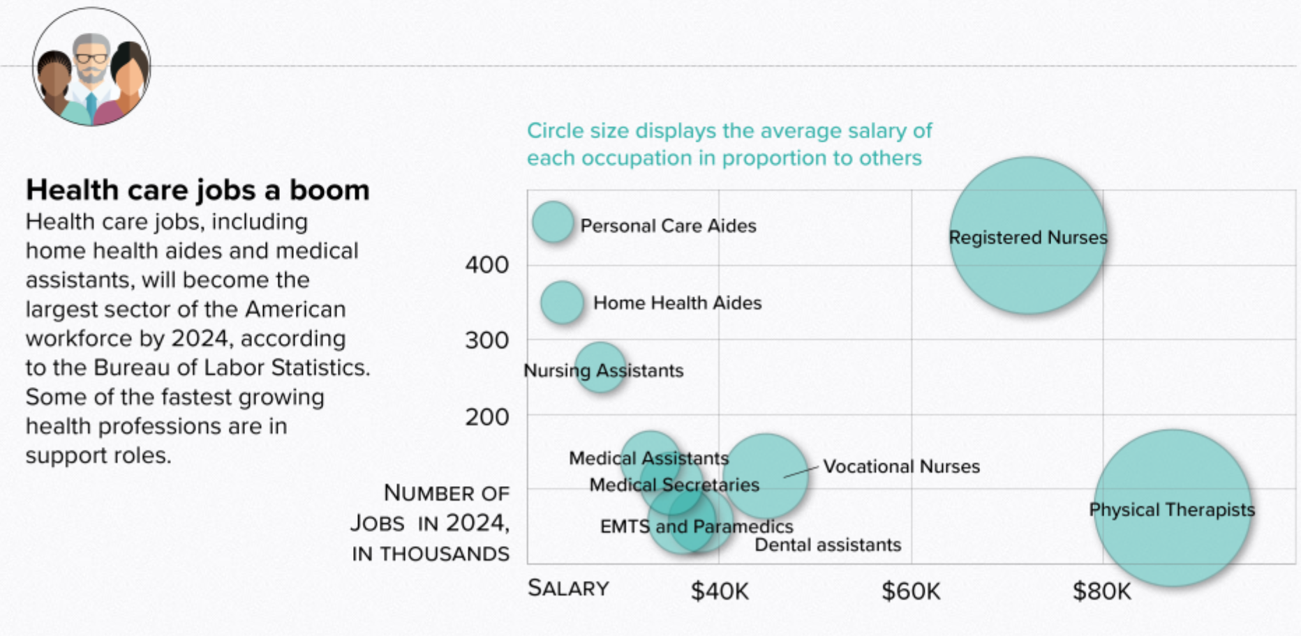
But this is a bubble chart, not a scatter plot, and so we have a third variable encoded in the size of the dot/bubble. The first thing I looked for was a scale for the size of the circles. What magnitude is the RN circle vs. the Personal Care Aides circle? There is none, but unfortunately that seems to be a common practice with bubble chart. But after failing to find that, I noticed that the circles decrease in size from right to left. That was when I looked to the legend and saw the y-axis in numbers of jobs and the x-axis in average salary. But then the circles are sized in proportion to the average salary of each profession to the other. In other words, the circles are basically re-plotting the x-axis. The physical therapist circle should be roughly twice as large, by area, than the vocational nurses. But we can also just see by the x-axis coordinates. The bubble chart-ness of the chart is unnecessary and the data could be told more clearly by stripping that away and making a straight-up scatter plot where all the circles are sized the same.
Credit for the piece goes to Christina Animashaun.
Leave a Reply
You must be logged in to post a comment.