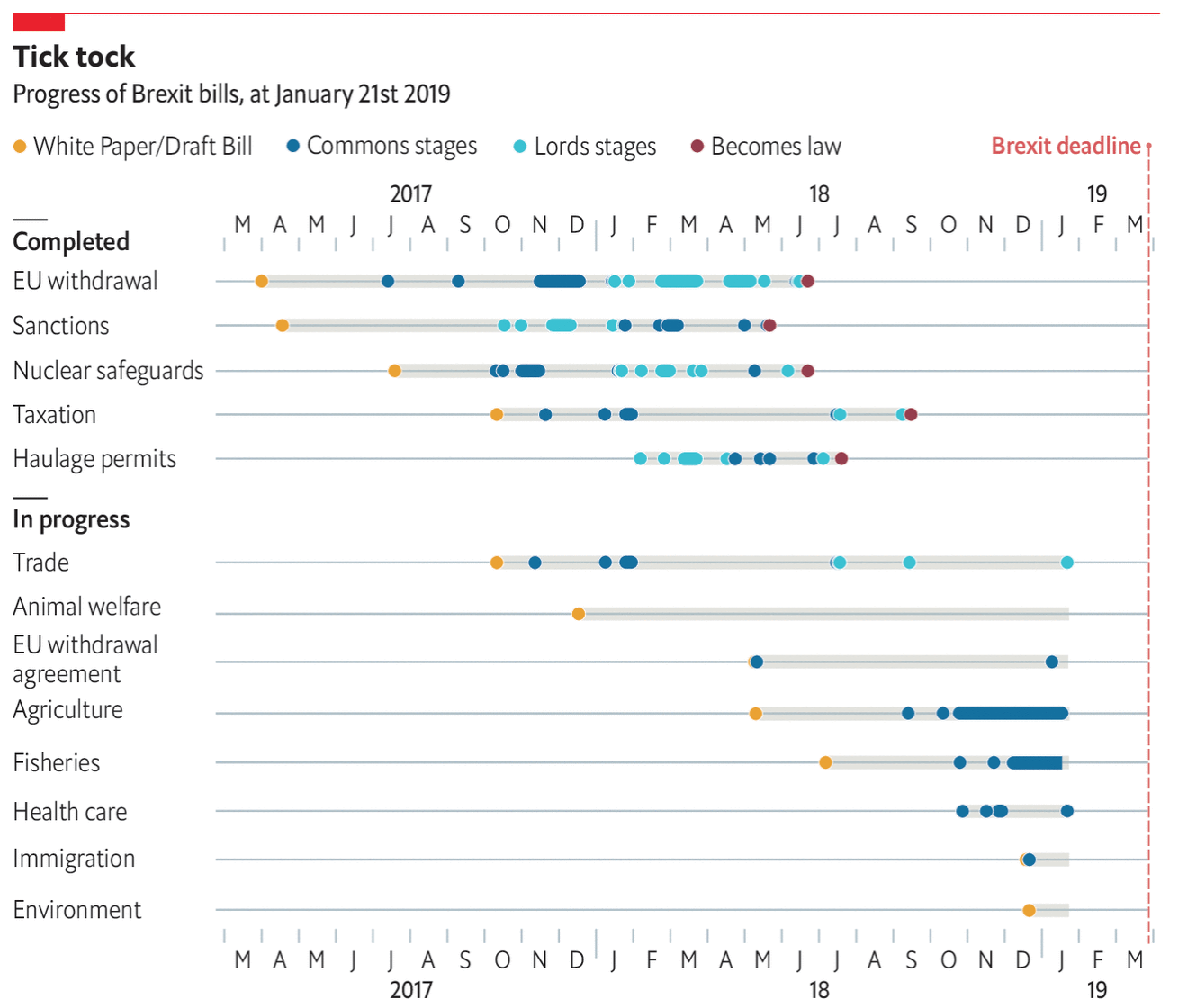
Well we have another week and so we have another fraught day of House of Commons votes on Brexit. Once again, it looks like HM Government will lose all the votes, but the question is by how much? Significant defeats means there will be little support, but smaller defeats might show the European Union that it needs to open up the Brexit Withdrawal Agreement and renegotiate it.
But that’s not all. As this piece last week from the Economist shows, the Withdrawal Agreement is just one piece—an admittedly very large piece—of many pieces of legislation that need to be passed into law to manage the UK’s withdrawal from the EU. And while some have indeed been passed, many others are languishing.
So much to do, only a handful of business days in which to do it…
The piece overall is effective. It clusters the bills into those that have been passed and those still in the works. And then within each of those, the various stages of the British legislative process exist as colour-coded dots. My quibble would be with those dots. There are a few instances where dots overlap and I would have either made the dots transparent or stacked them vertically above and below the line, just to make it clearer to the reader where the dots are located.
Credit for the piece goes to the Economist Data Team.
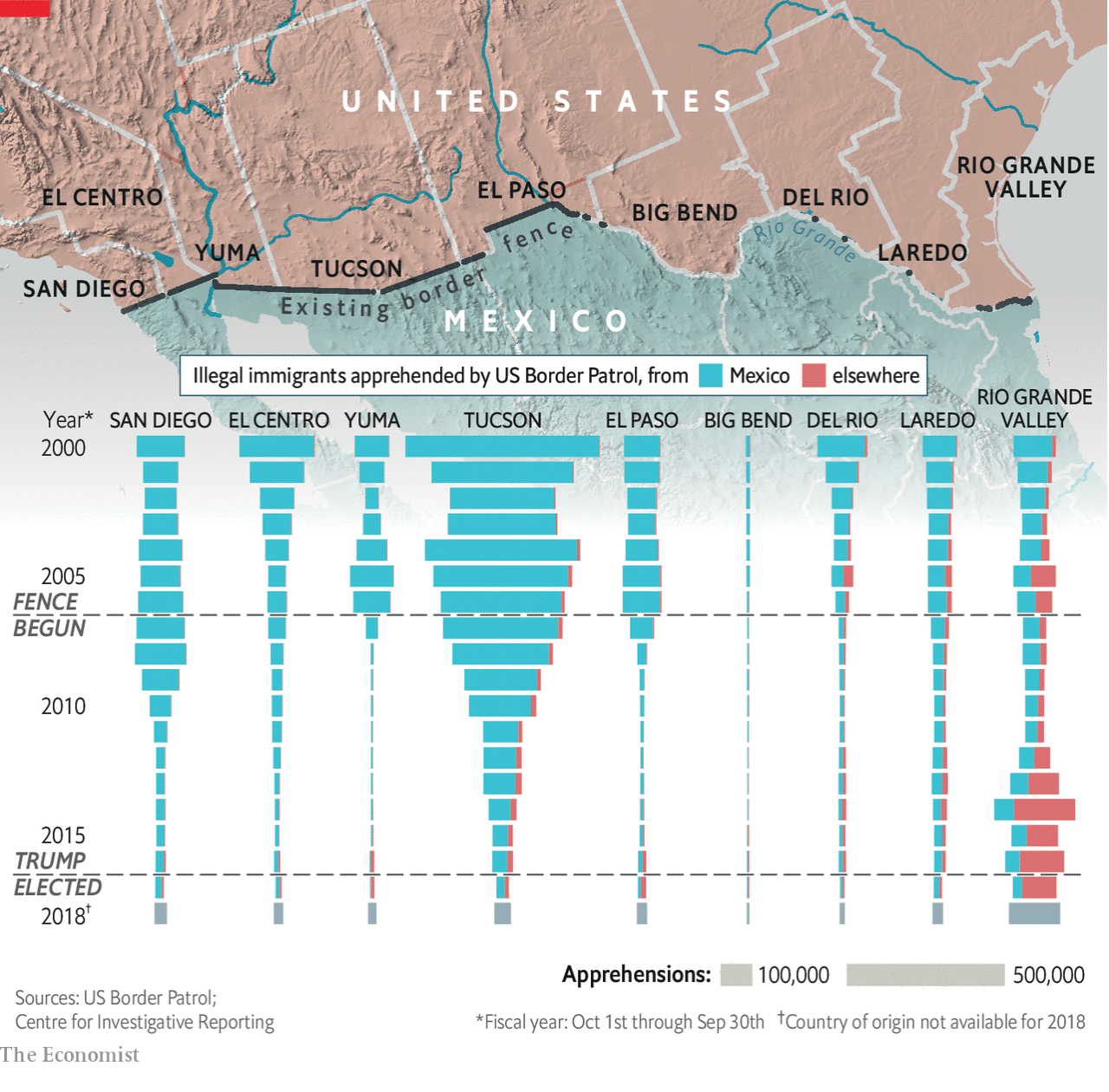
We move from one manufactured crisis to another today as we look at a piece by the Economist on the number of illegal immigrants arrested at the US southern border. Lately, here in the United States we have been hearing of an invasion on our southern border. Illegal immigrants streaming across the border. Except, that is not true. In fact, illegal immigration is at or near its lowest rate in recent years.
Note how few there have been in recent years…
The graphic does one thing really well and that is its unorthodox placement of the map. Instead of the usual orientation, here the designers chose to “tilt” the map so that the border segments roughly align with the sets of charts below them. I might have desaturated the map a little bit and cut off the gradient so Mexico does not bleed through underneath the bars, but the concept overall is really nice.
On the other hand, we have the bar charts arranged like funnels. This does allow the reader to see the slopes trending towards zero, however, it makes it incredibly difficult to see changes in smaller numbers. And without a scale on the axis, the reader has to take the bars and mentally transpose them on top of the grey bars in the bottom right corner. I wonder if a more traditional set of bar charts in small multiples could have worked better beneath the map.
Overall, however, I really do like this piece because of the way the map and the bar charts interact in their positioning.
Credit for the piece goes to the Economist Data Team.
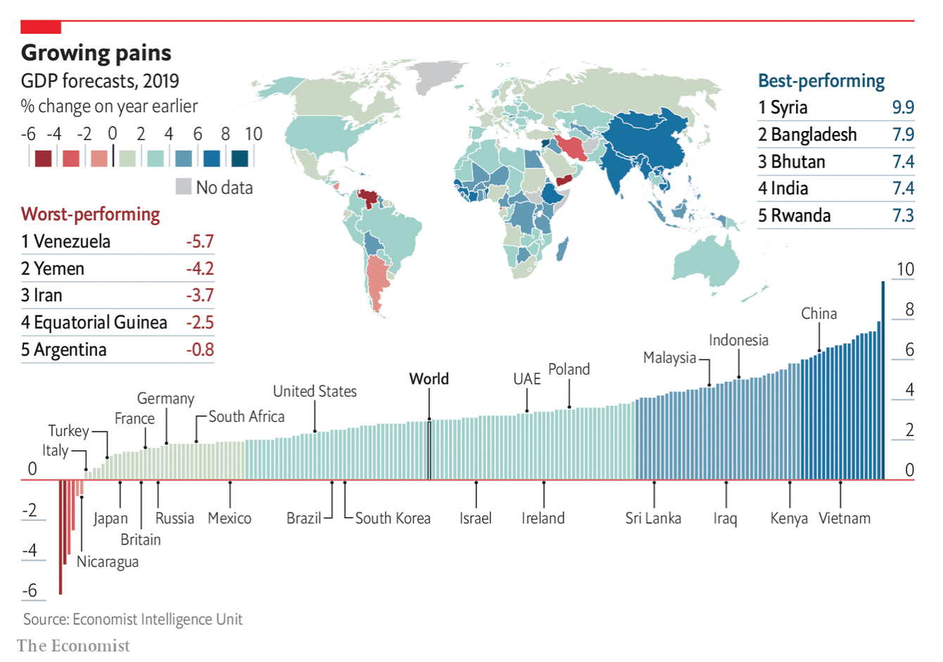
I mentioned this this time last year, but I used to make a lot of datagraphics about GDP growth. The format here has not changed and so there is nothing new to look at there. But, the content is still interesting. And the accompanying Economist article makes the point that high growth rates are not always what they seem. After all, Syria’s high growth rate is because its base is so small.
The 2019 GDP growth forecasts
Credit for the piece goes to the Economist Data Team.
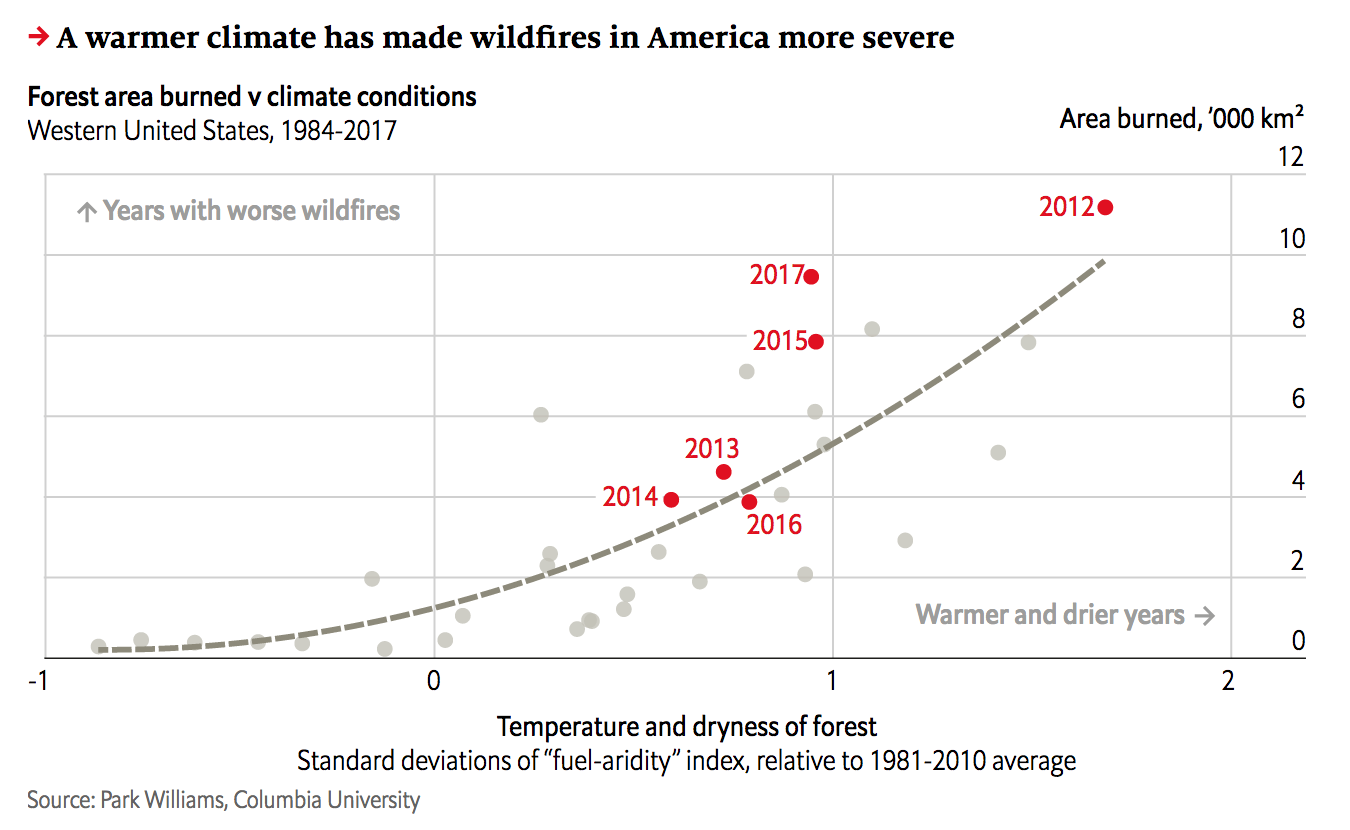
Yesterday we looked at the wildfire conditions in California. Today, we look at the Economist’s take, which brings an additional focus on the devastation of the fires themselves. However, it adds a more global perspective and looks at the worldwide decline in forest fires and both where and why that is the case.
California isn’t looking too…hot. Too soon?
The screenshot here focuses on California and combines the heat and precipitation we looked at yesterday into a fuel-aridity index. That index’s actual meaning is simplified in the chart annotations that indicate “warmer and drier years” further along the x-axis. The y-index, by comparison, is a simpler plot of the acres burned in fires.
This piece examines more closely that link between fires and environmental conditions. But the result is the same, a warming and drying climate leaves California more vulnerable to wildfires. However, the focus of the piece, as I noted above, is actually on the global decline of wildfires.
Only 2% of wildfires are actually in North America, the bulk occur in Africa. And the piece uses a nice map to show just where those fires occur. In parallel the text explains how changing economic conditions in those areas are lessening the risk of wildfire and so we are seeing a global decline—even with climate change.
Taken with yesterday’s piece with its hyper-California focus, this provides a more global context of the problem of wildfires. It’s a good one-two read.
Credit for the piece goes to the Economist Data Team.
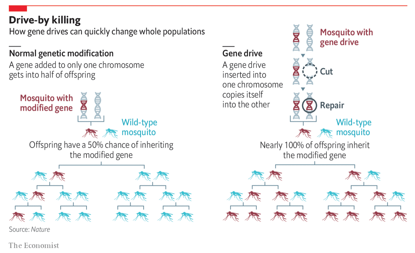
I don’t always get to share more illustrative diagrams that explain things, but that’s what we have today from the Economist. It illustrated the concept of a gene drive by which a gene modified in one chromosome then modifies the remaining chromosome to insert itself there. Consequently it stands an almost 100% chance of being passed onto the subsequent generation.
Naturally this means great things for removing, say, mosquito-born diseases from populations as the gene drives can be used to ultimately eliminate the population. But of course, should we be doing this? Regardless, we have a graphic from the Economist.
I still find them a pest…
It makes nice use of a small mosquito icon to show how engineered mosquitos can take over the population from wild-type. The graphic does a nice job showing the generational effect with the light blue wild-type disappearing. But I wonder if more could not be said about the actual gene drive itself. Of course, it could be that they simplified the process substantially to make it accessible to the audience.
Credit for the piece goes the Economist graphics department.
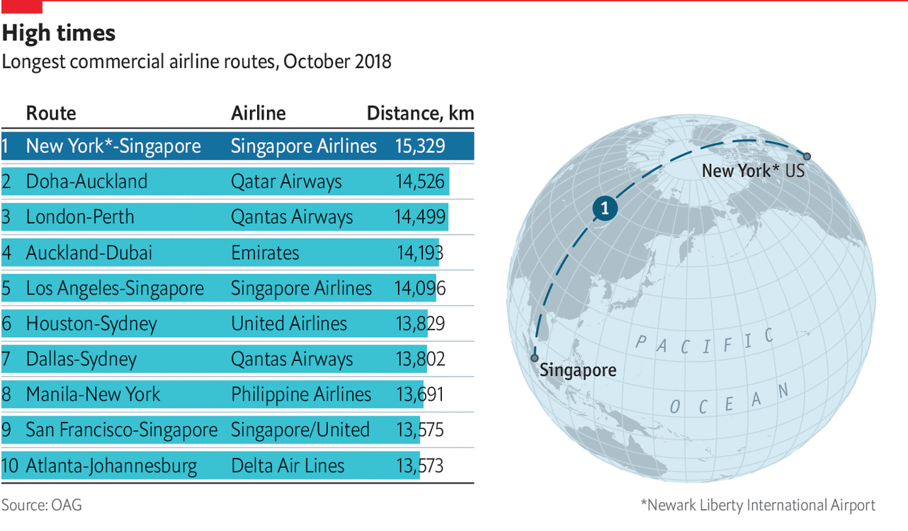
You might recall that back in March I wrote about the use of spherical maps to show great circles. This helps illustrate the actual routes that aircraft take in flight. (Yes, actual flight plans deviate based on routes, weather, traffic, &c.) At the time I wrote about how there was a soon-to-be Singapore–New York route. Ta da.
That’s just a long time in one aircraft.
Nothing fancy here in this graphic from the Economist. It probably is just a reuse of the original but with the additional routes removed. But, I still love these kinds of maps. From a design manager standpoint, in a way this is great efficiency in that an element from a graphic made once can now, with minimal effort, be used in a second piece. And not in a meaningless, throw-in way, but this graphic does very much help to illustrate the actual route and long across the globe it travels.
In a second note, not related to the graphic itself, I want to point out a subtle change made by the Economist. This is the first online graphic to use an updated chrome, which is the branding elements that surround the actual content of the piece.
Slight changes
The biggest change is a new or modified typeface for the graphic header. I have not seen anything about design changes at the Economist, but I will look into it. But the changes are, again, subtle. The best example in these two comparisons (new on the left, old on the right) is the shape of the letter e.
E, as in Economist
You can see how the terminal, or the part of the letter hooking and swinging out at the bottom, used to come to an end at an angle. Now it ends with a vertical chop. I haven’t looked too extensively at the typeface, but given the letter e, it appears to be a little bit wider of a face.
The other change, not quite as subtle, is the positioning of the iconic red rectangle around which so much of the Economist’s brand hangs. Bringing back the above graphic, you can see where I drew a black line to indicate the edge of the original graphic.
The box is now orientated horizontally (again, new is on the left), which actually brings it closer to the actual Economist logo. But, and probably more importantly, it allows the graphic’s edge to go to the, well, edge. And since their site uses generous whitespace around their graphics, they don’t necessarily need margins within the graphic.
They have also chosen to raise the level at which the header starts, i.e. there is less space between the red rule at the top of the graphic and the start of the words. This, however, appears to have been possible in the original design.
As more graphics roll out, I am going to be curious to see if there are other changes. Or even just to see how these subtle changes affect the rest of the graphics.
Credit for the piece goes to the Economist Data Team.
First, I want to start with a housekeeping note. Your author will be travelling for work and then a short autumn holiday. And so while I may be able to sneak a post or two in, I generally would not expect anything until next Friday, 12 October.
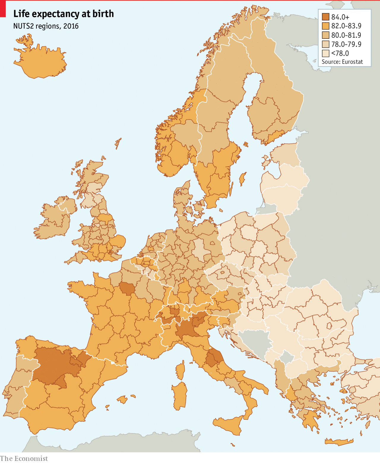
But let’s end this string of posts with a map. It is a choropleth, so in one sense there is nothing crazy going on here. The map comes from the Economist, which published an article on life expectancy throughout Europe and the big takeaway is that it is lower in the east than the west.
Apparently life is pretty good in northern Spain
The great part of the map, however, is that we get to see a more granular level of detail. Usually we just get a view of the European states, which presents them as an even tone of one shade or one colour. Here we can see the variety of life expectancy in the UK, France, and Belgium, and then still compare that to eastern Europe.
Of course creating a map like this demands data to drive it. Do data sets exist for the sub-national geographic units of EU or European states? Sometimes not. And in those cases, if you need a map, the European state choropleth is the choice you have to make. I just hope that we get to see more data sets like this with more granular data to present a more complex and patterned map.
Credit for the piece goes to the Economist Data Team.
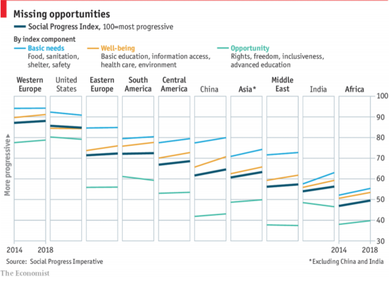
Last Thursday the Economist published an article looking at quality of life across the world. The data came from the Social Progress Imperative and examined quality of life, excluding economic performance. And as the article details, the results were mixed at best.
But, hey, the chart was really nice. We have a small multiple set looking at the overall index across all regions across the world and then the US, China, and India in particular.
Unfortunately the US is heading in the wrong direction…
I think this chart hits almost all the right notes. My only qualm would be the component indices being placed alongside the overall index. I wonder if breaking the whole thing out by component would work. As it is, it generally works well, I am just curious because there is the one issue of the United States where our well-being line falls beneath that of the overall index. But then again, the story is the overall index.
Credit for the piece goes to the Economist Data Team.
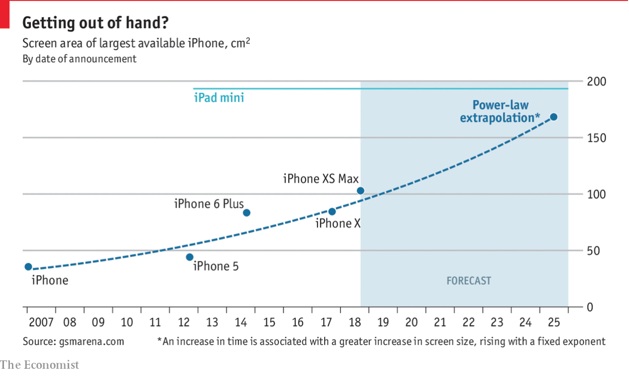
Your humble author has returned. And on my trip up to Boston I took plenty of photos with my Nexus 5X, a Google-designed smartphone. That is correct, this designer does not use an iPhone. But I am aware of the latest things coming out of Apple—after all this is being typed up on a Mac—and so the larger screen size caught my attention.
The Economist put together a piece looking at the screen sizes of the iPhone models over the years and then used that to project into the future the likely sizes of the phone’s display.
Bigger, and bigger, and bigger, and…
Now the article hints at what I would be particularly interested in: the screen sizes of comparable Android models. How have they changed over the years? I still cling to my smaller screen size mobile as I am not a fan of the phablet.
The chart itself is simple and well done, plotting the models without any fuss. But the most important part is the benchmark line of the iPad mini’s screen size. And the user can clearly see the forecast merger of the sizes.
Credit for the piece goes to the Economist Data Team.
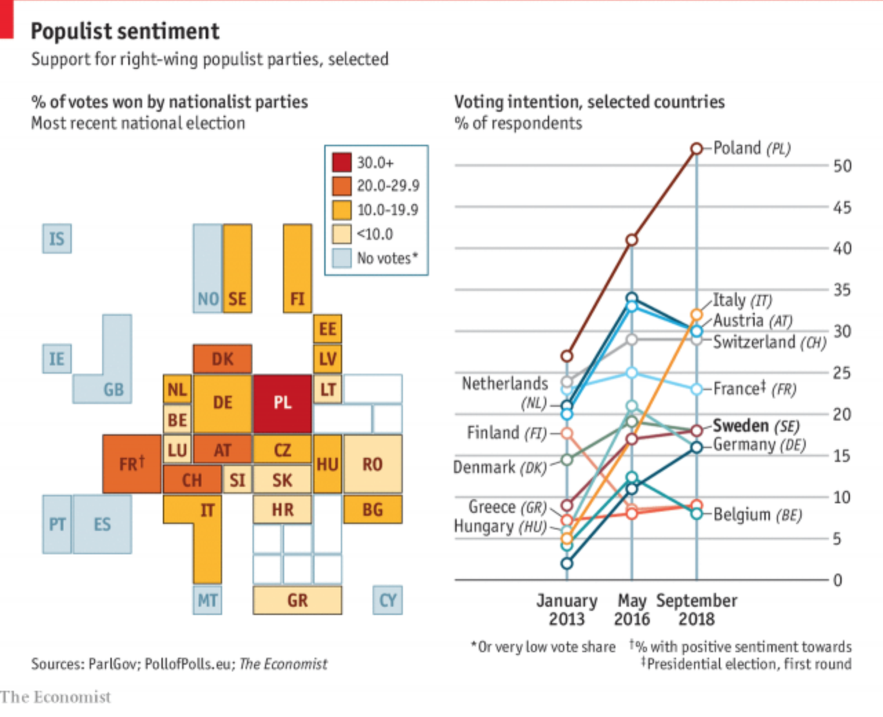
Yesterday we looked at the rise of the far-right in Sweden based on their electoral gains in this past weekend’s election. Today, the Economist has a piece detailing their strength throughout Europe and they claim that this type of nationalist party may have peaked.
The tile map, though
The graphic fascinates me because it appears to be a twist on the box or tile map, which is often used to eliminate or reduce the discrepancies in geographic size so that countries, states, or whatevers, can be examined more easily and more equitably.
I am guessing that the ultimate sizes, which appear to be one to four units, are determined by population size. The biggest hitters of Germany, the UK, France, and Spain are all four squares or boxes whereas the smaller states like Malta are just one. (But again, hey, we can all see Malta this time.)
I think this kind of abstraction will grow on me over time. It is a clever solution to the age-old problem of how do we show important data in both Germany and Malta on a map when Malta is so geographically small it probably renders as only a few pixels.
On the other hand, I am not loving the line chart to the right. I understand what it is doing and why. And even conceptually it works well to show the peaks of the parties. However, there are just a few too many lines and we get into the spaghettification of the chart. I might have labelled a far fewer number and let most sit at some neutral grey. Or, space permitting, a series of small multiples could have been used.
Credit for the piece goes to the Economist Data Team.