First, I want to start with a housekeeping note. Your author will be travelling for work and then a short autumn holiday. And so while I may be able to sneak a post or two in, I generally would not expect anything until next Friday, 12 October.
But let’s end this string of posts with a map. It is a choropleth, so in one sense there is nothing crazy going on here. The map comes from the Economist, which published an article on life expectancy throughout Europe and the big takeaway is that it is lower in the east than the west.
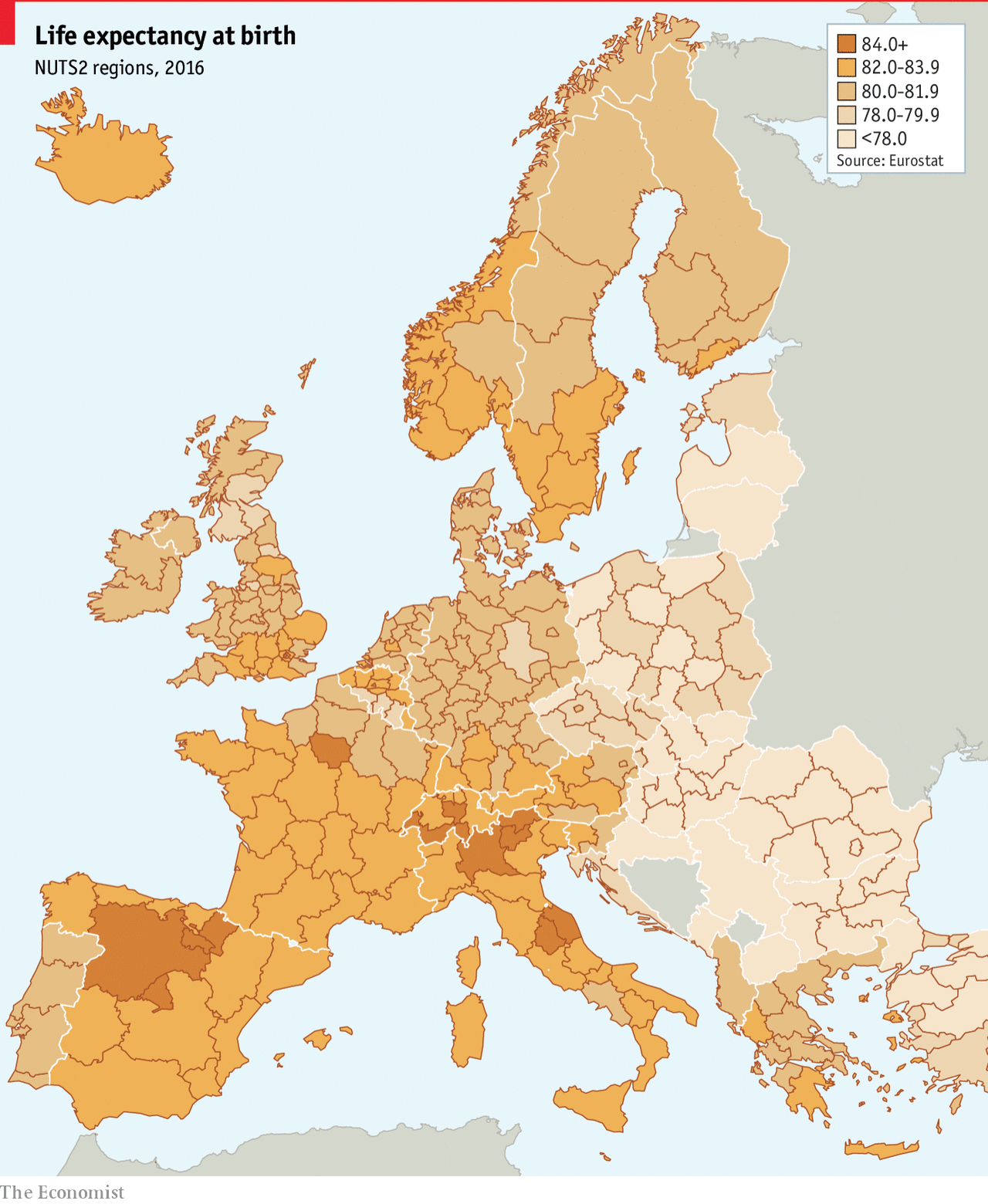
The great part of the map, however, is that we get to see a more granular level of detail. Usually we just get a view of the European states, which presents them as an even tone of one shade or one colour. Here we can see the variety of life expectancy in the UK, France, and Belgium, and then still compare that to eastern Europe.
Of course creating a map like this demands data to drive it. Do data sets exist for the sub-national geographic units of EU or European states? Sometimes not. And in those cases, if you need a map, the European state choropleth is the choice you have to make. I just hope that we get to see more data sets like this with more granular data to present a more complex and patterned map.
Credit for the piece goes to the Economist Data Team.
Leave a Reply
You must be logged in to post a comment.