Last week I met a friend for drinks and part of our conversation was about how on a trip to east Asia, he flew from New York and then over the North Pole. The North Pole! I then explained it was cool, but not unique. Instead aircraft typically fly between destinations via great circles. Basically, the shortest distance between two points on the Earth is a straight line, but remember the Earth is not exactly flat. Its spherical nature means that the shortest distance sometimes is what you would see as a curve on a flat map. And sometimes, those curves are shortest when plotted over the North Pole, because unlike a flat map, the east and west ends really do connect.
Lo and behold, yesterday the Economist published a piece about a new non-stop flight between London and Perth, on Australia’s southwest coast. The graphic shows the ten longest commercial flight paths. And what do you know, one of the longest is a soon-to-be flight from New York to Singapore that flies near the North Pole.
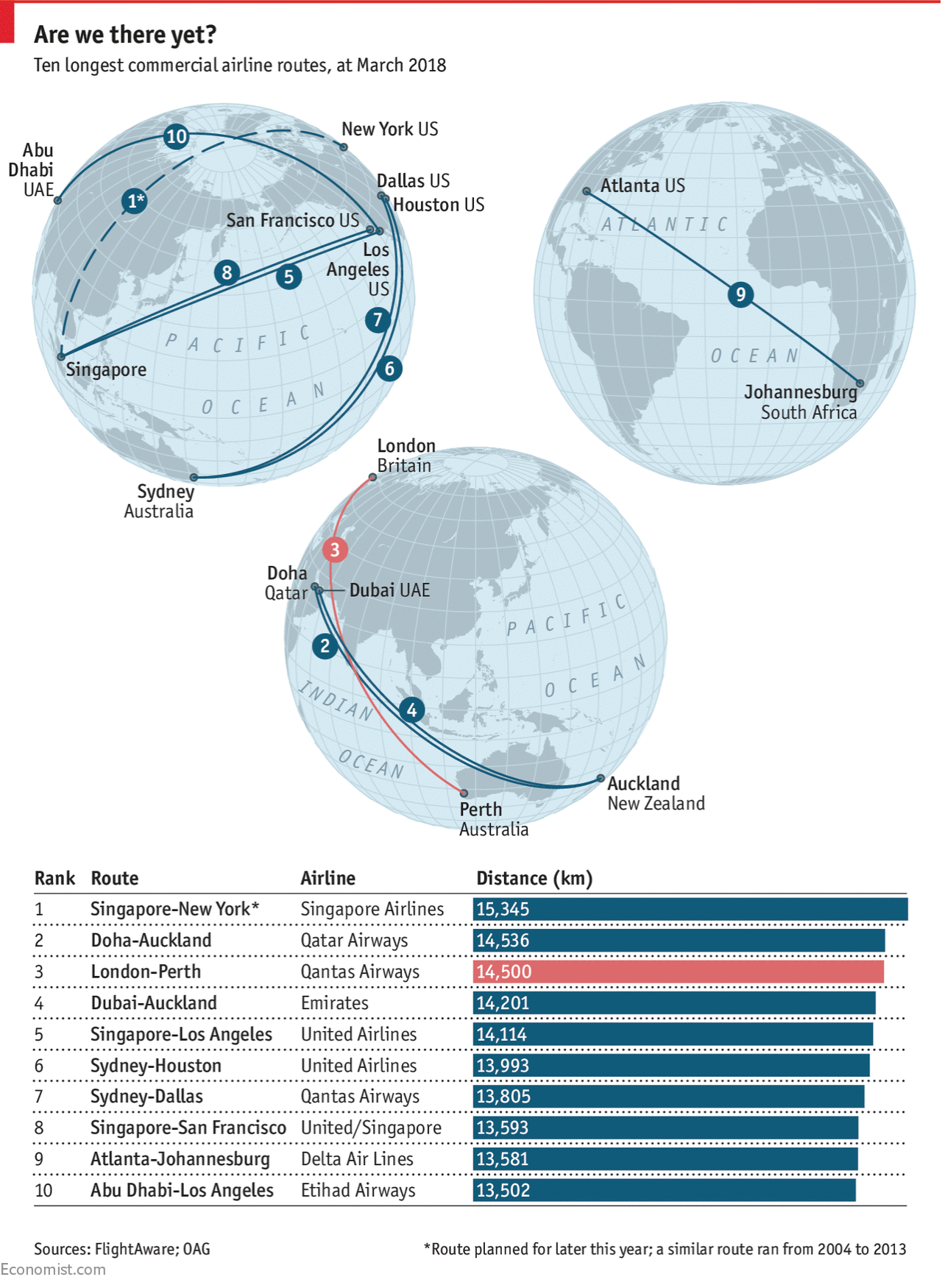
Of course the key to this type of diagram is the type of projection. Instead of using the Mercator-like map made popular by direction-focused maps like those of Google, here we see an orthographic presentation. It presents the Earth as if we were to see it from space, allowing us to see the fullness of the flight paths. Tellingly, those that appear to cross the middle of the map are shown as straight lines (Atlanta to Johannesburg), but those nearer the edges show the curvature of the great circles (Houston to Sydney).
Credit for the piece goes to the Economist graphics department.
Leave a Reply
You must be logged in to post a comment.