Last week I wrote about how we were seeing new cases continuing to rapidly decline. This week we can say cases are still declining, but perhaps a bit less rapidly than earlier.
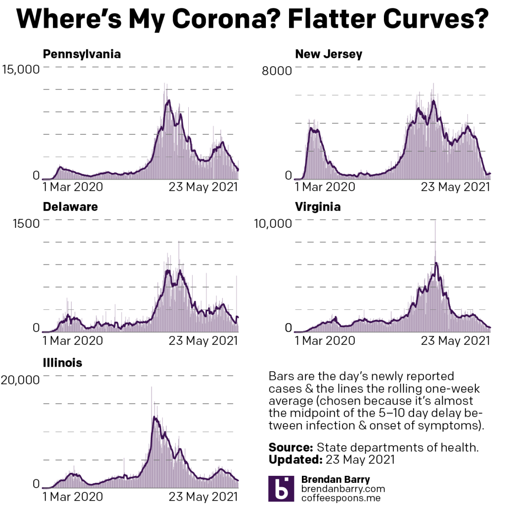
The charts above show that slowdown in the tail at the right of the chart. First some points to note, Delaware reported that several hundred cases had not been entered into their database, and so we saw a one-time spike midweek. But note that after the spike, the numbers continue to trend down. In other words, the rapid decline was probably a bit less rapid than we saw, but it was still a decline.
Pennsylvania’s chart has a problem of your author’s own design. Now that I’m fully vaccinated I was able to leave the flat this weekend and the Pennsylvania data wasn’t ready by the time I left on Saturday. But by the Sunday data, it was and so the 2500 new cases is probably split somehow between those days—accounted for by the seven-day average. This points to a broader question for which I do not yet have an answer: as life increasingly returns to normal, how much longer will I continue to update these charts?
I started these graphics as a way for myself to track the spread of the virus in my home state and the state where I still have a large number of friends. At the time, there were few if any visualisations out there doing this. Now most media outlets have them and my work at home led to a similar project at work. The reason I continued to make these was you, my readers here and in other places where I post this work. Your comments, messages, texts, and emails made it clear you valued the work. First, I know there are still many people left to be fully vaccinated, nearly half the population, and due to bias, some of the people most likely to follow these posts are those most likely to get vaccinated as early as possible. But please let me know, readers, if you’re still getting value out of these graphics.
But back to the data, in two of the remaining three states, Virginia and Illinois, we saw numbers continue to decline. New Jersey, however, shows a tail with a slight uptick in the seven-day average of new cases. This will be something I follow closely this coming week.
Deaths finally appear to be dropping.
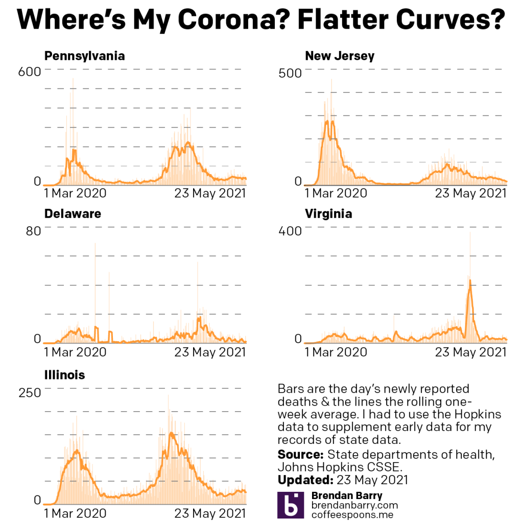
Not by large numbers, no, but in Virginia and Illinois we saw declines of 5 deaths per day. Pennsylvania was even greater with a decline of 7. We are still above rates we saw last summer, but it does appear that finally we have hit the inflection point we have been waiting for the last several weeks.
Finally we have vaccinations. These charts look at the cumulative number of people fully vaccinated.
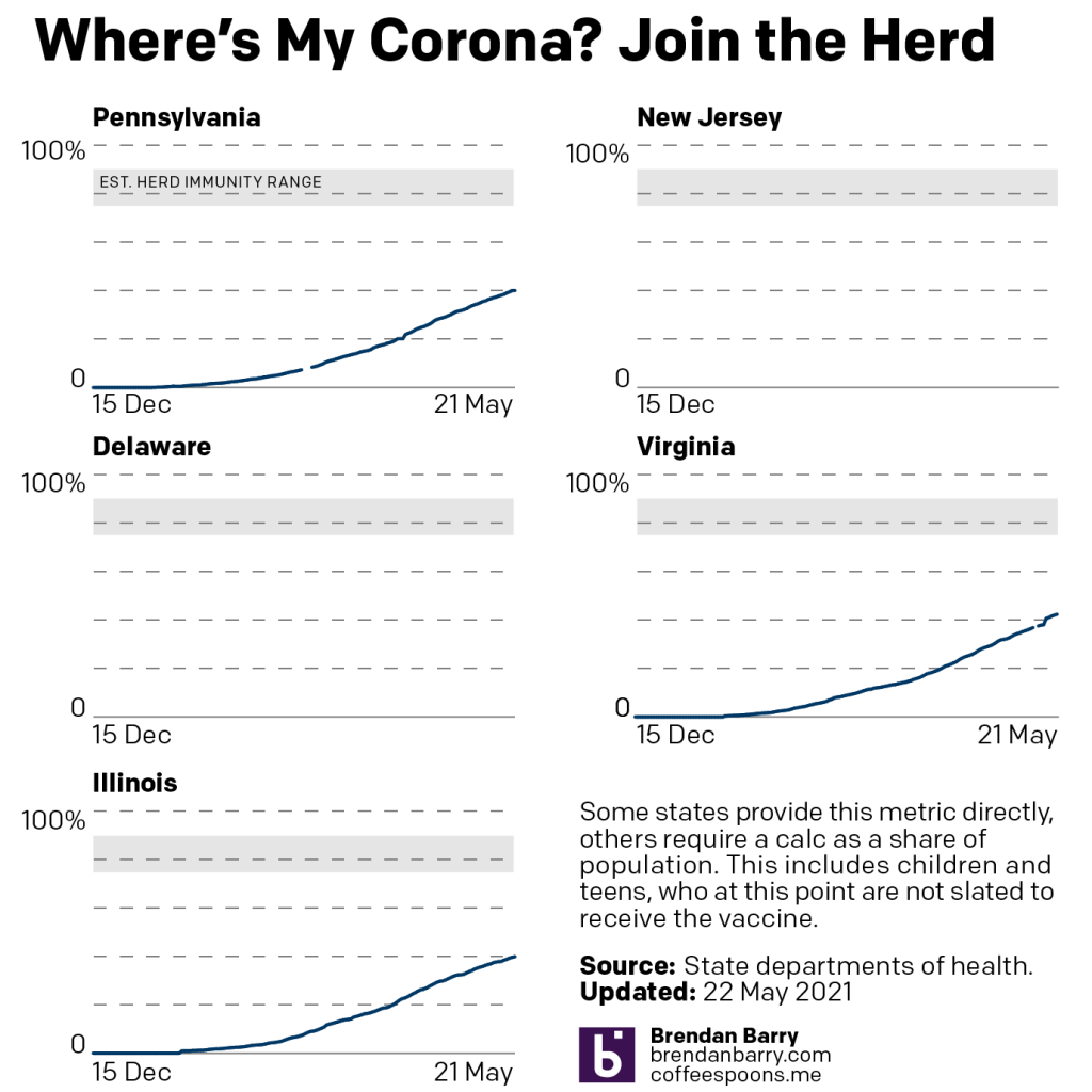
And in that the number keeps going up, and that’s good. But they can also only keep going up. But if you look closely at the right tail of the curve, you begin to see it flattening out as the rate of daily vaccinations begins to drop. Unfortunately we’re well below levels we think we’d need for herd immunity. But, to try and look at the positive, we’re almost halfway there and that is certainly playing a role as we can see with the rapid decline in numbers of new cases. But we need to keep trying to get more people vaccinated.
Credit for the piece is mine.
Leave a Reply
You must be logged in to post a comment.