Making America Save Again

For years, one issue with the American economy had been that we did not save enough. It’s understandable, as it’s hard to keep up with the image of the carefree American without profligate spending. But that’s also not great long-term. But thanks to Covid-19, we’ve now swung to the other side of the spectrum: Americans may be saving too much.

Saying that sounds callous to the devastation the pandemic has wrought upon large swathes of the economy. But it’s true in the aggregate as this New York Times piece explains. In particular, the authors highlight one example. Consider a corporate CEO who earned a $100,000 bonus for keeping the company he runs afloat during the recession. He adds $100k to the aggregate American income. But at a restaurant shuttered by the pandemic, owners lay off a hostess, a server, a bartender, and a dishwasher, each earning $25,000. Their collective lost income is $100,000 and so balances out that one CEO. And as CEOs are more able to work remotely than servers, it’s not hard to see how the upper-income earning cohorts of the economy have done well. In human-terms, four unemployed service industry people is terrible. But statistically, it’s a wash. Once we understand that, it makes the piece sensible.

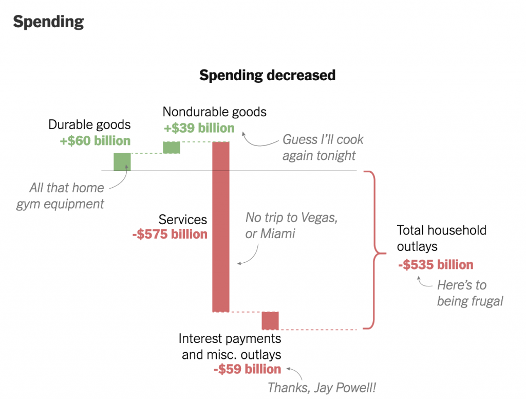
It uses decomposition charts, basically stacked bar charts broken apart, to show what constitutes the two sides of the American household budget: earning and spending. I’ve taken a screenshot of the spending side of the ledger.
This is the aggregate, I’d be curious how this relates to you, my readers.

We see that starting from the baseline, the solid line, American households spent more money this year on durable goods. A dotted line then carries that adjusted baseline to the right for the next component of the ledger: nondurable goods. We spent more on those too, so the baseline moves up. The designers annotated the graphic, adding descriptions of what each bar represents in a casual, lighthearted tone. I’ve definitely been cooking for myself a lot more.

Here I wish we had some more traditional charting elements, e.g. axis lines and labels. Now this piece is published under the Upshot, a more conversational and less formal brand than the Times as a whole. That probably explains the casual annotations. But I think some basic axis labels, e.g. spending more vs. spending less, could add some context without the need for the annotations.

Where the piece might lose people is what happens after durable goods. Americans stopped spending on services, a decline of over half a trillion dollars. That’s a lot of money. And so the adjusted baseline shifts to well below where we started. Add on savings from things like interest rates (Jay Powell is the chair of the Federal Reserve, for whose Philadelphia bank I work in full disclosure) and Americans have spent more than half a trillion dollars less. And as the article explains, we’ve also saved an enormous amount, to the tune of $1 trillion. Add it together and you’ve got America saving $1.5 trillion in 2020.

That money has to go somewhere. And you can see where some of it went when you look at surging prices in GameStop. Longer term, when the pandemic begins to end, we are going to have a pent up demand from people who have had their lives on hold for a year or more. And if there is insufficient supply for whatever’s in demand, prices will rise and we could see a sharp jump in inflation. But that’s a post for another day.

Back to this graphic, as a statistical graphic, it works. But without axis labels and data definitions, barely so. However, I think it’s meant to be more casual and illustrative than data-driven. If I look at this piece through that lens, I do think it works.

Credit for the piece goes to Neil Irwin and Weiyi Cai.

Farewell, Cardboard Cutouts

In 2020, baseball did not permit fans to attend regular season matches. (They changed this for the playoffs.) Instead, many stadiums opted for cardboard cutouts: fans often paid a fee and submitted a picture that the team printed on cardboard cutouts. Like so many things we will say about 2020, it was surreal.

But in Philadelphia at least, cardboard cutouts are out, and human fans are in. The state government in Harrisburg and the city government will allow 20% capacity at outdoor stadiums and 15% for indoor stadiums.

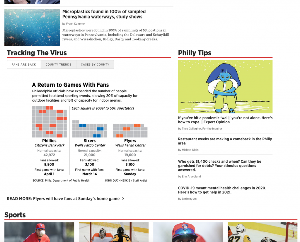
The Philadelphia Inquirer created a small graphic for its homepage to capture this news.

I cannot wait to safely attend a live match. C’mon, vaccines.

I intentionally included other site elements in the cropping to show how the graphic fits into the broader site. The extra white space around the image helps focus attention on the datagraphic over the numerous photographic elements for each article. Clicking on other tabs in the section brings up full-component-width graphics.

To the graphic itself.

Still can’t wait…

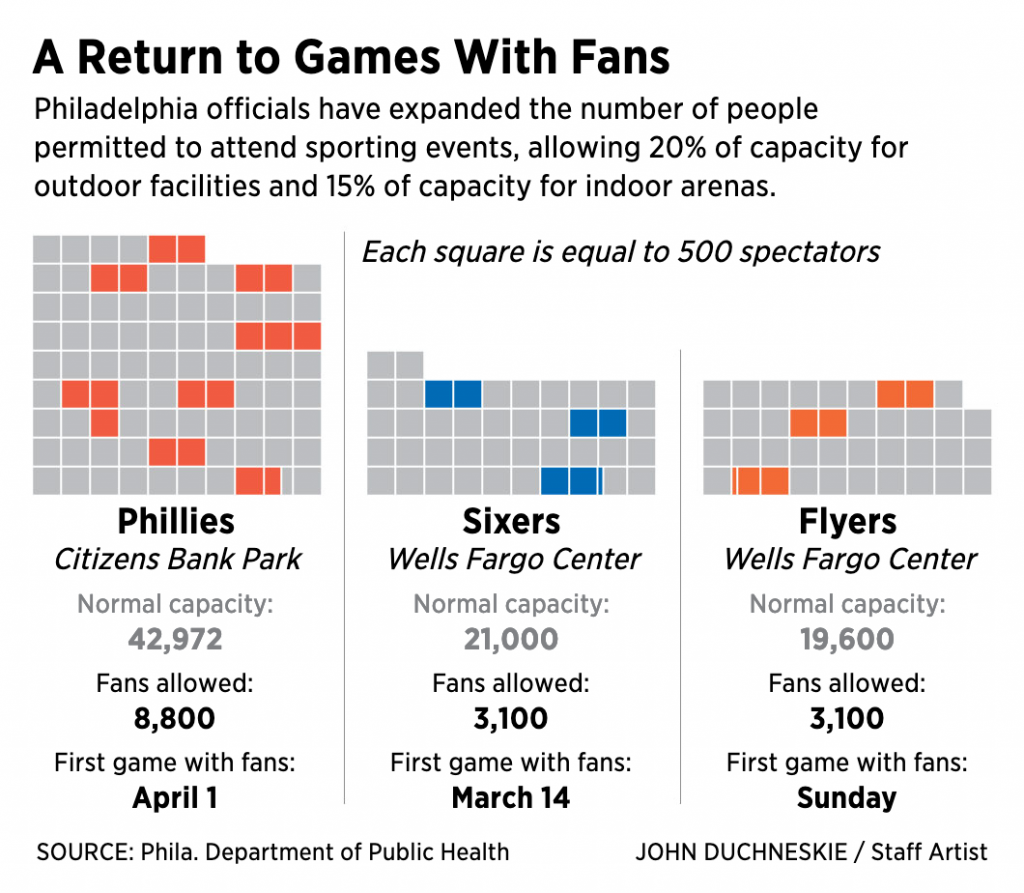
My guess would be this was a quick turnaround piece. There are a few things going on here. The first and most obvious one, the squares as spectators. Now I confess this confused me at first. I was not entirely certain what the coloured squares meant; they mean in-person attendees. Was this supposed to be an overall stadium? Or was it a representative seating section?

The quick turnaround becomes important, because this is probably how I would have first conceptualised the graphic. But, with more time, I may have attempted to incorporate the shape of the playing field, be it a baseball diamond or basketball court, or hockey rink—I know all the sports terms!—and surrounded them with shapes representing a certain number of spectators. Squares might not work in that case because of the curves. Circles? Hexagons? Regardless of the shape, the filling of occupied seats would be the same as here, but it would perhaps be clearer to some readers, i.e. me.

Second, we get to the table below the graphics. Here we have a subtle design decision. Note that here the designer greyed out the normal capacity figures. The new figures at that 20% and 15% rates are what appear in black bold text. My usual instinct is to use typographic weight, regular vs. bold, in these situations. But the grey here works equally well.

Third, and this also involves the table, we have the first game data. We talked about the comparison of the capacity and permitted attendance. But I wonder, did the date of the first game with fans needed to be displayed in the same way as the permitted attendance? Because the news isn’t the dates of the first games—at least not as I read the news—but the numbers of attendees. And because of that, maybe I would have reduced the size of the type for the date of the first game. Or, conversely, set the type for the new attendance in a larger point size.

Overall, I enjoyed seeing this news presented visually, even if I was left confused.

Credit for the piece goes to John Duchneskie.

Lead Pie

This past weekend, I read an article in Politico discussing parents’ outrage over levels of lead and other toxic metals in baby food. The story focuses on a Congressional report into the matter, but that ties back into an EPA study from 2017 that investigated lead contamination. Specifically the article’s author notes “a chart that was buried in supplemental material”. Buried chart? Well I went off to investigate.

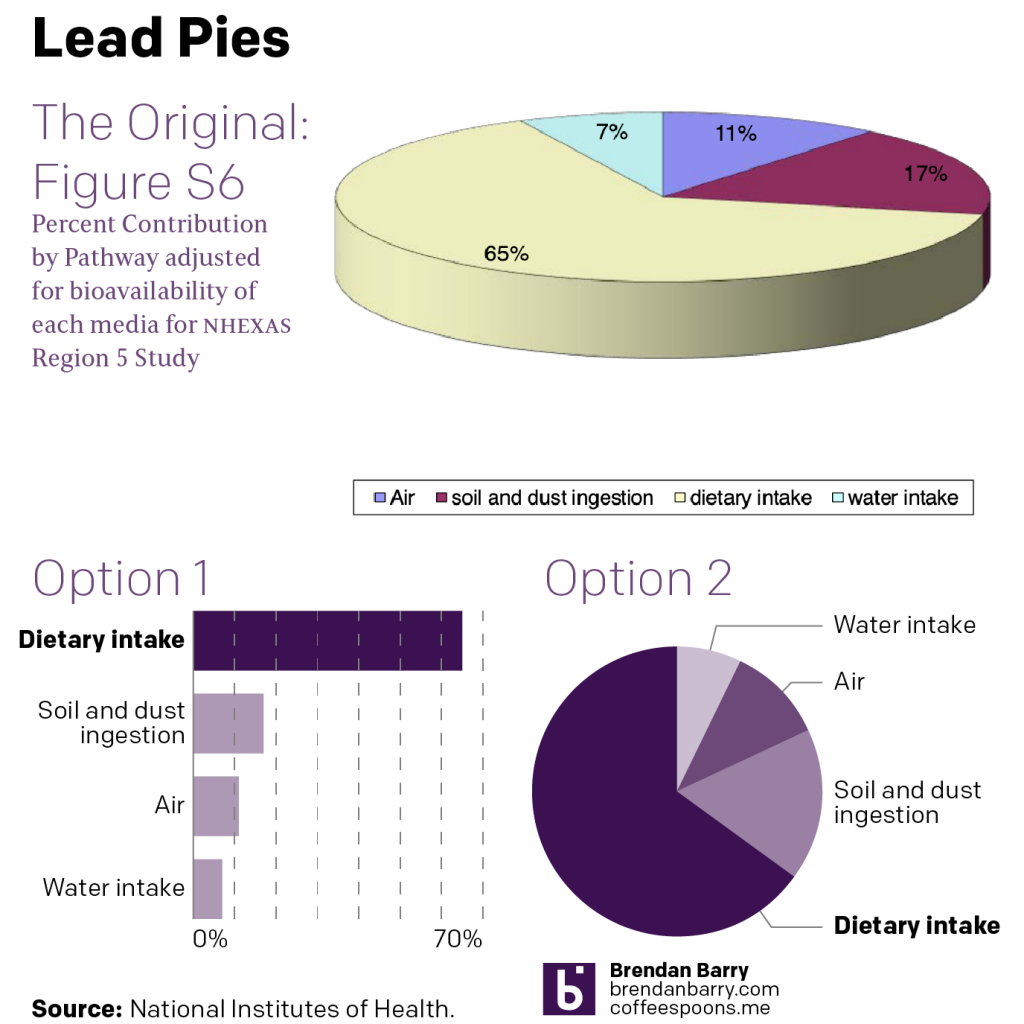
And I found all the charts. But I wanted to focus on one. I am not entirely clear what it means: Percent contribution by pathway adjusted for bioavailability of each media for NHEXAS Region 5 study. I get that it’s looking at channels of intake, but it’s unclear if this is lead or some other contaminant. Is this for all people? Or a sub-section of the population as other charts in that supplemental material pack are?

So I made a graphic where I compared the original to two alternate versions.

Now, the editorial focus of the article is on baby food, which is not the apparent focus of the study (unless it is couched in academic/technical terms). But what’s worth noting is that the pale yellow recedes into the background as the burgundy dominates the graphic.

If graphics are done well, they should show clear visual relationships, they do not need to label specific datapoints unless through a progressive disclosure of information. But if you are going to label everything, I would want to make certain that in the case of that same burgundy slice, we have sufficient contrast to read the 17% label.

Pie charts are not good at allowing people to compare slices. So the pie chart as the format here is not a great place to start, but as you can see in my Option 2, if you are going to choose a pie chart form, there are ways of making it more legible. Namely, do not make it three-dimensional.

Here the foreground receives prominence over the background, which may be receding and visually shrinking into the background. And as the point of a chart is to make visual comparisons, if we cannot compare like for like, it’s not ideal.

Also, we have the thickness of the pie chart. That vertical heights adds yellow to the slice of the pie we see in front. Casually, that makes the yellow slice appear even larger than it already is from the three-dimensional foreshortening.

Option 2 presents this as a stripped down pie chart. Make it flat. I used one colour with tints of one purple. I used the 100% to highlight the dietary intake channel, because of the Politico article’s focus.

But really, Option 1 is the improvement here. Comparing the smaller slices is easier here as the eye simply moves vertically down the graphic. We are also able to add axis lines that provide a context for where those values fall, between 0 and 10 for Water intake, and just over 10 for Air. Somewhere between 15 and 20 for Soil and dust ingestion.

Finally, that legend. We don’t want the reader to have to strain to identify what slice is what. Why is the legend in a box? Why is it so far away from the pie? In both my options I closely and visually link the labels to the slices/bars they represent. That makes it easier for the reader to know what they are looking at when they are looking at it.

The moral of the story, people, don’t use three-dimensional pie charts.

Credit for the original version goes to the EPA. Credit for the alternate versions is mine.

Another Look at 500,000

Yesterday we looked at how the New York Times covered the deaths of 500,000 Americans due to Covid-19. But I also read another article, this by the BBC, that attempted to capture the scale of the tragedy.

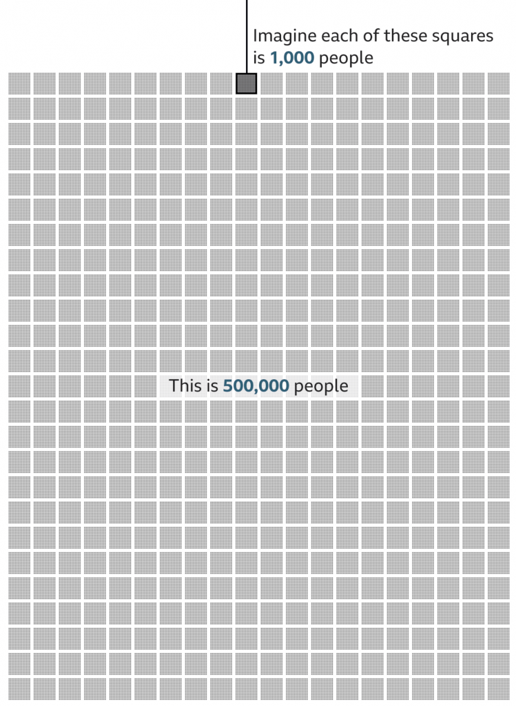
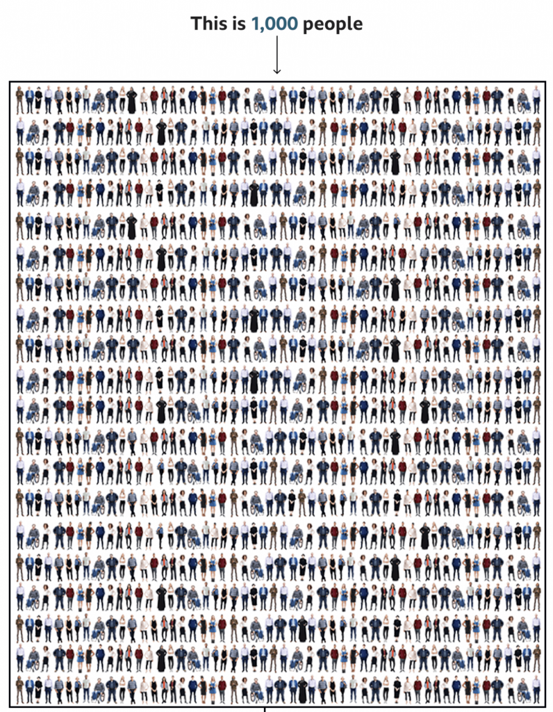
Instead of looking at the deaths in a timeline, the BBC approached it from a cumulative impact, i.e. 500,000 dead all in one go. To do this, they started with an illustration of 1,000 people. Then they zoomed out and showed how that group of 1,000 fit into a broader picture of 500,000.

We’re going to take a look at this in reverse, starting with the 500,000.

Half a statistic.

I think this part of the graphic works well. There’s just enough resolution to see individual pixels in the smaller squares, connecting us to the people. And of course the number 500 stacks nicely.

My quibble here might be whether the text overlay masks 8,000 people. Initially, I thought the design was akin to hollow square, but when I looked closer I could see the faint grey shapes of the boxes behind a white overlay. Perhaps it could be a bit clearer if the text fell at the end of all the boxes?

But overall, this part works well. So now let’s look at the top.

1,000 tragedies

This is where I have some issues.

When I first saw this, my eyes immediately went to the visual patterns. On the left and right there are rivers or columns of what look like guys in white t-shirts. Of course, once I focused on those, I saw other repeated patterns, the guy in the black jacket with his arms bent out, hands on his hips. The person in the wheelchair occupies a different amount of area and has a distinct shape and so that stood out too.

Upon even closer inspection, I noticed the pattern began to repeat itself. Every other line repeated itself and with the wheelchair person it was easy to see the images were sometimes just flipped to look different.

Now, allow me to let you in on a secret, unless you gave a designer a budget of infinite time, they wouldn’t illustrate 1,000 actual people to fill this box. We don’t have time for that. And I’ll also admit that not all designers are good illustrators—myself first and foremost. A good design team for an organisation that uses illustration should have either a full-time illustrator, or a designer who can capably illustrate things.

But this gets to my problem with the graphic. I normally can distance myself from reading a piece to critiquing it. But here, I immediately fixated on the illustrations, which is not a good sign.

There are three things I think that could have been done. The first two are relatively simple fixes whilst the third is a bit grander in scope.

First, I wonder if a little more time could have been spent with the illustrations. For one, white t-shirt guy, I don’t see his illustration reused, so why not change the colour of his t-shirt. Maybe in some instances make it purple, or orange, or some other colour. I think re-colouring the outfits of the people could actually solve this problem a good bit.

But second, if the patterns still appear visible to readers, mix it up a bit. I understand the lack of desire to spend time creating an individualised row for each row. Crafting each row person by person probably is out of the time requirements—though maybe the people above the designer(s) should know that content takes time to create. So what about repeating smaller blocks? I counted 20 rows, which means there should be 50 people per row. Make each row about ten blocks, and have several different blocks from which you can choose. Ideally, you have more blocks than you need per row, so not all figures are repeated, but if constrained, just make sure that no two rows have the same alignment of blocks.

Thirdly, and here’s the one that would really have required more time for the designer to do their job, make the illustrations meaningful. In a broad sense, we do have some statistics on the deaths in the United States. According to the CDC, 63% of deaths have been by white non-Hispanics, 15% by Black non-Hispanics, and 12% by Hispanic/Latino, 4% by Asian Americans, 1% by Native Americans, 0.3% by Hawaiian and Pacific Islander, and 4% by multiple non-Hispanic. Using those numbers, we would need 630 obviously white illustrations, 150 obviously Black, and so on.

If the designer had infinite time, the illustrations could also be made to try and capture age as well. Older people have been hit harder by this pandemic, and the illustrations could skew to cover that cohort. In other words, few young people. According to the CDC, fewer than 5% of deaths have been by people aged under 40. In other words, no baby illustrations needed.

That’s not to say babies haven’t died—87 deaths of people between 0 and 4 have been reported—but that when creating a representative average, they can be omitted, because that’s less than 0.1%, or not even 1 out of 1000.

To reiterate though, that third concept would take time to properly execute. And it would also require the skills to execute it properly. And I am no illustrator, so could I draw enough representative people to fake 1,000? Sure, but time and money.

The first two options are probably the most effective given I’d bet this was a piece thought up with little time to spare.

Credit for the piece goes to the BBC graphics team.

Dove vs. Hawk

Earlier, I saw these two graphics floating around the Twitter. They each come from a major financial institution and attempt to place the voting (and non-voting members) of the Federal Open Market Committee (FOMC) on a spectrum of doves to hawks or slightly less dovish. The FOMC, part of the Federal Reserve system, sets interest rates for the US economy. Now, I’m being super simplistic here, but it’s broadly true. I should add, full disclosure, I presently work for the Federal Reserve Bank of Philadelphia.

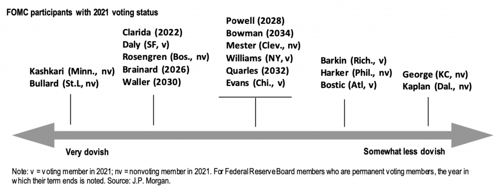
The first graphic is from JPMorgan and plots in one-colour all the voting and non-voting members on a single axis from very dovish to somewhat less dovish. Thin black lines point to evenly spaced points on the axis and people are listed at each interval.

It’s a fairly simple approach, but effective. Nothing revolutionary here. What I find a bit odd is the line underneath the centre tick. What prompts that group to have what I’ll call a summary bar? Is it because Jay Powell, the chair of the Federal Reserve, is placed within that group? It’s a bit unclear.

Now keep in mind the classifications here, very dovish and somewhat less dovish, as we compare JPMorgan’s graphic to that of Bank of America.

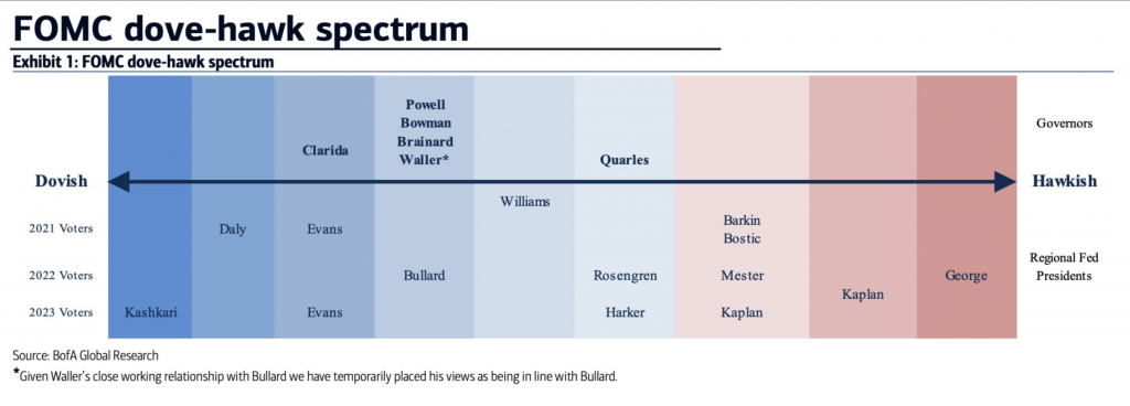
The first thing that strikes me is the use of colour. Here we have a fairly straightforward divergent spectrum of red to blue. Along with other design elements, like typographic scale and contrast for the header, subhead, and labels, this piece strikes me as better designed and more polished.

But I still have questions.

Here we have dovish to hawkish. At the hawkish extreme, we have Esther George of Kansas City and Robert Kaplan of Dallas. In JPMorgan’s chart, both are grouped together as somewhat less dovish. But with Bank of America, they are decidedly hawkish. (Although with nine intervals, the Bank of America graphic has a bit more granularity than JPMorgan’s.)

So the biggest question, unfortunately left unanswered by each graphic, is what defines hawkish and somewhat less dovish? Just by words, they sound not at all alike. But both companies clearly place both individuals at the same end of the spectrum.

Part of the issue stems from the divergence point between red and blue. For most spectra of this type, that would be the demarcation between a committee member who is a dove or a hawk. But we have no similar separation for JPMorgan.

There is, however, one design element for Bank of America’s piece that I really like. My explanation of the FOMC at the top was a bit simplistic. Not every regional Federal Reserve president gets to vote every year. They rotate each year except for New York. These presidents get to vote alongside those on the Board of Governors.

In the graphic, note that everybody above the axis label is a member of the Board, i.e. they get to vote every year until their term expires. Below the axis we have the rotation schedule. Each line represents a bank president who can vote in a particular year. For example, the Philadelphia president, Patrick Harker, was a voting member on the committee in 2020, but falls off in 2021 and will not return to 2023. The Bank of America graphic captures this for each president very well.

I am a bit confused as to why some members, i.e. Kaplan and John Williams of New York, appear to sit between lines. I am unaware of any reasons why they would be between years.

Overall, I prefer the Bank of America piece. It more clearly presents the rotation element of the voting members of the FOMC. Yes, it has colours, but I’m confused as to why the demarcation between doves and hawks happens where it does. And why JPMorgan doesn’t describe anyone as a hawk. So while I prefer it, I think it could still use some additional information or context to make it clearer to readers.

Credit for the JPMorgan piece goes to a designer at JPMorgan.

Credit for the Bank of America piece goes to a Bank of American Global Research designer.

Needle Time

Yesterday was maybe the last election day for the 2020 US General Election. (There are still a few US House seats yet to be called, most notably a contested race in upstate New York.) These were a pair of runoff elections in Georgia for the state’s two US Senate seats (one for a full, six-year term, the other to finish out the final two years of a retiring senator).

I spent most of the night eating pizza and tracking results. One thing that I keep tabs on (in the sense of open tabs in the browser) is the New York Times needle forecast. It has its problems, but I wanted to highlight something I think was new last night. Or, if it wasn’t, I didn’t notice it back in November.

Below the needle was a simple table of results.

The needle speaks

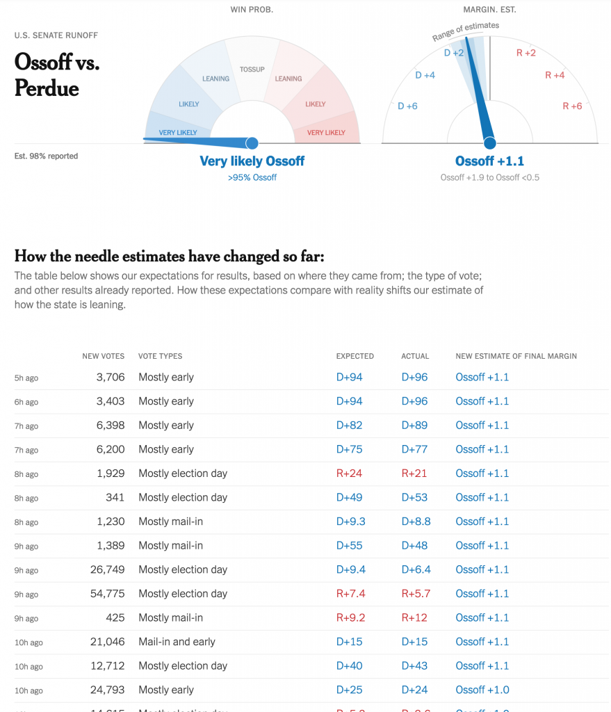
In the past, the needle was a bit opaque and it consumed data and spat out forecasts without users having a sense of what was driving those forecasts. Back in November, there were a few instances where states published incorrect data—that they later fixed—and when the needle consumed it, the needle forecast incorrect results.

But now we have a clear record of what data the forecast consumed in the table below the needles. It’s fairly straightforward as tables go. But tables don’t have to be sexy to be clear and effective.

The table lists the time when the data was added, the number of votes added, the type of vote added, and then the actual data vs. what was expected. And ultimately how that changed the needle. This goes a long way towards data transparency.

Simple colour use, bright blues and reds, show when the result/data favoured the Republican or Democrat. Thin, light strokes instead of heavy black lines for rows and columns place the visual emphasis on the data. And smaller type for the timestamp places the less important data at a lower level of importance.

It’s just very well done.

Credit for the piece goes to Michael Andre, Aliza Aufrichtig, Matthew Bloch, Andrew Chavez, Nate Cohn, Matthew Conlen, Annie Daniel, Asmaa Elkeurti, Andrew Fischer, Will Houp, Josh Katz, Aaron Krolik, Jasmine C. Lee, Rebecca Lieberman, Jaymin Patel, Charlie Smart, Ben Smithgall, Umi Syam, Miles Watkins and Isaac White.

Difficult Descendancy Charts

The holiday break is over as your author has burned up all his remaining time for 2020 and so now we’re back to work. And that means attempting to return to a more frequent and regular posting schedule for Coffeespoons.

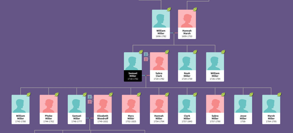
I wanted to start with the death of Diego Maradona, a legendary Argentinian footballer. He died in December of a heart attack and left behind a complicated inheritance situation. To help explain the situation, the BBC created what in genealogy we call a descendancy chart. You typically use a descendancy chart to show the children, and sometimes grandchildren, of a person. (You can also attach people above the person of interest and show the person’s ancestral families.)

This is an example of a descendancy chart from my research into an unrelated family.

The descendants of Samuel Miller

You can see Samuel Miller married Sabra Clark and had at least nine children with her. And I followed one of them, another Samuel, who married Elizabeth Woodruff and they had four children. In this version, you can also see Samuel the elder’s parents and siblings.

But Diego presents a complicated situation. He was married and had two children, then divorced. That’s not terribly uncommon. But he then went on to have potentially eight children with potentially five different women. (I say potentially because some of the claims are still working their way through the courts via paternity tests.)

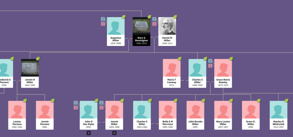
The above type of chart works well with one couple. In my own family, I have at least one ancestor who had potentially two husbands (the second marriage has not yet been confirmed, but she definitely had children with two different men). And when we use this chart type to look at my ancestor’s descendants, you can see it becomes tricky.

Mary Remington’s descendants

Her children’s fathers can be placed to either side and then the children flow out from that. But whereas in the first chart we could see all nine children in one glance, Mary Remington had four and we only see two in this same view.

So how do you deal with one person who has six total relationships that have offspring?

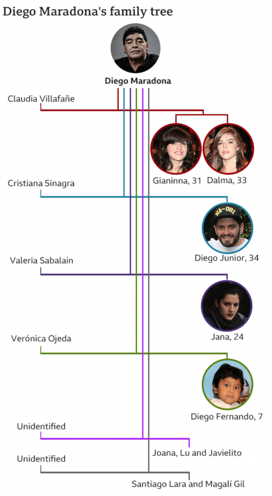
The BBC opted for a vertical chart that uses colour to link the couples. Diego and his ex-wife receive a red line, and that link moves vertically down from Diego with the two daughters shown as descendants on the right.

Diego Maradona’s descendants

Each subsequent relationship with offspring receives its own colour and continues to move vertically down the page, linking the mother on the left to the children on the right.

What I find interesting is the inconsistency within the chart, however. At the end, with the unidentified women, we have two instances of multiple children. Santiago Lara and Magali Gil, for example, descend from one stem. But note at the top how Diego’s two daughters Gianinna and Dalma each receive their own stem. Is there a reason for combining the two children from one unidentified mother into one branch?

And why the vertical format? You can see in my two examples, we are looking at a horizontal format. It works well when I am working on my desktop. The format is less useful on a mobile. I wonder if the BBC knows from their analytics that most people access their content like this via mobile phone and created a graphic that best uses that tall but narrow proportion. Because the proportions do not work well when the article is viewed on a desktop.

The vertical descendancy chart here is an intriguing solution to show descendants from multiple partners in a single mobile screen display. I am not sure how useful it would be as a new form, because I am not certain of how many times we would run into issues of children from six partners, but it could be worth exploring.

Credit for the images from my examples goes to the designers at Ancestry.com.

Credit for the BBC graphic goes to the graphics department of the BBC.

Warmer, Wetter Winters in the UK

I remember hearing and reading stories as a child about the Thames in London freezing over and hosting winter festivals. Of course most of that happened during what we call the Little Ice Age, a period of below average temperatures during the 15th through the early 19th century.

But those days are over.

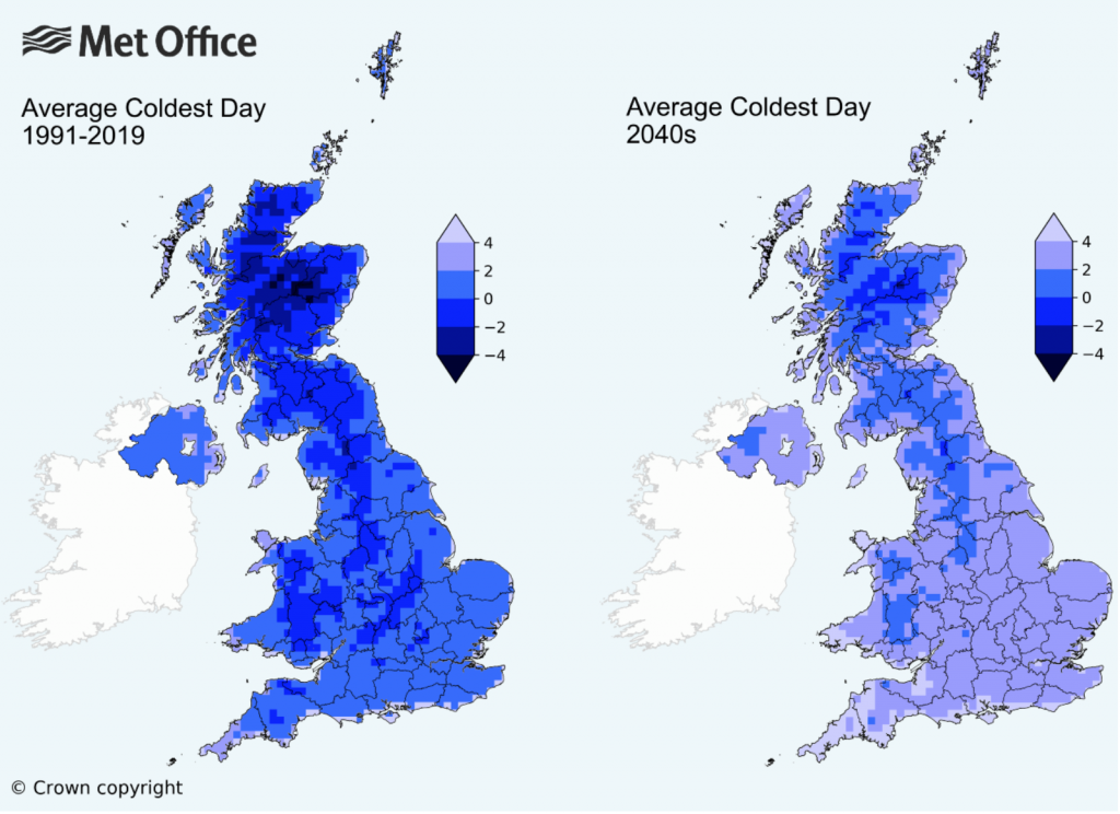
The UK’s Meteorological Office, or the Met for short, released some analysis of the impacts of climate change to winter temperatures in the United Kingdom. And if, like me, you’re more partial to winter than summer, the news is…not great.

Winter warming

Broadly speaking, winters will become warmer and wetter, i.e. less snowy and more rainy. Meanwhile summers will become hotter and drier. Farewell, frost festivals.

But let’s talk about the graphic. Broadly, it works. We see two maps with a unidirectional stepped gradient of six bins. And most importantly those bins are consistent between the maps, allowing for the user to compare regions for the same temperatures: like for like.

But there are a couple of things I would probably do a bit differently. Let’s start with colour. And for once we’re not dealing with the colour of the BBC weather map. Instead, we have shades of blue for the data, but all sitting atop an even lighter blue that represents the waters around the UK and Ireland. I don’t think that blue is really necessary. A white background would allow for the warmest shade of blue, +4ºC, to be even lighter. That would allow greater contrast throughout the spectrum.

Secondly, note the use of think black lines to delineate the sub-national regions of the UK whilst the border of the Republic of Ireland is done in a light grey. What if that were reversed? If the political border between the UK and Ireland were black and the sub-national region borders were light grey—or white—we would see a greater contrast with less visual disruption. The use of lines lighter in intensity would allow the eye to better focus on the colours of the map.

Then we reach an interesting discussion about how to display the data. If the purpose of the map is to show “coldness”, this map does it just fine. For my American audience unfamiliar with Celsius, 4ºC is about 39ºF, many of you would definitely say that’s cold. (I wouldn’t, because like many of my readers, I spent eight winters in Chicago.)

The article touches upon the loss of snowy winters. And by and large, winters require temperatures below the freezing point, 0ºC. So what if the map used a bidirectional, divergent stepped gradient? Say temperatures above freezing were represented in shades of a different colour like red whilst below freezing remained in blue, what would happen? You could easily see which regions of the UK would have their lowest temperatures fail to fall below freezing.

Or another way of considering looking at the data is through the lens of absolute vs. change. This graphic compares the lowest annual temperature. But what if we instead had only one map? What if it coloured the UK by the change in temperature? Then you could see which regions are being the most (or least) impacted.

If the data were isolated to specific and discrete geographic units, you could take it a step further and then compare temperature change to the baseline temperatures and create a simple scatterplot for the various regions. You could create a plot showing cold areas getting warmer, and those remaining stable.

That said, this is still a really nice piece. Just a couple little tweaks could really improve it.

Credit for the piece goes to the UK Met Office.

Biden’s Biggest Pyramids

Yesterday we looked at an article from the Inquirer about the 2020 election and how Biden won because of increased margins in the suburbs. Specifically we looked at an interactive scatter plot.

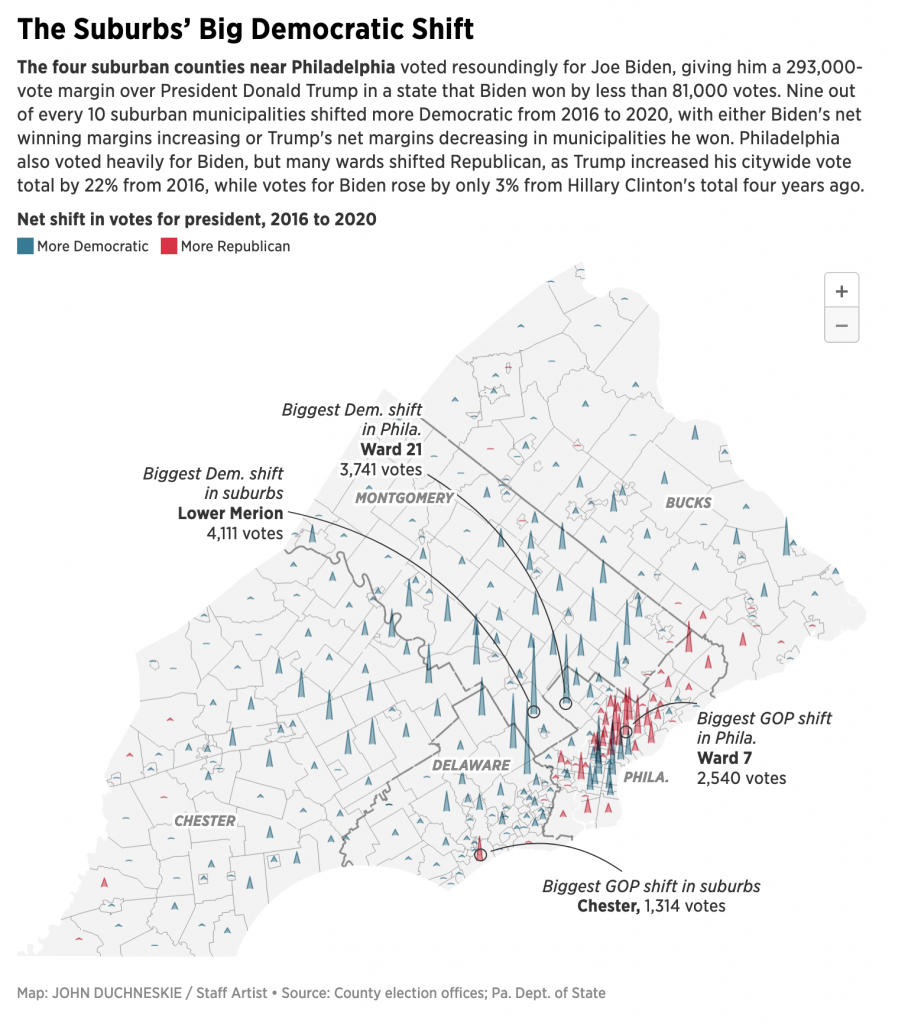
Today I want to talk a bit about another interactive graphic from the same article. This one is a map, but instead of the usual choropleth—a form the article uses in a few other graphics—here we’re looking at three-dimensional pyramids.

All the pyramids, built by aliens?

Yesterday we talked about the explorative vs. narrative concept. Here we can see something a bit more narrative in the annotations included in the graphic. These, however, are only a partial win, though. They call out the greatest shifts, which are indeed mentioned in the text. But then in another paragraph the author writes about Bensalem and its rightward swing. But there’s no callout of Bensalem on the map.

But the biggest things here, pun intended, are those pyramids. Unlike the choropleth maps used elsewhere in the article, the first thing this map fails to communicate is scale. We know the colour means a county’s net shift was either Democratic or Republican. But what about the magnitude? A big pyramid likely means a big shift, but is that big shift hundreds of votes? Thousands of votes? How many thousands? There’s no way to tell.

Secondly, when we are looking at rural parts of Bucks, Chester, and Montgomery Counties, the pyramids are fine. They remain small and contained within their municipality boundaries. Intuitively this makes sense. Broadly speaking, population decreases the further you move from the urban core. (Unless there’s a secondary city, e.g. Minneapolis has St. Paul.) But nearer the city, we have more population, and we have geographically smaller municipalities. Compare Colwyn, Delaware County to Springfield, Bucks County. Tiny vs. huge.

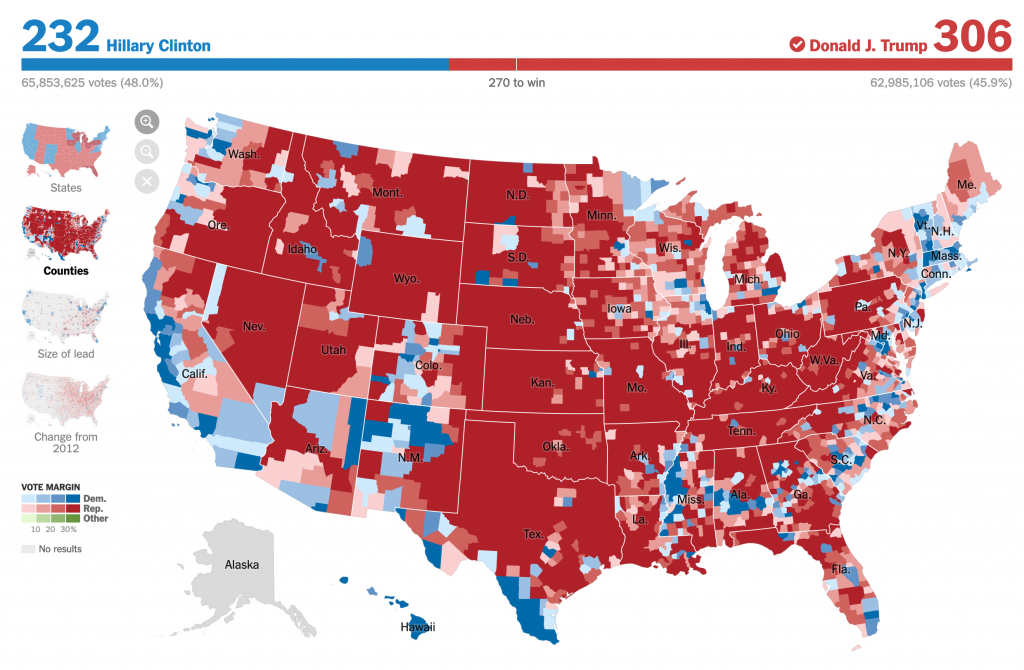
In choropleth maps we face this problem all the time. Look at a classic election map at the county level from 2016.

Wayb ack when…

You can see that there is a lot more red on that map. But Hillary Clinton won the popular vote by more then 3,000,000 votes. (No, I won’t rehash the Electoral College here and now.) More people are crowded into smaller counties than there are in those big, expansive red counties with far, far fewer people.

And that pattern holds true in the Philadelphia region. But instead of using the colour fill of an area as above, this map from the Inquirer uses pyramids. But we face the same problem, we see lots of pyramids in a small space. And the problem with the pyramids is that they overlap each other.

At a glance, you cannot see one pyramid beind another. At least in the choropleth, we see a tiny field of colour, but that colour is not hidden behind another.

Additionally, the way this is constructed, what happens if in a municipality there was a small net shift? The pyramid’s height will be minimal. But to determine the direction of the shift we need to see the colour, and if the area under the line creating the pyramid is small, we may be unable to see the colour. Again, compare that to a choropleth where there would at least be a difference between, say, a light blue and light red. (Though you could also bin the small differences into a single neutral bin collecting all small shifts be them one way or the other.)

I really think that a more straight forward choropleth would more clearly show the net shifts here. And even then, we would still need a legend.

The article overall, though, is quite strong and a great read on the electoral dynamics of the Philadelphia region a month ago.

Credit for the piece goes to John Duchneskie.

Biden Won the Burbs

The thing with election results is that we don’t have the final numbers for a little while after Election Day. And that’s normal.

There are a few things I want to look at in the coming weeks and months once my schedule eases up a bit. But for now, we can use this nice piece from the Philadelphia Inquirer to look at a story close to home: the vote in the Philadelphia suburbs.

It’s all happening in the yellow.

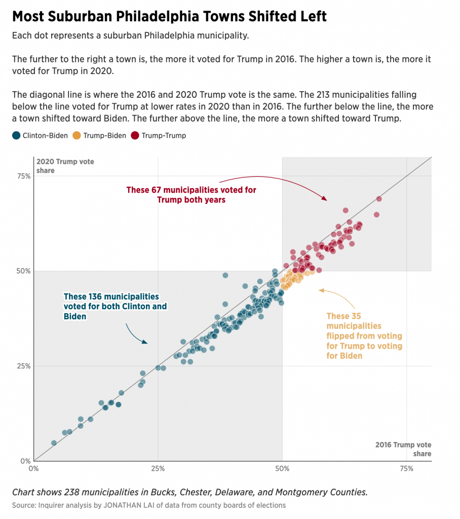
I’ve already looked at some analysis like this for Wisconsin and I shared it on my social. But there I looked at the easy, county-level results. What the Inquirer did above is break down the Pennsylvania collar counties of Philadelphia, i.e. the suburbs, into municipality level results. It then plotted them 2020 vs. 2016 and the results were—as you can guess since we know the result—Biden beat Trump.

What this chart does well is colours the municipalities that Biden flipped yellow. It’s a great choice from a colour standpoint. As the third of the primaries, with both blue and red well represented, it easily contrasts with the Biden- and Trump-won towns and cities of the region. The colour is a bit “darker” than a full-on, bright yellow, but that’s because the designers recognised it needs to stand out on a white field.

Let’s face it, yellow is a great colour to use, but it’s difficult because it’s so light and sometimes difficult to see. Add just the faintest bit of black to your mix, especially if you’re using paints, and voila, it works pretty well. So here the designer did a great job recognising that issue with using yellow. Though you can still see the challenge, because even though it is a bit darker, look at how easy it is to read the text in the blue and the red. Now compare that to the yellow. So if you’re going to use yellow, you want to be careful how and when you do.

The other design decision here comes down to what I call the explorative vs. the narrative. Now, I don’t think explorative is a word—and the red squiggle agrees—but it pairs nicely with narrative. And I’ve been talking about this a lot in my field the last several works, especially offline. (In the non-blog sense, because obviously all my work is done online these days. Oh, how I miss my old office.)

Explorative works present the user with a data set and then allow them to, in this case, mouse over or tap on dots and reveal additional layers of information, i.e. names and specific percentages. The idea is not to tell a specific story, but show an overall pattern. And if the piece is interactive, as this is, potentially allow the user to drill down and tease out their own stories.

Compare that to the narrative, my Wisconsin piece I referenced above is more in this category. Here the work takes you through a guided tour of the data. It labels specific data points, be them on trend or outliers and is sometimes more explicit in its analysis. These can also be interactive—though my static image is not—and allow users to drill down, and critically away, from the story to see dots of interest, for example.

This piece is more explorative. The scatter plot naturally divides the municipalities into those that voted for Biden, Trump, and then more or less than they voted for Trump in 2016. The labels here are actually redundant, but certainly helpful. I used the same approach in my Wisconsin graphic.

But in my Wisconsin graphic, I labelled specific counties of interest. If I had written an accompanying article, they would have been cited in the textual analysis so that the graphic and text complemented each other. But here in the Inquirer, it’s a bit of a missed opportunity in a sense.

The author mentions places like Upper Darby and Lower Merion and how they performed in 2020 vis-a-vis 2016. But it’s incumbent on the user to find those individual municipalities on the scatter plot. What if the designer had created a version where the towns of interest were labelled from the start? The narrative would have been buttressed by great visualisations that explicitly made the same point the author wrote about in the text. And that is a highly effective form of communication when you’re not just telling, but also showing your story or argument.

Overall it’s a great article with a lot to talk about. Because, spoiler, I’m going to be talking about it again tomorrow.

Credit for the piece goes to Jonathan Lai.