Choose Your Own FiveThirtyEight Adventure

In case you weren’t aware, the US election is in less than a week, five days. I had written a long list of issues on the ballot, but it kept getting longer and longer so I cut it. Suffice it to say, Americans are voting on a lot of issues this year. But a US presidential election is not like many other countries’ elections in that we use the Electoral College.

For my non-American readers, the Electoral College, very briefly, was created by the country’s founding fathers (Washington, Jefferson, Adams, Franklin, et al.) to do two things. One, restrict selection of the American president to a class of individuals who theoretically had a broader/deeper understanding of the issues—but who also had vested interests in the outcome. The founders did not intend for the American people to elect the president. The second feature of the Electoral College was to prevent the largest states from dominating smaller states in elections. Why else would Delaware and Rhode Island surrender their sovereignty to join the new United States if Virginia, Pennsylvania, and New York make all the decisions? (The founders went a step further and added the infamous 3/5 clause, but that’s another post.)

So Americans don’t elect the president directly and larger states like California, New York, and Texas, have slightly less impact than smaller states like Wyoming, Vermont, and Delaware. Each state is allotted a number of Electoral College votes and the key is to reach 270. (Maybe another time I’ll get into the details of what happens in a 269–269 tie.) Many Americans are probably familiar with sites like 270 To Win, where you can determine the outcome of the election by saying who won each state. But, even though the US election is really 50 different state elections, common threads and themes run through all those states and if one candidate or another wins one state, it makes winning or losing other states more or less likely. FiveThirtyEight released a piece that attempts to link those probabilities and help reveal how decisions voters in one state make may reflect on how other voters decide.
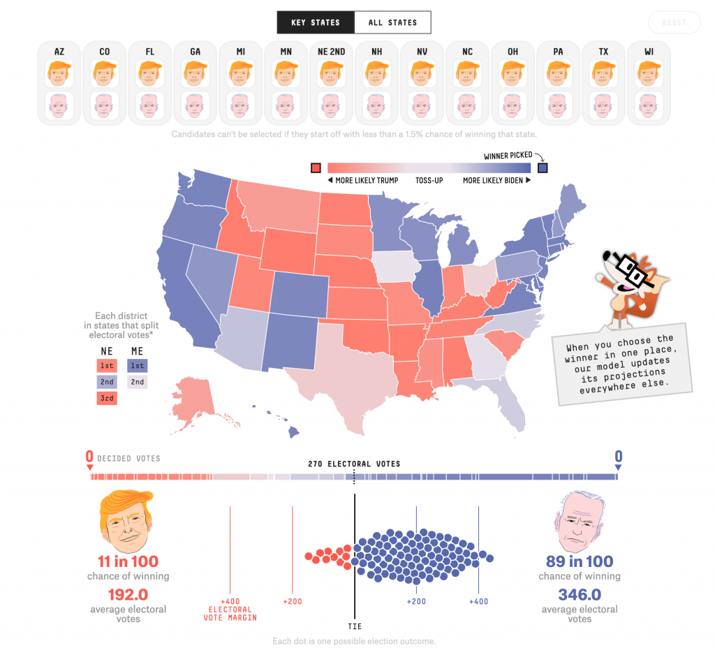
The interface is fairly straightforward—I’m looking at this on a desktop, though it does work on mobile—with a bunch of choices at the top and a choropleth map below. There we have a continually divergent gradient, meaning the states aren’t grouped into like bins but we have incredibly subtle differences between similar states. (I should also point out that Maine and Nebraska are the two exceptions to my above description of the Electoral College. They divide their votes by congressional district, whoever wins the district gets that Electoral College vote and then the state overall winner receives the remaining two votes.)

Below that we have a bar chart, showing each state, its more/less likely winner state and the 270 threshold. Below that, we have what I’ve read/heard described as a ball plot. It represents runs of the simulation. As of Thursday morning, the current FiveThirtyEight model says Trump has an 11 in 100 chance of winning, Biden, conversely, an 89-in-100 chance.

But what happens when we start determining the winners of states?

Well, for my non-American readers, this election will feature a large number of voters casting their ballots early. (I voted early by mail, and dropped my ballot off at the county election office.) That’s not normal. And I cannot emphasise this next point enough. We may not know who wins the election Tuesday night or by the time Americans wake up on Wednesday. (Assuming they’re not like me and up until Alaska and Hawaii close their polls. Pro-tip, there’s a potentially competitive Senate race in Alaska, though it’s definitely leaning Republican.)

But, some states vote early and/or by mail every year and have built the infrastructure to count those votes, or the vast majority of them, on or even before Election Day. Three battleground states are in that group: Arizona, Florida, and North Carolina. We could well know the result in those states by midnight on Election Day—though Florida is probably going to Florida.

So what happens with this FiveThirtyEight model if we determine the winners of those three states? All three voted for Trump in 2016, so let’s say he wins them again next week.
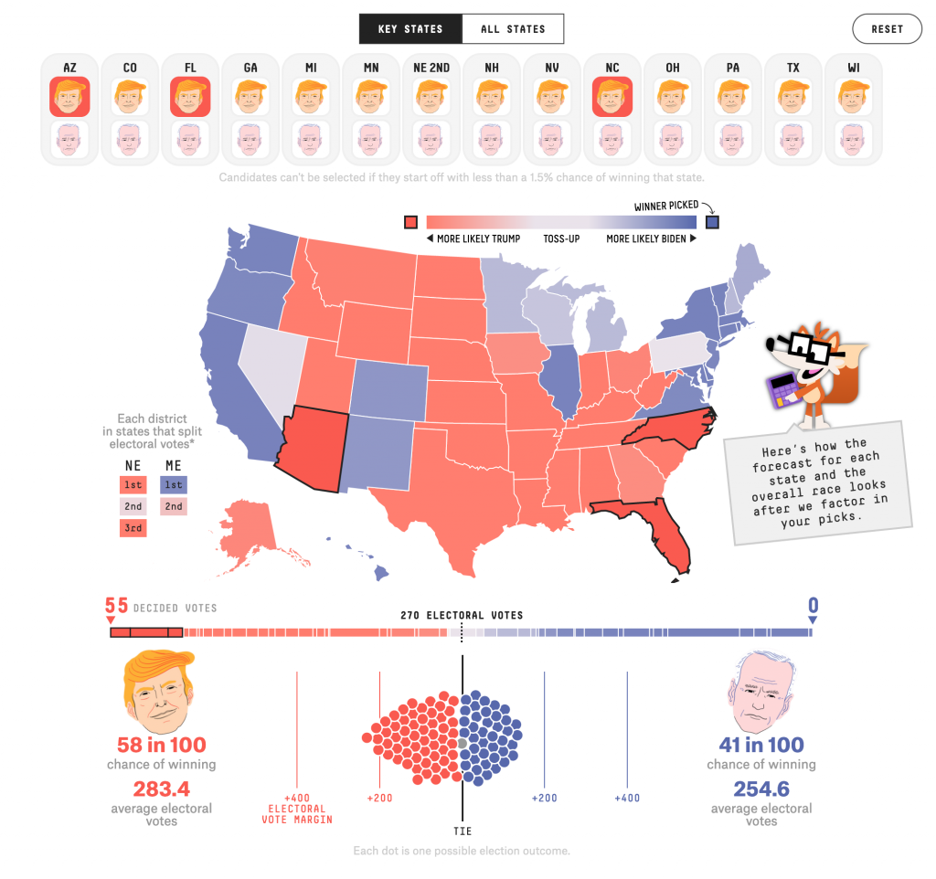
We see that the states we’ve decided are now outlined in black. The remainder of the states have seen their colours change as their odds reflect the set electoral choice of our three states. We also now have a rest button that appears only once we’ve modified the map. I’m also thinking that I like FiveyFox, the site’s new mascot? He provides a succinct, plain language summary of what the user is looking at. At the bottom we see what the model projects if Arizona, Florida, and North Caroline vote for Trump. And in that scenario, Trump wins in 58 out of 100 elections, Biden in only 41. Still, it’s a fairly competitive election.

So what happens if by midnight we have results from those three states that Biden has managed to flip them? And as of Thursday morning, he’s leading very narrowly in the opinion polls.
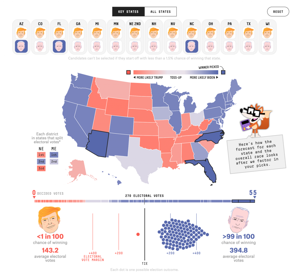
Well, the interface hasn’t really changed. Though I should add below this screenshot there is a button to copy the link to this outcome to your clipboard if, like me, you want to share it with the world or my readers.

As to the results, if Biden wins those three states, Trump has less than a 1-in-100 chance of winning and Biden a greater than 99-in-100.

This is a really strong piece from FiveThirtyEight and it does a great job to show how states are subtly linked in terms of their likelihood to vote one way or the other.

Credit for the piece goes to Ryan Best, Jay Boice, Aaron Bycoffe and Nate Silver.

Covid Migration

Yep, Covid-19 remains a thing. About a month or so ago, an article in City Lab (now owned by Bloomburg), looked at the data to see if there was any truth in the notion that people are fleeing urban areas. Spoiler: they’re not, except in a few places. The entire article is well worth a read, as it looks at what is actually happening in migration and why some cities like New York and San Francisco are outliers.

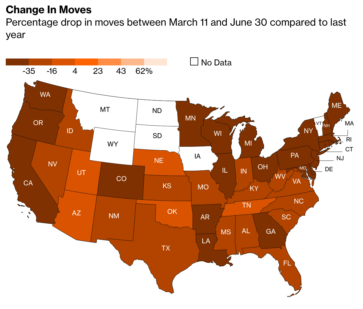
But I want to look at some of the graphics going on inside the article, because those are what struck me more than the content itself. Let’s start with this map titled “Change in Moves”, which examines “the percentage drop in moves between March 11 and June 30 compared to last year”.

Conventionally, what would we expect from this kind of choropleth map. We have a sequential stepped gradient headed in one direction, from dark to light. Presumably we are looking at one metric, change in movement, in one direction, the drop or negative.

But look at that legend. Note the presence of the positive 4—there is an entire positive range within this stepped gradient. Conventionally we would expect to see some kind of red equals drop, blue equals gain split at the zero point. Others might create a grey bin to cover a negative one to positive one slight-to-no change set of states. Here, though, we don’t have that. Nor do we even get a natural split, instead the dark bin goes to a slightly less dark bin at positive four, so everything less than four through -16 is in the darker bin.

Look at the language, too, because that’s where it becomes potentially more confusing. If the choropleth largely focuses on the “percentage drop” and has negative numbers, a negative of a negative would be…a positive. A -25% drop in Texas could easily be mistaken with its use of double negatives. Compare Texas to Nebraska, which had a 2% drop. Does that mean Nebraska actually declined by 2%, or does it mean it rose by 2%?

A clean up in the data definition to, say, “Percentage change in moves from…” could clear up a lot of this ambiguity. Changing the colour scheme from a single gradient to a divergent one, with a split around zero (perhaps with a bin for little-to-no change), would make it clearer which states were in the positive and which were in the negative.

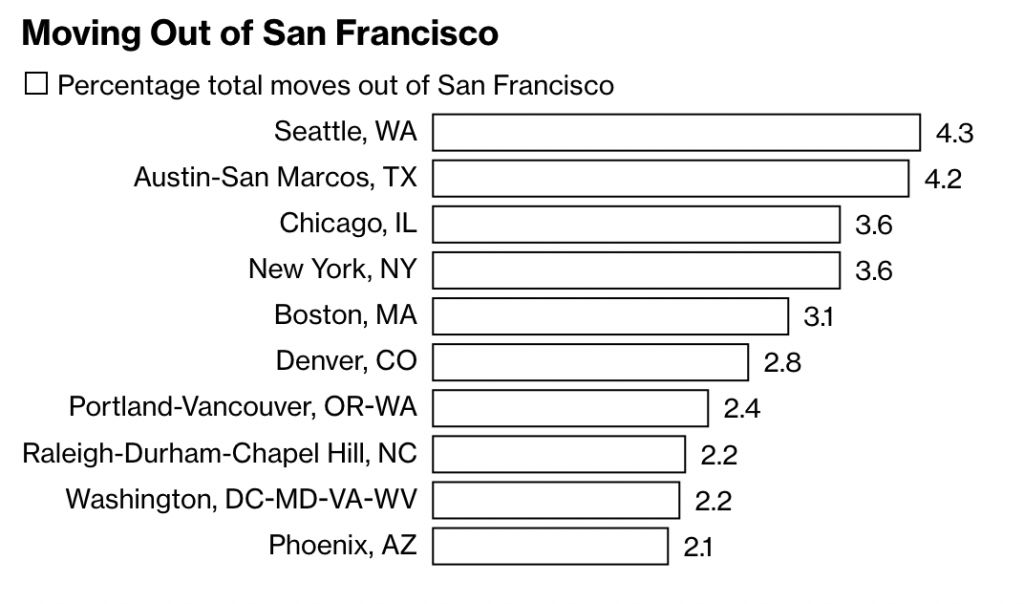
The article continues with another peculiar choice in its bar charts when it explores the data on specific cities.

Here we see the destinations of people moving out of San Francisco, using, as a note explains, requests for quotes as a proxy for the numbers of actual moves. What interests me here is the minimalist take on the bar charts. Note the absence of an axis, which leaves the bars almost groundless for comparison, except that the designer attached data labels to the ends of the bars.

Normally data labels are redundant. The point of a visualisation is to visualise the comparison of data sets. If hyper precise differences to the decimal point are required, tables often are a better choice. But here, there are no axis labels to inform the user as to what the length of a bar means.

It’s a peculiar design decision. If we think of labelling as data ink, is this a more efficient use with data labels than just axis labels? I would venture to say no. You would probably have five axis labels (0–4) and then a line to connect them. That’s probably less ink/pixels than the data labels here. I prefer axis lines to help guide the user from labels up (in this case) through the bars. Maybe the axis lines make for more data ink than the labels? It’s hard to say.

Regardless, this is a peculiar decision. Though, I should note it’s eminently more defensible than the choropleth map, which needs a rethink in both design and language.

Credit for the piece goes to Marie Patino.

Positioning Is Important

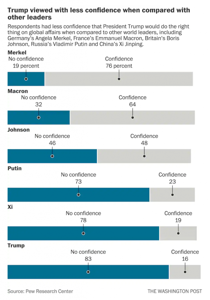
Yesterday Pew Research released the results of a survey of how the rest of the world views select countries throughout the world. The Washington Post covered it in an article and created some graphics to support the text. The text, of course, was no big surprise in that the rest of the world views the United States poorly compared to just several years ago and that, in particular, President Trump is a leader in whom the world has no confidence.

But that’s not what I want to talk about. Instead, I want to address a design element in the one of their graphics. (But you should go ahead and read about the survey results.)

The issue here is the positioning of the labels for each bar, representing a world leader. At the very top of the graphic, things are in a good way. We have Merkel with a small space beneath that text then another label, “No confidence, 19 percent”, and then a connecting line to a dot to the blue bar. We then have a small space and the label Macron, meaning we have moved on and are on the next world leader.

But what if the reader sees the title and starts towards the bottom? They want to see the leaders in whom the world has no confidence. Now look at the bottom of the chart and the positioning of the labels for Trump, and above him, Xi, Putin, and maybe even Johnson. Because the “No confidence, x percent” labels have moved further to the right, there is an enormous space between the leader’s name and their coloured bar. Visually, this creates a link between the leader’s name and the preceding bar. For example, Trump appears to have a no confidence value of 78 with an unlabelled bar chart beneath him.

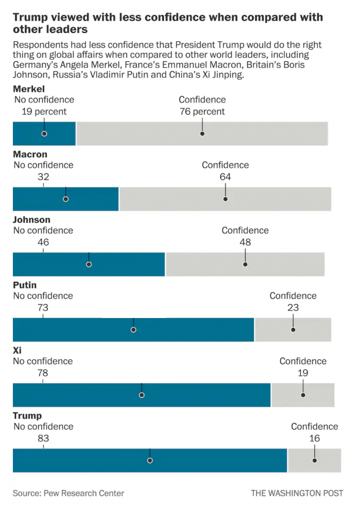
I suggest that there are two easy fixes to better link the labels to the data. The first is to move the leaders’ labels down, once the “No confidence” label has moved sufficiently far to the right. Like so.

The leader is now very clearly attached to his or her data with little confusion.

My second option is to fix the “No confidence” labels permanently to the left of the chart so as not to create that visual space in the first place, like so.

Here, after seeing the first option, I wonder if there is enough visual space at all between the leaders. But, this is only a quick Photoshop exercise. If I wanted to really tweak this, I would consider putting the data point or number in bold to the right of the label.That would eliminate an entire line of type that could be repurposed as a visual buffer between leaders.

I think either option would be preferable because of increased clarity for the reader.

Credit for the piece goes to the Washington Post graphics department.

Double Your Hurricanes, Double Your Fun

In a first, the Gulf of Mexico basin has two active hurricanes simultaneously. Unfortunately, they are both likely to strikes somewhere along the Louisiana coastline within approximately 36 hours of each other. Fortunately, neither is strong as a storm named Katrina that caused a mess of things several years ago now.

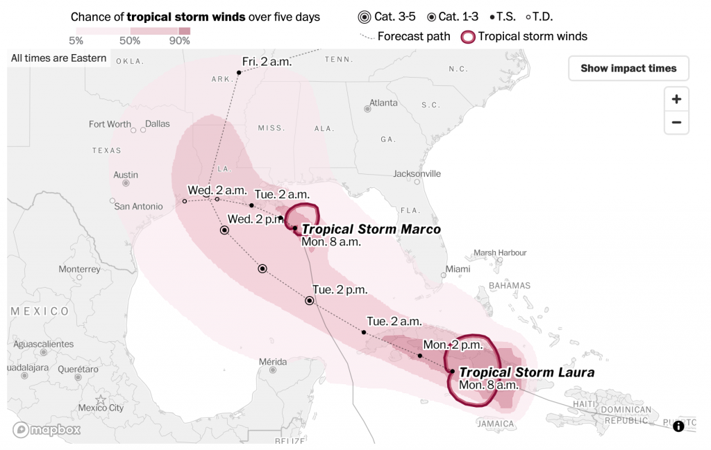
Over the last few weeks I have been trying to start the week with my Covid datagraphics, but I figured we could skip those today and instead run with this piece from the Washington Post. It tracks the forecast path and forecast impact of tropical storm force winds for both storms.

The forecast path above is straight forward. The dotted line represents the forecast path. The coloured area represents the probability of that area receiving tropical storm force winds. Unsurprisingly the present locations of both storms have the greatest possibilities.

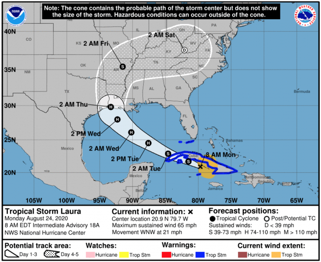
Now compare that to the standard National Weather Service graphic, below. They produce one per storm and I cannot find one of the combined threat. So I chose Laura, the one likely to strike mid-week and not the one likely to strike later today.

The first and most notable difference here is the use of colour. The ocean here is represented in blue compared to the colourless water of the Post version. The colour draws attention to the bodies of water, when the attention should be more focused on the forecast path of the storm. But, since there needs to be a clear delineation between land and water, the Post uses a light grey to ground the user in the map (pun intended).

The biggest difference is what the coloured forecast areas mean. In the Post’s versions, it is the probability of tropical force winds. But, in the National Weather Service version, the white area actually is the “cone”, or the envelope or range of potential forecast paths. The Post shows one forecast path, but the NWS shows the full range and so for Laura that means really anywhere from central Louisiana to eastern Texas. A storm that impacts eastern Texas, for example, could have tropical storm force winds far from the centre and into the Galveston area.

Of course every year the discussion is about how people misinterpret the NWS version as the cone of impact, when that is so clearly not the case. But then we see the Post version and it might reinforce that misconception. Though, it’s also not the Post’s responsibility to make the NWS graphic clearer. The Post clearly prioritised displaying a single forecast track instead of a range along with the areas of probabilities for tropical storm force winds.

I would personally prefer a hybrid sort of approach.

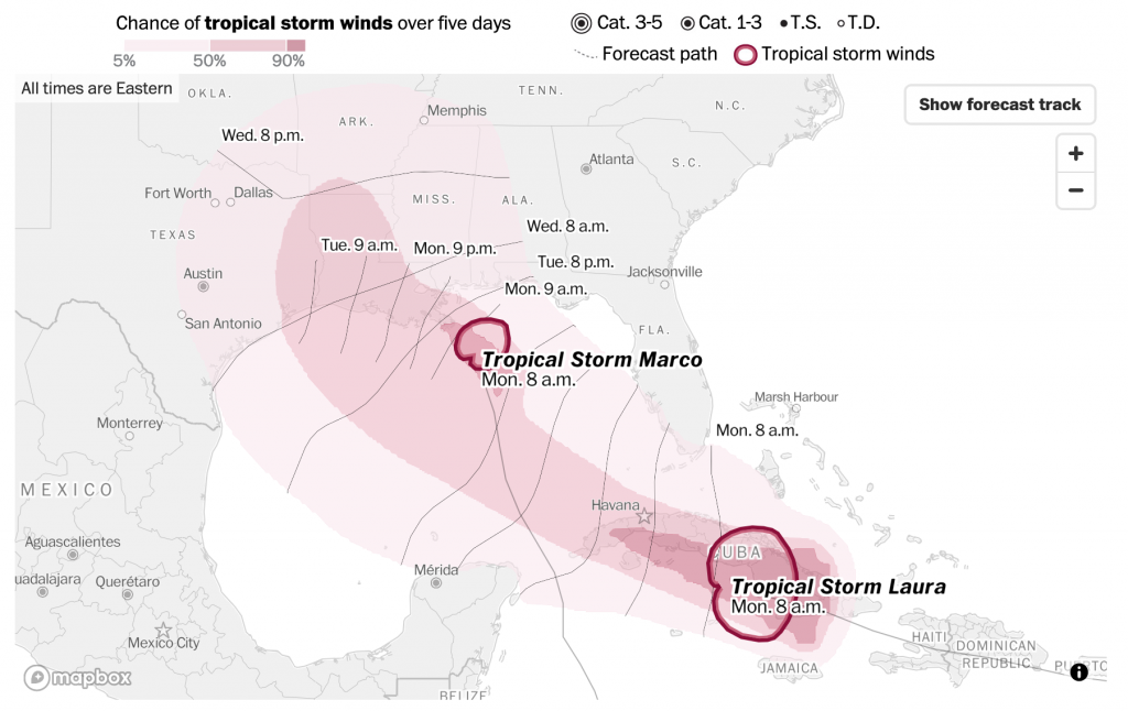
But I also wanted to touch briefly on a separate graphic in the Post version, the forecast arrival times.

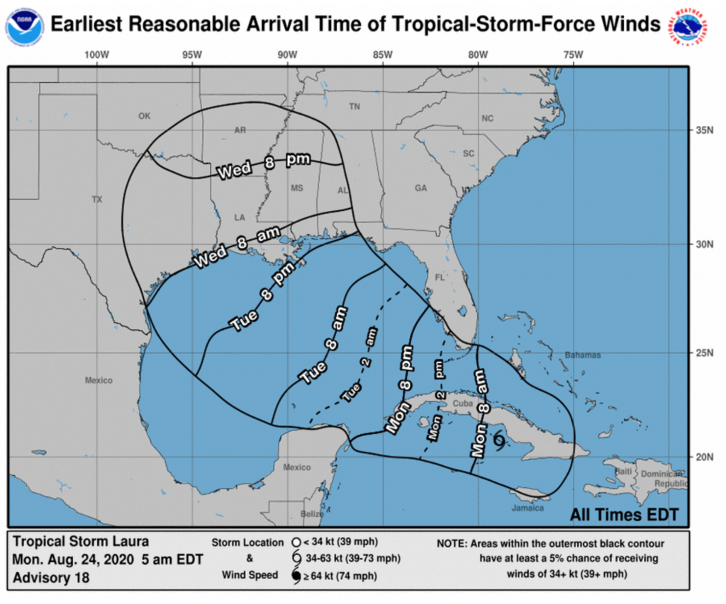
This projects when tropical storm force winds will begin to impact particular areas. Notably, the areas of probability of tropical storm force winds does not change. Instead the dotted line projections for the paths of the storms are replaced by lines relatively perpendicular to those paths. These lines show when the tropical storm winds are forecast to begin. It’s also another updated design of the National Weather Service offering below.

Again, we only see one storm per graphic here and this is only for Laura, not Marco. But this also probably most analogous to what we see in the Post version. Here, the black outline represents the light pink area on the Post map, the area with at least a 5% forecast to receive tropical storm force winds. The NWS version, however, does not provide any further forecast probabilities.

The Post’s version is also design improved, as the blue, while not as dark the heavy black lines, still draws unnecessary attention to itself. Would even a very pale blue be an improvement? Almost certainly.

In one sense, I prefer the Post’s version. It’s more direct, and the information presented is more clearly presented. But, I find it severely lack in one key detail: the forecast cone. Even yesterday, the forecast cone had Laura moving in a range both north and south of the island of Cuba from its position west of Puerto Rico. 24 hours later, we now know it’s on the southern track and that has massive impact on future forecast tracks.

Being east of west of landfall can mean dramatically different impacts in terms of winds, storm surge, and rainfall. And the Post’s version, while clear about one forecast track, obscures the very real possibilities the range of impacts can shift dramatically in just the course of one day.

I think the Post does a better job of the tropical storm force wind forecast probabilities. In an ideal world, they would take that approach to the forecast paths. Maybe not showing the full spaghetti-like approach of all the storm models, but a percentage likelihood of the storm taking one particular track over another.

Credit for the Post pieces goes to the Washington Post graphics department.

Credit for the National Weather Service graphics goes to the National Weather Service.

Flood Stages of the Schuylkill

Hurricane Isaias ran up the East Coast of the United States then the Hudson River Valley before entering Canada. Before it left the US, however, it dumped some record-setting amounts of rain in Philadelphia and across the region. And in times of heavy rains, the lower-lying areas of the city (and suburbs like Upper Darby and Downingtown to mention a few) face inundation from swollen rivers and creeks. And in the city itself, the neighbourhood of Eastwick is partially built upon a floodplain. So staying atop river levels is important and the National Weather Service has been doing that for years.

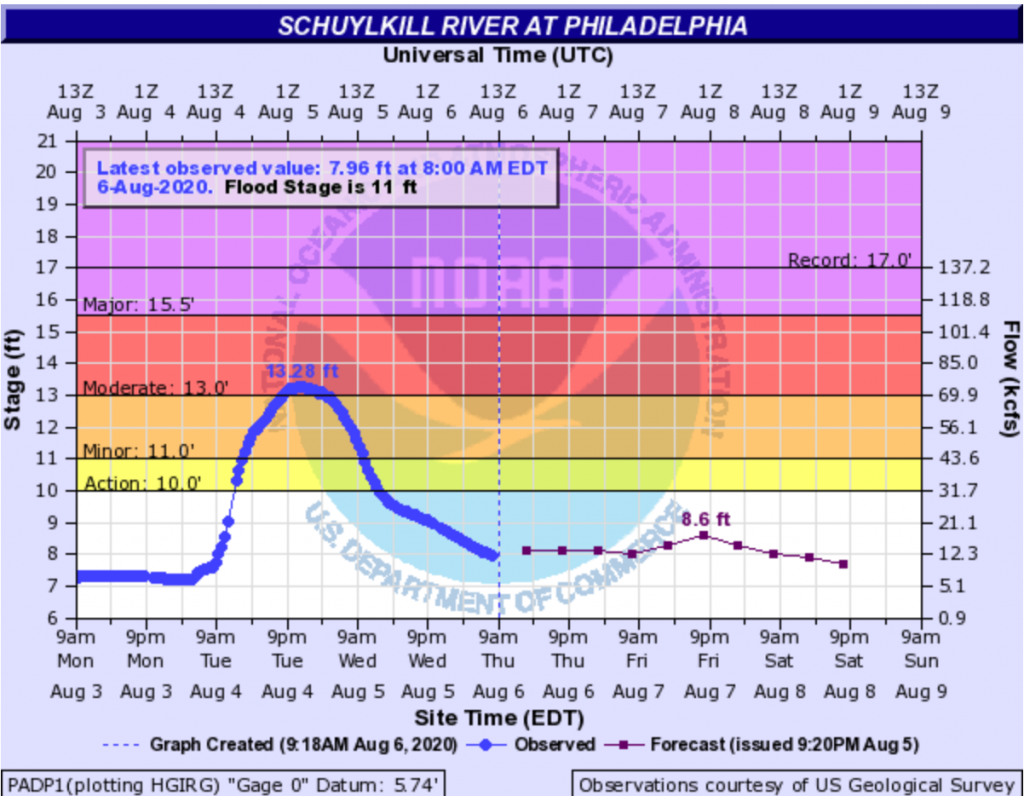
The National Weather Service graphic above is from this very morning and represents the water level of the Schuylkill River (the historical Philadelphia was sited between two rivers, the more commonly known Delaware and its tributary the Schuylkill), which receives water from the suburbs to the north and west of the city, the area hardest hit by Isaias’ rainfall.

The chart looks at the recent as well as the forecast stages of the river. Not surprisingly, the arrival of Isaias accounts for the sudden rise in the blue line. But there is a lot going on here, yellows, reds, and purples, some kind of NOAA logo behind the chart, labels sitting directly on lines, and some of the type is pixellated and difficult to read.

But it does do a nice job of showing the differences in observations and forecast points in time. By that I mean, a normal line chart has an equal distribution of observations along its length. There is an equal space between the weeks or the months or the years. But in instances like this, observations may not be continuous—imagine a flood destroying a sensor—or here that the forecasts are not as frequently produced as observations. And so these are all called out by the dots on the lines we see.

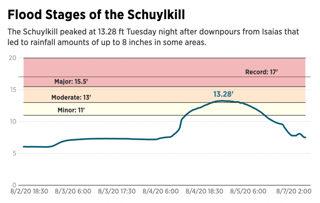
This is the chart I am accustomed to seeing. But then last night, reading about the damage I came across this graphic (screenshot also from this morning to compare to above) from the Philadelphia Inquirer.

It takes the same data and presents it a cleaner, clearer fashion. The flood stages are far easier to read. Gone is the NOAA logo and the unnecessary vertical gridlines. The type is far more legible and the palette less jarring and puts the data series in front and centre.

In general, this is a tremendous improvement for the legibility of the chart. I would probably use a different colour for the record flood stage line, or given their use of solid lines for the axis maybe make it dotted. But that’s a small quibble.

The only real issue here is what happens to the time? Compare the frequent observations in the past in the original, every half hour or so, to the six hourly dots (the blue versus the purple). In the Inquirer version, those spaces between forecast points disappear and become the same as the half-hour increments.

To be fair, the axis labelleing implies this as the label goes from August 4 to 5 and then jumps all the way to 7, but it is not as intuitive as it could be. Here I would recommend following the National Weather Service’s fashion of adjusting for the time gap. It would probably mean some kind of design tweak to emphasise that the observations earlier than now are observed every half hour or so, versus the six-hour forecasts. The NWS did this through dots. One could use a dotted line, or some other design treatment.

This missing time is the only thing really holding back this piece from the Inquirer from standing out as a great update of the traditional National Weather Service hydrograph chart.

Credit for the National Weather Service piece goes to the National Weather Service.

Credit for the Inquirer piece goes to Dominique DeMoe.

Axis Lines in Charts

The British election campaign is wrapping up as it heads towards the general election on Thursday. I haven’t covered it much here, but this piece from the BBC has been at the back of my mind. And not so much for the content, but strictly the design.

In terms of content, the article stems from a question asked in a debate about income levels and where they fall relative to the rest of the population. A man rejected a Labour party proposal for an increase in taxes on those earning more than £80,000 per annum, saying that as someone who earned more than that amount he was “not even in the top 5%, not even the top 50”.

The BBC looked at the data and found that actually the man was certainly within the top 50% and likely in the top 5%, as they earn more than £75,300 per annum. Here in the States, many Americans cannot place their incomes within the actual spreads of income. The income gap here is severe and growing.  But, I want to look at the charts the BBC made to illustrate its points.

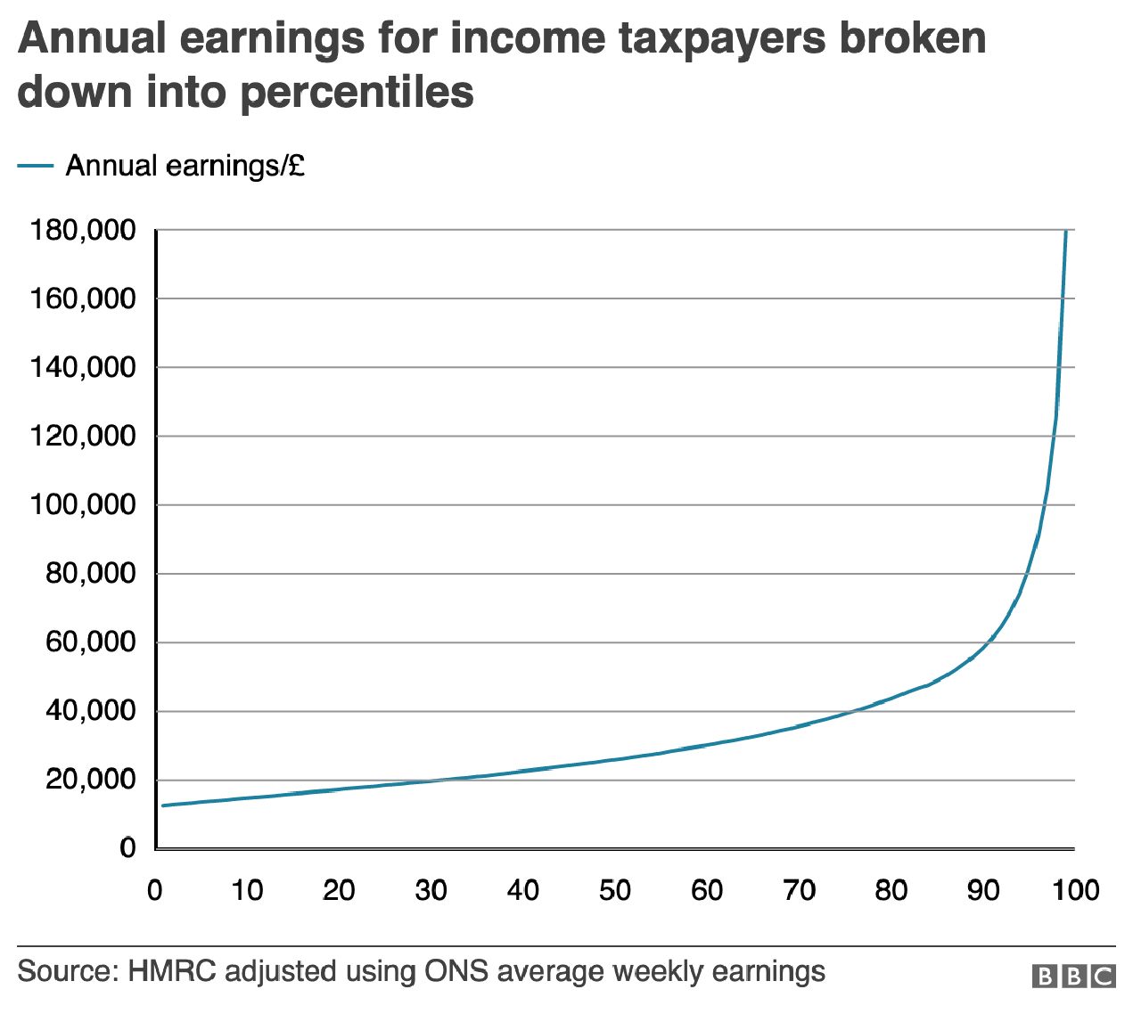
The most important is this line chart, which shows the income level and how it fits among the percentages of the population.

Are things lining up? It's tough to say.
Are things lining up? It’s tough to say.

I am often in favour of minimal axis lines and labelling. Too many labels and explicit data points begin to subtract from the visual representation or comparison of the data. If you need to be able to reference a specific data point for a specific point on the curve, you need a table, not a chart.

However, there is utility in having some guideposts as to what income levels fit into what ranges. And so I am left to wonder, why not add some axis lines. Here I took the original graphic file and drew some grey lines.

Better…
Better…

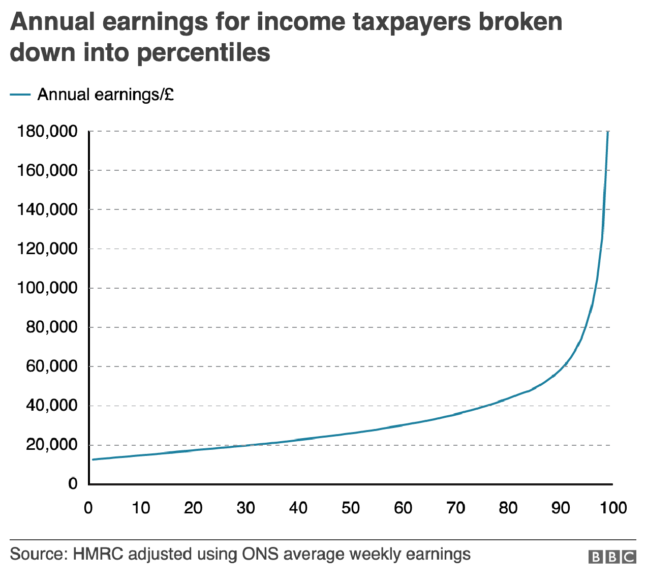
Of course, I prefer the dotted or dashed line approach. The difference in line style provides some additional contrast to the plotted series. And in this case, where the series is a thin but coloured line, the interruptions in the solidity of the axis lines makes it easier to distinguish them from the data.

Better still.
Better still.

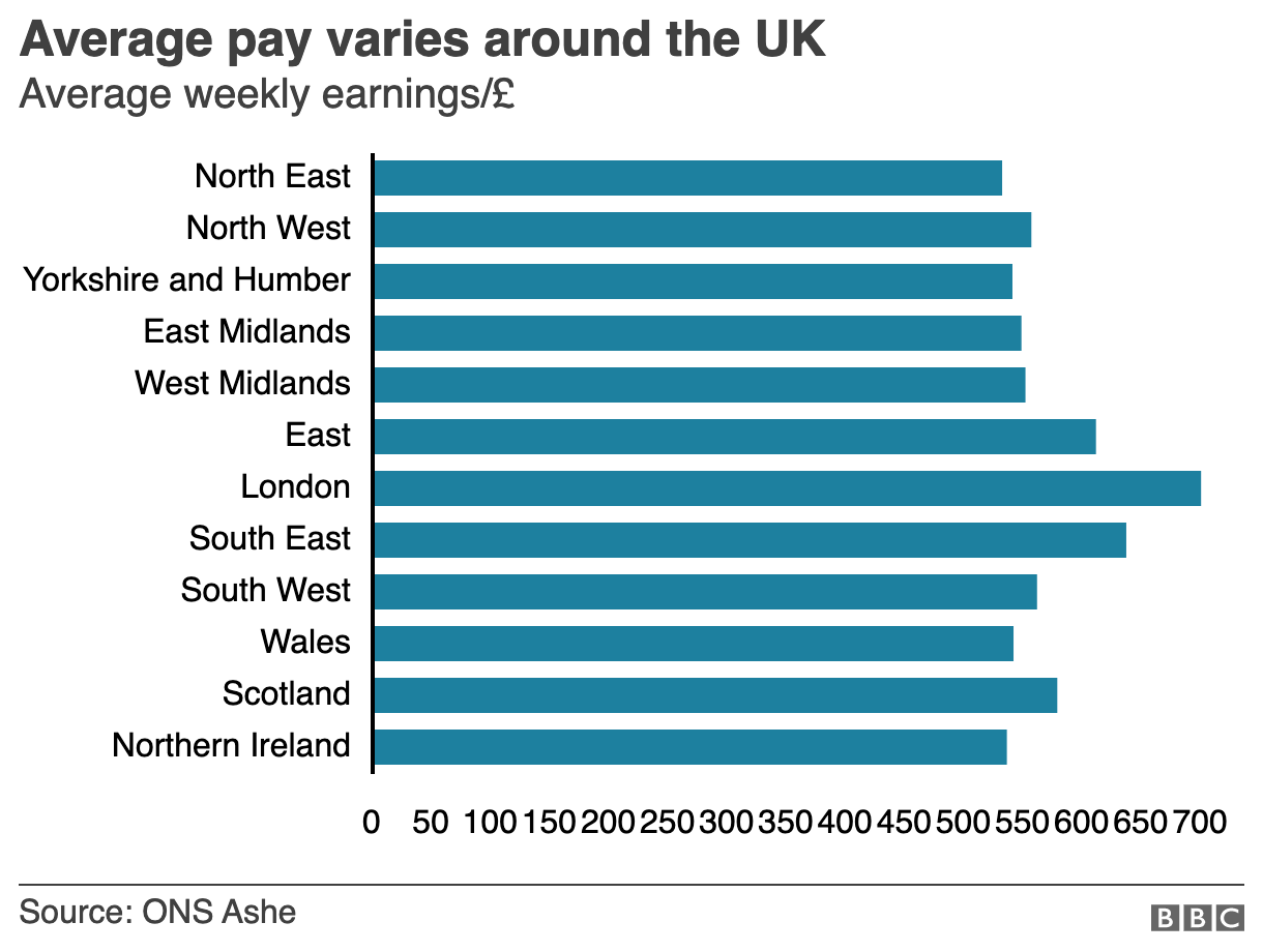
But the article also has another chart, a bar chart, that looks at average weekly incomes across different regions of the United Kingdom. (Not surprisingly, London has the highest average.) Like the line chart, this bar chart does not use any axis labels. But what makes this one even more difficult is that the solid black line that we can use in the line charts above to plot out the maximum for 180,000 is not there. Instead we simply have a string of numbers at the bottom for which we need to guess where they fall.

Here we don't even a solid line to take us out to 700.
Here we don’t even a solid line to take us out to 700.

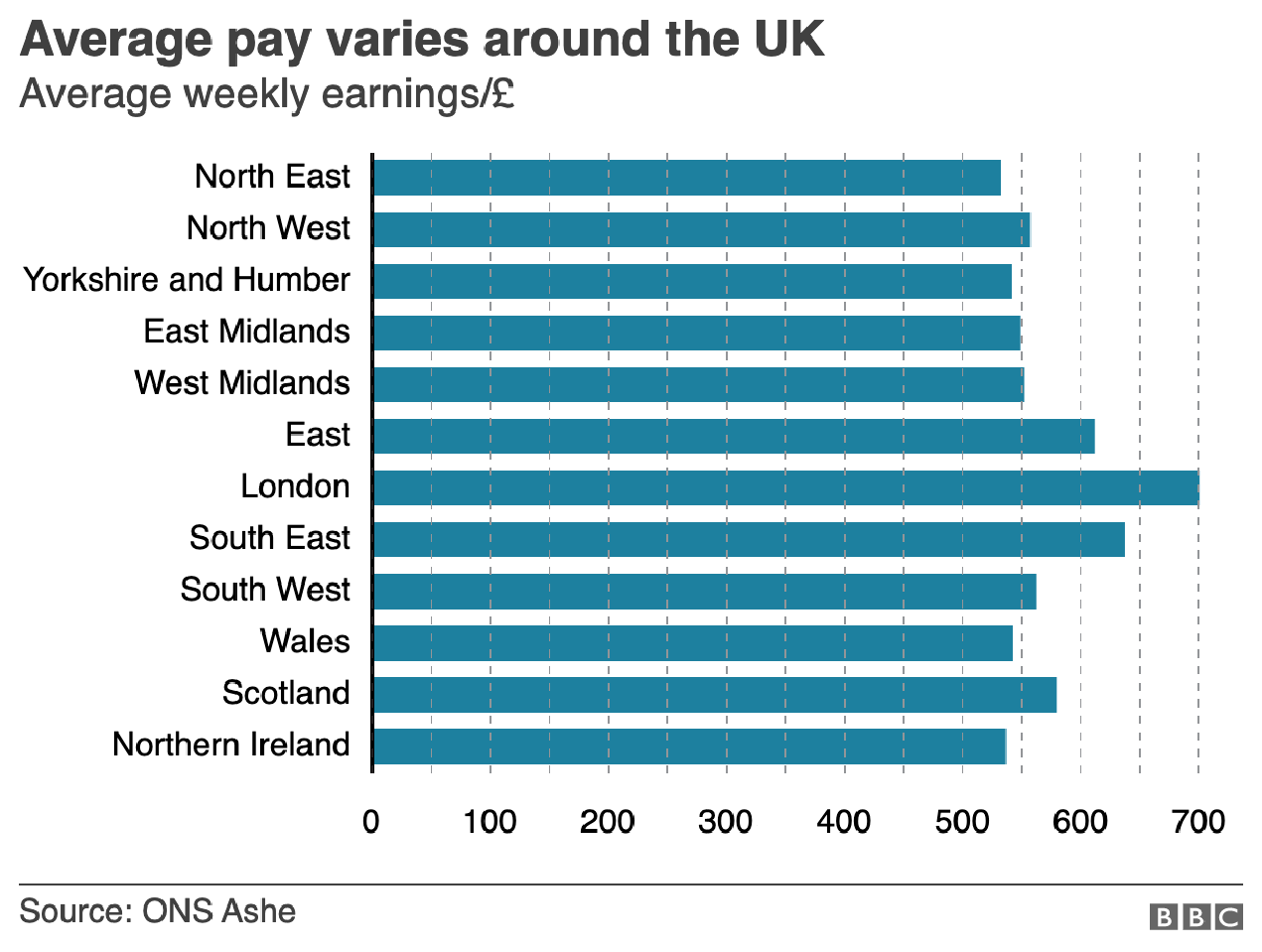
If we assume that the 700 value is at the centre of the text, we can draw some dotted grey lines atop the existing graphic. And now quite clearly we can get a better sense of which regions fall in which ranges of income.

We could have also tried the solid line approach.

But we still have this mess of black digits at the bottom of the graphic. And after 50, the numbers begin to run into each other. It is implied that we are looking at increments of 50, but a little more spacing would have helped. Or, we could simply keep the values at the hundreds and, if necessary, not label the lines at the 50s. Like so.

Much easier to read
Much easier to read

The last bit I would redo in the bar chart is the order of the regions. Unless there is some particular reason for ordering these regions as they are—you could partly argue they are from north to south, but then Scotland would be at the top of the list—they appear an arbitrary lot. I would have sorted them maybe from greatest to least or vice versa. But that bit was outside my ability to do this morning.

So in short, while you don’t want to overcrowd a chart with axis lines and labelling, you still need a few to make it easier for the user to make those visual comparisons.

Credit for the original pieces goes to the BBC graphics department.

Thanksgiving Side Dishes

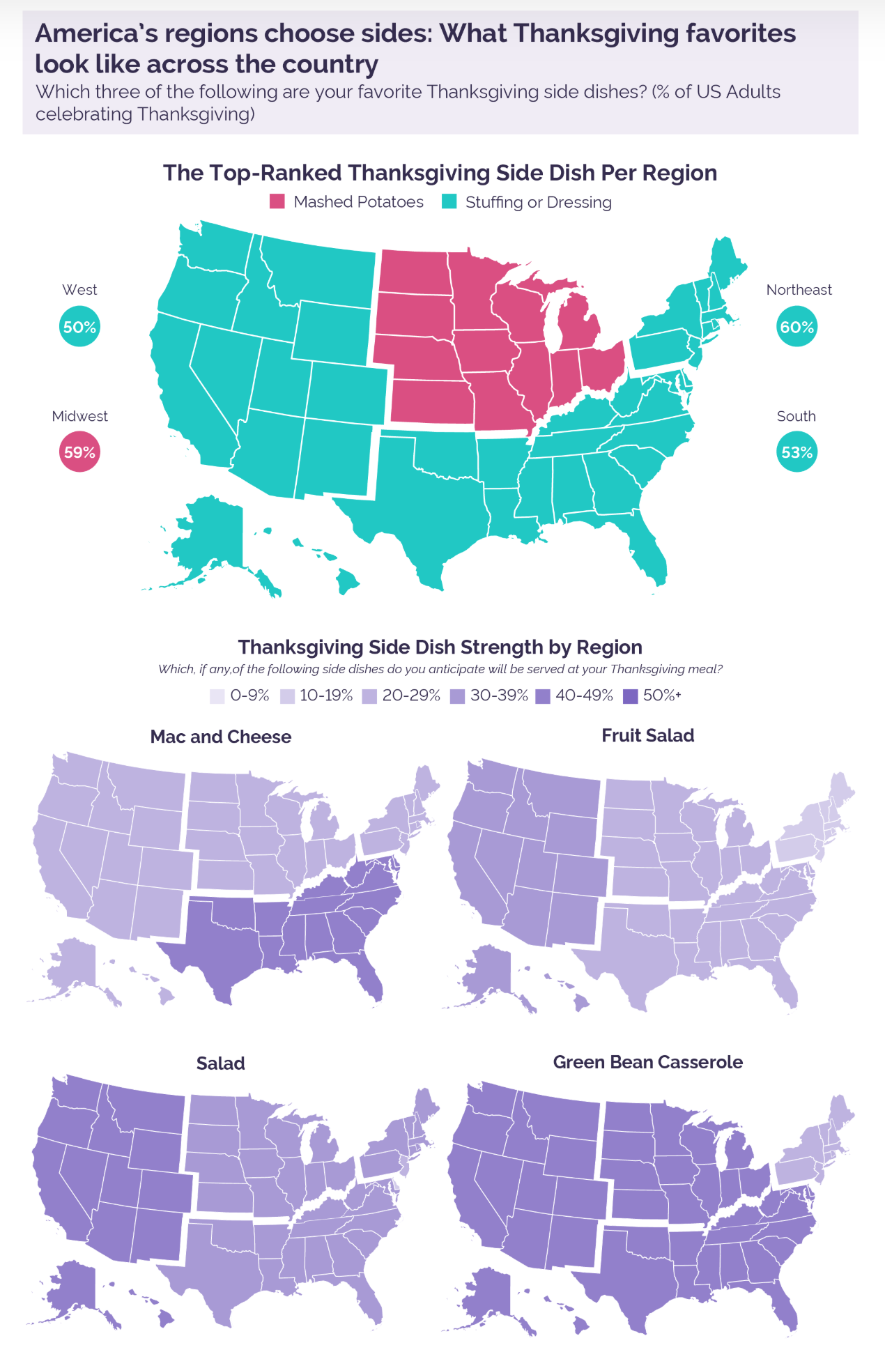
American Thanksgiving meals often feature elaborate spreads of side dishes. And everyone has a favourite. A common theme around the holiday is for media outlets to conduct surveys to see which ones are most popular where. In today’s piece we have one such survey from pollster YouGov. In particular, I wanted to focus on a series of small multiples maps they used to illustrate the preferences.

Big splashes of colour do not necessarily make for a great map

I used to see this approach taken more often and by this I hope I do not see a foreshadow of its comeback. Here we have US states aggregated into distinct regions, e.g. the Northeast. One could get into an argument about how one defines what region. The Midwest is one often contested such region—I have one post on it dating back to at least 2014.

Instead, however, I want to focus on the distinction between states and regions. This small multiples graphic is a set of choropleth maps that use side dish preferences to colour the map. Simple enough. However, the white lines delineating states imply different fields to be coloured within the graphic. Consequently, it appears that each state within the region has the same preference at the same percentage.

The underlying data behind the maps, at least that which was released, indicates the data is not at the state level but instead at the regional level. In other words, there are no differences to be seen between, say, Pennsylvania and New Jersey. Consequently, a more appropriate map choice would have been one that omitted the state boundaries in favour of the larger outlines of the regions.

More radically, a set of bar charts would have done a better job. Consider that with the exception of fruit salad, in every map, only one region is different than the others. A bar chart would have shown the nuance separating the three regions that in almost all of these maps is lost when they all appear as one colour.

I appreciate what the designers were attempting to do, but here I would ask for seconds, as in chances.

Credit for the piece goes to the YouGov graphics team.

Food Flows Connect Counties

For my American audience, this week is Thanksgiving. That day when we give thanks for Native Americans giving European settlers their land for small pox ridden blankets. And trinkets. Don’t forget the trinkets. But we largely forget about the history and focus on three things: family, food, and American football. Not necessarily in that order.

But this week I am largely going to want to focus on the food.

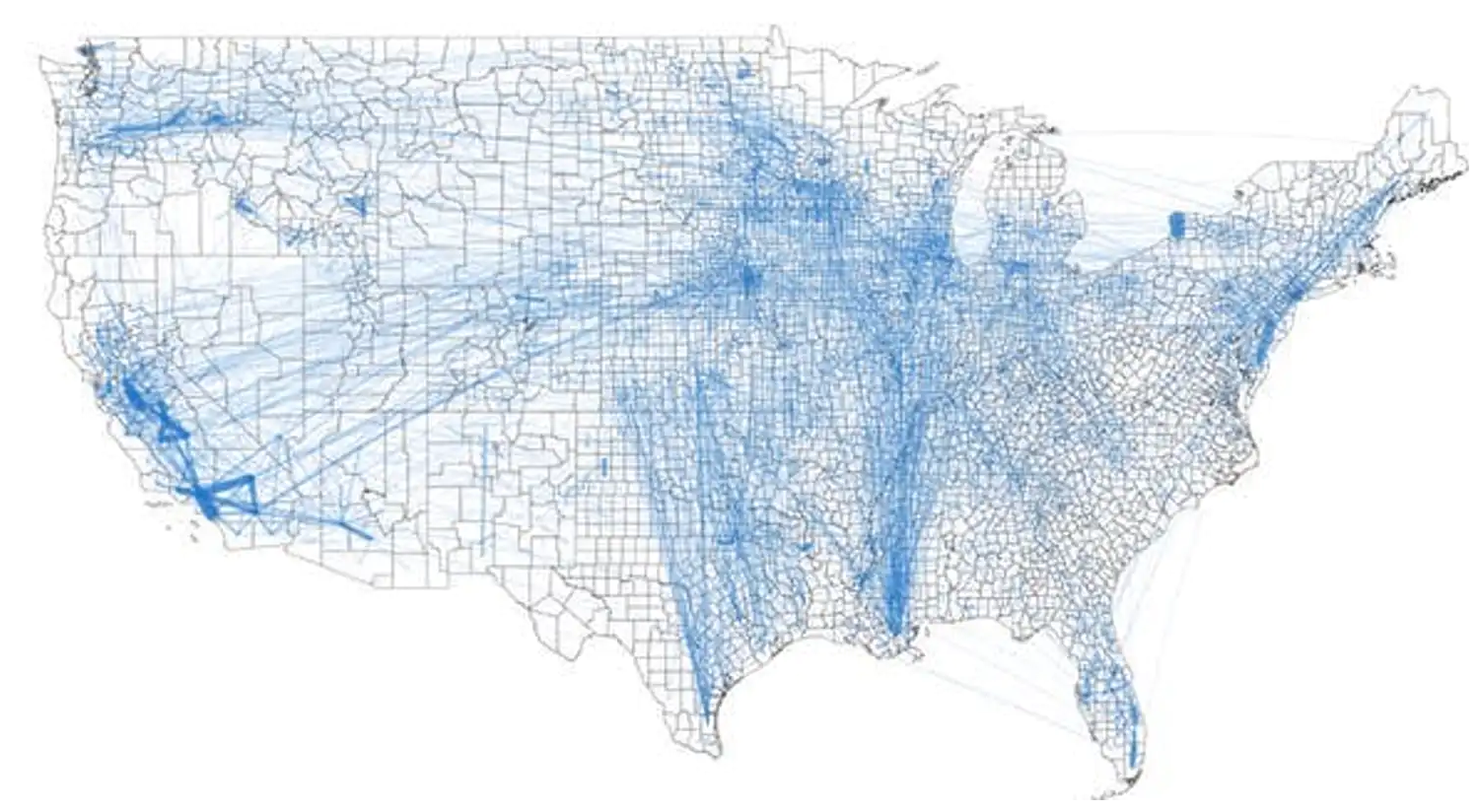
Today we can look at a graphic coming from a team of researchers at the University of Illinois who examined the flows of food across the United States, down to the county level. It helped produce this map that shows the linkages between counties.

Oh look at that Mississippi River trail

To be sure, the piece uses some line charts and other maps to showcase the links, but the star is really this map. But aside from its lack of Alaska and Hawaii, I think it suffers from one key design choice: leaving the county borders black.

The black lines, while thin, compete with the faint blue lines that show the numerically small links between counties. Larger trade flows, such as those within California, are clearly depicted with thicker strokes that contrast with the background political boundaries of the counties. But the light blue lines recede into the background beneath the borders.

I wonder if a map of solid, light grey fills and white county borders would have helped showcase the blue lines and thus trade flows a little bit better. After all, the problem is especially  noticeable in the eastern half of the United States where we have much geographically smaller counties.

Hat tip to friend and former colleague Michael Schaefer for sharing the article in question.

Credit for the piece goes to Megan Konar et al.

From Order to Chaos?

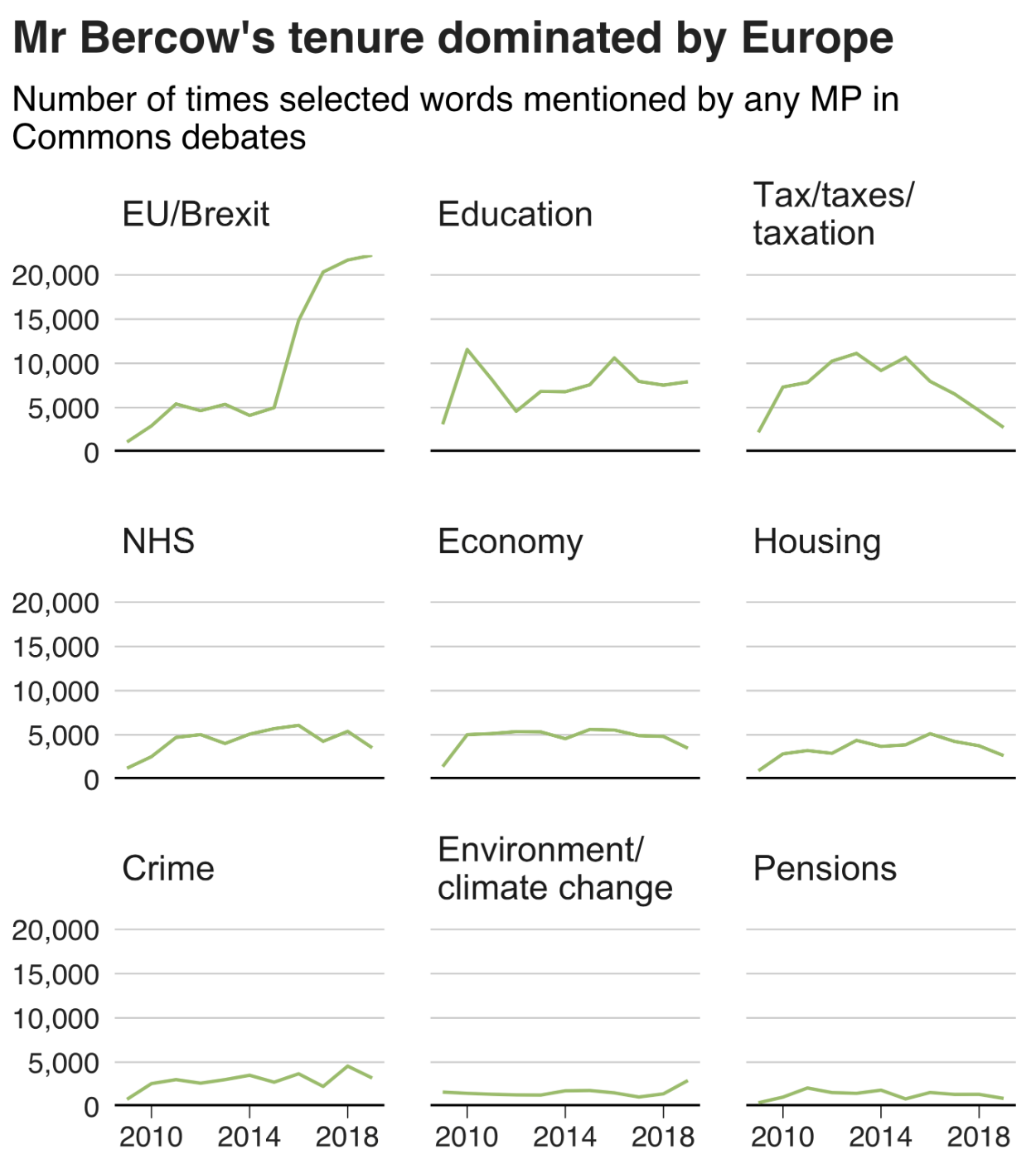
A few weeks ago we said farewell to John Bercow as Speaker of the House (UK). Whilst I covered the election for the new speaker, I missed the opportunity to post this piece from the BBC. It looked at Bercow’s time in office from a data perspective.

The piece did not look at him per se, but that era for the House of Commons. The graphic below was a look at what constituted debates in the chamber using words in speeches as a proxy. Shockingly, Brexit has consumed the House over the last few years.

At least climate change has also ticked upwards?

I love the graphic, as it uses small multiples and fixes the axes for each row and column. It is clean, clear, and concise—just what a graphic should be.

And the rest of the piece makes smart use of graphical forms. Mostly. Smart line charts with background shading, some bar charts, and the only questionable one is where it uses emoji handclaps to represent instances of people clapping the chamber—not traditionally a thing that  happens.

Content wise it also nailed a few important things, chiefly Bercow’s penchant for big words. The piece did not, however, cover his amazing sense of sartorial style vis-a-vis neckties.

Overall a solid piece with which to begin the weekend.

Credit for the piece goes to Ed Lowther & Will Dahlgreen.