This past weekend, I read an article in Politico discussing parents’ outrage over levels of lead and other toxic metals in baby food. The story focuses on a Congressional report into the matter, but that ties back into an EPA study from 2017 that investigated lead contamination. Specifically the article’s author notes “a chart that was buried in supplemental material”. Buried chart? Well I went off to investigate.
And I found all the charts. But I wanted to focus on one. I am not entirely clear what it means: Percent contribution by pathway adjusted for bioavailability of each media for NHEXAS Region 5 study. I get that it’s looking at channels of intake, but it’s unclear if this is lead or some other contaminant. Is this for all people? Or a sub-section of the population as other charts in that supplemental material pack are?
So I made a graphic where I compared the original to two alternate versions.
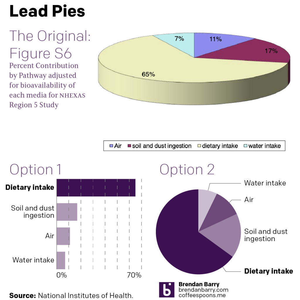
Now, the editorial focus of the article is on baby food, which is not the apparent focus of the study (unless it is couched in academic/technical terms). But what’s worth noting is that the pale yellow recedes into the background as the burgundy dominates the graphic.
If graphics are done well, they should show clear visual relationships, they do not need to label specific datapoints unless through a progressive disclosure of information. But if you are going to label everything, I would want to make certain that in the case of that same burgundy slice, we have sufficient contrast to read the 17% label.
Pie charts are not good at allowing people to compare slices. So the pie chart as the format here is not a great place to start, but as you can see in my Option 2, if you are going to choose a pie chart form, there are ways of making it more legible. Namely, do not make it three-dimensional.
Here the foreground receives prominence over the background, which may be receding and visually shrinking into the background. And as the point of a chart is to make visual comparisons, if we cannot compare like for like, it’s not ideal.
Also, we have the thickness of the pie chart. That vertical heights adds yellow to the slice of the pie we see in front. Casually, that makes the yellow slice appear even larger than it already is from the three-dimensional foreshortening.
Option 2 presents this as a stripped down pie chart. Make it flat. I used one colour with tints of one purple. I used the 100% to highlight the dietary intake channel, because of the Politico article’s focus.
But really, Option 1 is the improvement here. Comparing the smaller slices is easier here as the eye simply moves vertically down the graphic. We are also able to add axis lines that provide a context for where those values fall, between 0 and 10 for Water intake, and just over 10 for Air. Somewhere between 15 and 20 for Soil and dust ingestion.
Finally, that legend. We don’t want the reader to have to strain to identify what slice is what. Why is the legend in a box? Why is it so far away from the pie? In both my options I closely and visually link the labels to the slices/bars they represent. That makes it easier for the reader to know what they are looking at when they are looking at it.
The moral of the story, people, don’t use three-dimensional pie charts.
Credit for the original version goes to the EPA. Credit for the alternate versions is mine.
Leave a Reply
You must be logged in to post a comment.