In 2020, baseball did not permit fans to attend regular season matches. (They changed this for the playoffs.) Instead, many stadiums opted for cardboard cutouts: fans often paid a fee and submitted a picture that the team printed on cardboard cutouts. Like so many things we will say about 2020, it was surreal.
But in Philadelphia at least, cardboard cutouts are out, and human fans are in. The state government in Harrisburg and the city government will allow 20% capacity at outdoor stadiums and 15% for indoor stadiums.
The Philadelphia Inquirer created a small graphic for its homepage to capture this news.
I intentionally included other site elements in the cropping to show how the graphic fits into the broader site. The extra white space around the image helps focus attention on the datagraphic over the numerous photographic elements for each article. Clicking on other tabs in the section brings up full-component-width graphics.
To the graphic itself.
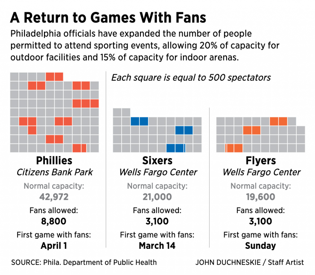
My guess would be this was a quick turnaround piece. There are a few things going on here. The first and most obvious one, the squares as spectators. Now I confess this confused me at first. I was not entirely certain what the coloured squares meant; they mean in-person attendees. Was this supposed to be an overall stadium? Or was it a representative seating section?
The quick turnaround becomes important, because this is probably how I would have first conceptualised the graphic. But, with more time, I may have attempted to incorporate the shape of the playing field, be it a baseball diamond or basketball court, or hockey rink—I know all the sports terms!—and surrounded them with shapes representing a certain number of spectators. Squares might not work in that case because of the curves. Circles? Hexagons? Regardless of the shape, the filling of occupied seats would be the same as here, but it would perhaps be clearer to some readers, i.e. me.
Second, we get to the table below the graphics. Here we have a subtle design decision. Note that here the designer greyed out the normal capacity figures. The new figures at that 20% and 15% rates are what appear in black bold text. My usual instinct is to use typographic weight, regular vs. bold, in these situations. But the grey here works equally well.
Third, and this also involves the table, we have the first game data. We talked about the comparison of the capacity and permitted attendance. But I wonder, did the date of the first game with fans needed to be displayed in the same way as the permitted attendance? Because the news isn’t the dates of the first games—at least not as I read the news—but the numbers of attendees. And because of that, maybe I would have reduced the size of the type for the date of the first game. Or, conversely, set the type for the new attendance in a larger point size.
Overall, I enjoyed seeing this news presented visually, even if I was left confused.
Credit for the piece goes to John Duchneskie.
Leave a Reply
You must be logged in to post a comment.