The thing with election results is that we don’t have the final numbers for a little while after Election Day. And that’s normal.
There are a few things I want to look at in the coming weeks and months once my schedule eases up a bit. But for now, we can use this nice piece from the Philadelphia Inquirer to look at a story close to home: the vote in the Philadelphia suburbs.
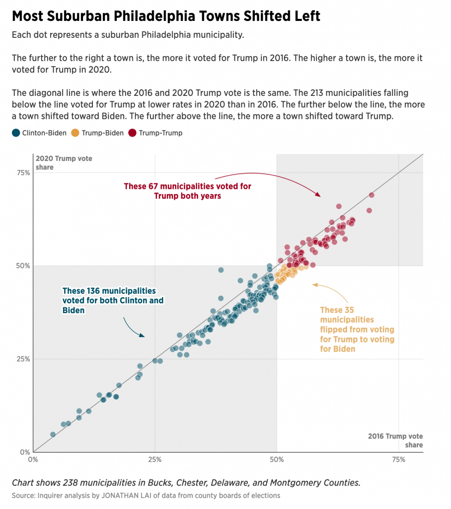
I’ve already looked at some analysis like this for Wisconsin and I shared it on my social. But there I looked at the easy, county-level results. What the Inquirer did above is break down the Pennsylvania collar counties of Philadelphia, i.e. the suburbs, into municipality level results. It then plotted them 2020 vs. 2016 and the results were—as you can guess since we know the result—Biden beat Trump.
What this chart does well is colours the municipalities that Biden flipped yellow. It’s a great choice from a colour standpoint. As the third of the primaries, with both blue and red well represented, it easily contrasts with the Biden- and Trump-won towns and cities of the region. The colour is a bit “darker” than a full-on, bright yellow, but that’s because the designers recognised it needs to stand out on a white field.
Let’s face it, yellow is a great colour to use, but it’s difficult because it’s so light and sometimes difficult to see. Add just the faintest bit of black to your mix, especially if you’re using paints, and voila, it works pretty well. So here the designer did a great job recognising that issue with using yellow. Though you can still see the challenge, because even though it is a bit darker, look at how easy it is to read the text in the blue and the red. Now compare that to the yellow. So if you’re going to use yellow, you want to be careful how and when you do.
The other design decision here comes down to what I call the explorative vs. the narrative. Now, I don’t think explorative is a word—and the red squiggle agrees—but it pairs nicely with narrative. And I’ve been talking about this a lot in my field the last several works, especially offline. (In the non-blog sense, because obviously all my work is done online these days. Oh, how I miss my old office.)
Explorative works present the user with a data set and then allow them to, in this case, mouse over or tap on dots and reveal additional layers of information, i.e. names and specific percentages. The idea is not to tell a specific story, but show an overall pattern. And if the piece is interactive, as this is, potentially allow the user to drill down and tease out their own stories.
Compare that to the narrative, my Wisconsin piece I referenced above is more in this category. Here the work takes you through a guided tour of the data. It labels specific data points, be them on trend or outliers and is sometimes more explicit in its analysis. These can also be interactive—though my static image is not—and allow users to drill down, and critically away, from the story to see dots of interest, for example.
This piece is more explorative. The scatter plot naturally divides the municipalities into those that voted for Biden, Trump, and then more or less than they voted for Trump in 2016. The labels here are actually redundant, but certainly helpful. I used the same approach in my Wisconsin graphic.
But in my Wisconsin graphic, I labelled specific counties of interest. If I had written an accompanying article, they would have been cited in the textual analysis so that the graphic and text complemented each other. But here in the Inquirer, it’s a bit of a missed opportunity in a sense.
The author mentions places like Upper Darby and Lower Merion and how they performed in 2020 vis-a-vis 2016. But it’s incumbent on the user to find those individual municipalities on the scatter plot. What if the designer had created a version where the towns of interest were labelled from the start? The narrative would have been buttressed by great visualisations that explicitly made the same point the author wrote about in the text. And that is a highly effective form of communication when you’re not just telling, but also showing your story or argument.
Overall it’s a great article with a lot to talk about. Because, spoiler, I’m going to be talking about it again tomorrow.
Credit for the piece goes to Jonathan Lai.
Leave a Reply
You must be logged in to post a comment.