Yesterday we looked at how the New York Times covered the deaths of 500,000 Americans due to Covid-19. But I also read another article, this by the BBC, that attempted to capture the scale of the tragedy.
Instead of looking at the deaths in a timeline, the BBC approached it from a cumulative impact, i.e. 500,000 dead all in one go. To do this, they started with an illustration of 1,000 people. Then they zoomed out and showed how that group of 1,000 fit into a broader picture of 500,000.
We’re going to take a look at this in reverse, starting with the 500,000.
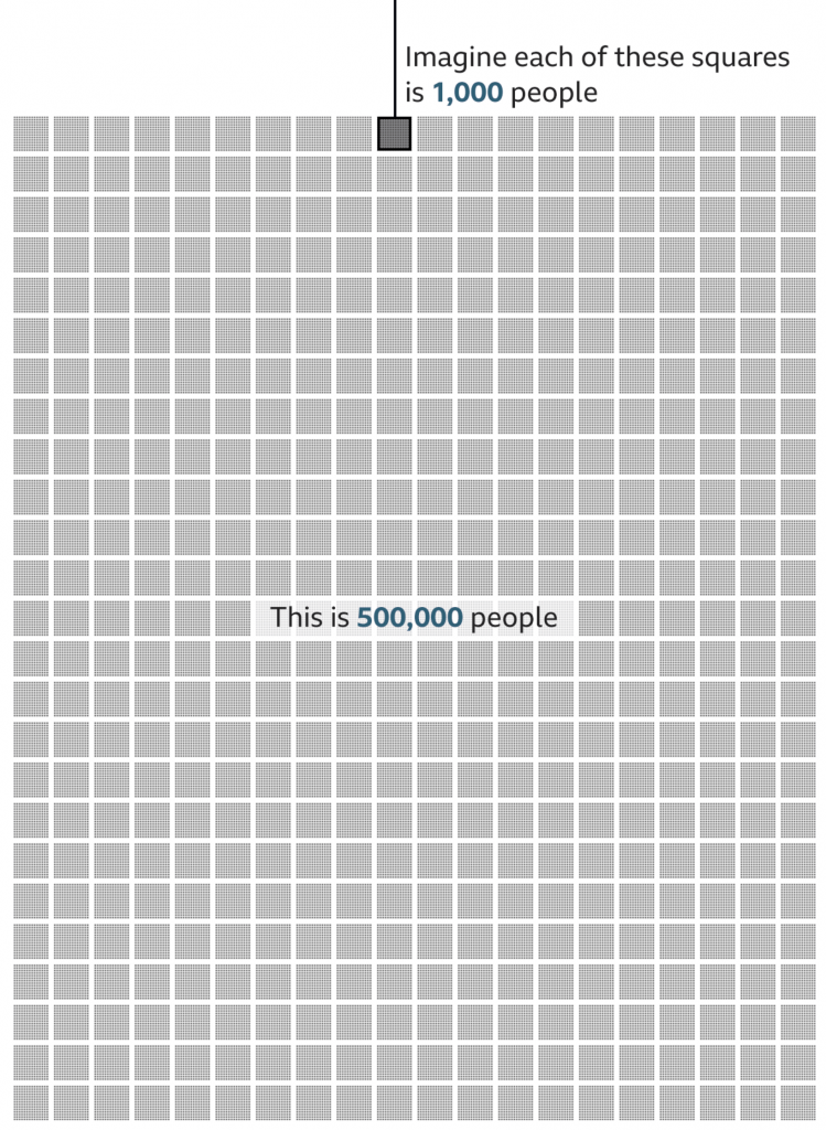
I think this part of the graphic works well. There’s just enough resolution to see individual pixels in the smaller squares, connecting us to the people. And of course the number 500 stacks nicely.
My quibble here might be whether the text overlay masks 8,000 people. Initially, I thought the design was akin to hollow square, but when I looked closer I could see the faint grey shapes of the boxes behind a white overlay. Perhaps it could be a bit clearer if the text fell at the end of all the boxes?
But overall, this part works well. So now let’s look at the top.
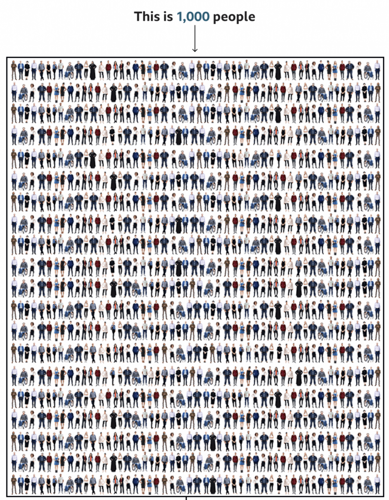
This is where I have some issues.
When I first saw this, my eyes immediately went to the visual patterns. On the left and right there are rivers or columns of what look like guys in white t-shirts. Of course, once I focused on those, I saw other repeated patterns, the guy in the black jacket with his arms bent out, hands on his hips. The person in the wheelchair occupies a different amount of area and has a distinct shape and so that stood out too.
Upon even closer inspection, I noticed the pattern began to repeat itself. Every other line repeated itself and with the wheelchair person it was easy to see the images were sometimes just flipped to look different.
Now, allow me to let you in on a secret, unless you gave a designer a budget of infinite time, they wouldn’t illustrate 1,000 actual people to fill this box. We don’t have time for that. And I’ll also admit that not all designers are good illustrators—myself first and foremost. A good design team for an organisation that uses illustration should have either a full-time illustrator, or a designer who can capably illustrate things.
But this gets to my problem with the graphic. I normally can distance myself from reading a piece to critiquing it. But here, I immediately fixated on the illustrations, which is not a good sign.
There are three things I think that could have been done. The first two are relatively simple fixes whilst the third is a bit grander in scope.
First, I wonder if a little more time could have been spent with the illustrations. For one, white t-shirt guy, I don’t see his illustration reused, so why not change the colour of his t-shirt. Maybe in some instances make it purple, or orange, or some other colour. I think re-colouring the outfits of the people could actually solve this problem a good bit.
But second, if the patterns still appear visible to readers, mix it up a bit. I understand the lack of desire to spend time creating an individualised row for each row. Crafting each row person by person probably is out of the time requirements—though maybe the people above the designer(s) should know that content takes time to create. So what about repeating smaller blocks? I counted 20 rows, which means there should be 50 people per row. Make each row about ten blocks, and have several different blocks from which you can choose. Ideally, you have more blocks than you need per row, so not all figures are repeated, but if constrained, just make sure that no two rows have the same alignment of blocks.
Thirdly, and here’s the one that would really have required more time for the designer to do their job, make the illustrations meaningful. In a broad sense, we do have some statistics on the deaths in the United States. According to the CDC, 63% of deaths have been by white non-Hispanics, 15% by Black non-Hispanics, and 12% by Hispanic/Latino, 4% by Asian Americans, 1% by Native Americans, 0.3% by Hawaiian and Pacific Islander, and 4% by multiple non-Hispanic. Using those numbers, we would need 630 obviously white illustrations, 150 obviously Black, and so on.
If the designer had infinite time, the illustrations could also be made to try and capture age as well. Older people have been hit harder by this pandemic, and the illustrations could skew to cover that cohort. In other words, few young people. According to the CDC, fewer than 5% of deaths have been by people aged under 40. In other words, no baby illustrations needed.
That’s not to say babies haven’t died—87 deaths of people between 0 and 4 have been reported—but that when creating a representative average, they can be omitted, because that’s less than 0.1%, or not even 1 out of 1000.
To reiterate though, that third concept would take time to properly execute. And it would also require the skills to execute it properly. And I am no illustrator, so could I draw enough representative people to fake 1,000? Sure, but time and money.
The first two options are probably the most effective given I’d bet this was a piece thought up with little time to spare.
Credit for the piece goes to the BBC graphics team.
Leave a Reply
You must be logged in to post a comment.