Hurricane Isaias ran up the East Coast of the United States then the Hudson River Valley before entering Canada. Before it left the US, however, it dumped some record-setting amounts of rain in Philadelphia and across the region. And in times of heavy rains, the lower-lying areas of the city (and suburbs like Upper Darby and Downingtown to mention a few) face inundation from swollen rivers and creeks. And in the city itself, the neighbourhood of Eastwick is partially built upon a floodplain. So staying atop river levels is important and the National Weather Service has been doing that for years.

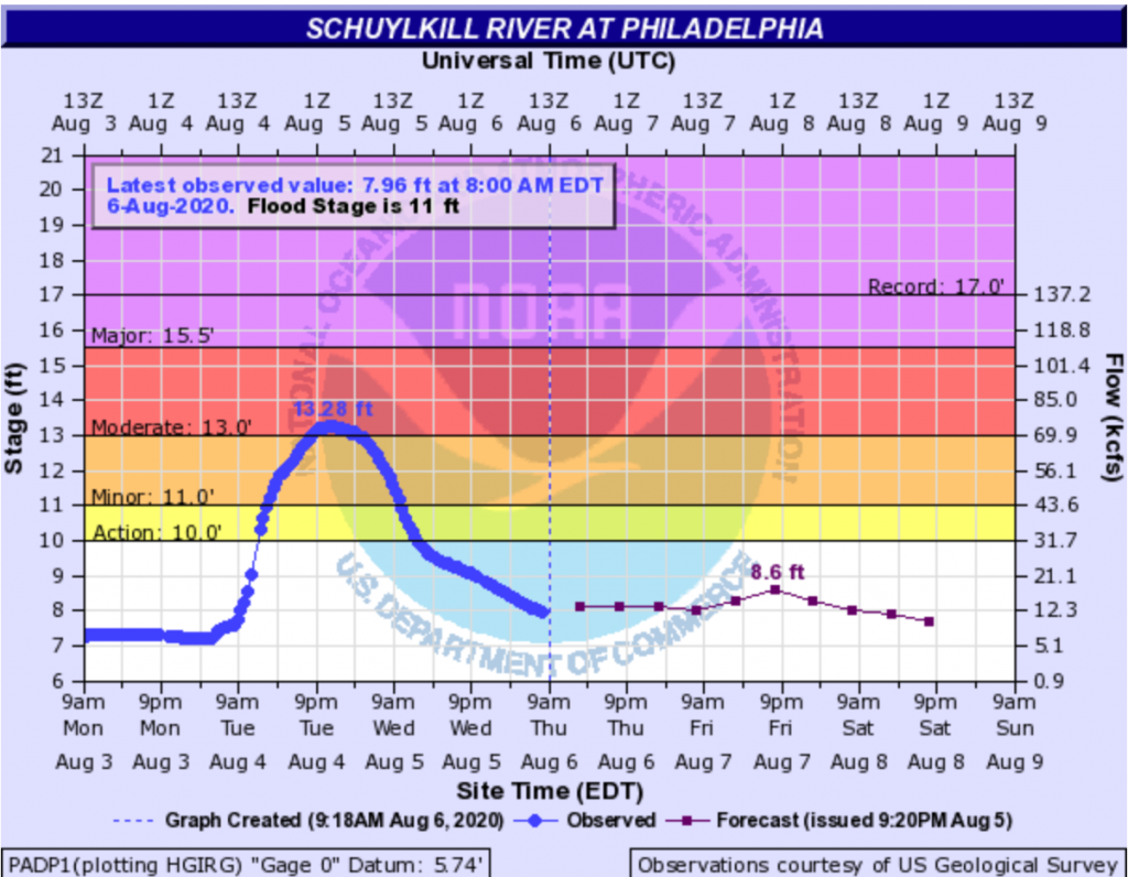
The National Weather Service graphic above is from this very morning and represents the water level of the Schuylkill River (the historical Philadelphia was sited between two rivers, the more commonly known Delaware and its tributary the Schuylkill), which receives water from the suburbs to the north and west of the city, the area hardest hit by Isaias’ rainfall.
The chart looks at the recent as well as the forecast stages of the river. Not surprisingly, the arrival of Isaias accounts for the sudden rise in the blue line. But there is a lot going on here, yellows, reds, and purples, some kind of NOAA logo behind the chart, labels sitting directly on lines, and some of the type is pixellated and difficult to read.
But it does do a nice job of showing the differences in observations and forecast points in time. By that I mean, a normal line chart has an equal distribution of observations along its length. There is an equal space between the weeks or the months or the years. But in instances like this, observations may not be continuous—imagine a flood destroying a sensor—or here that the forecasts are not as frequently produced as observations. And so these are all called out by the dots on the lines we see.
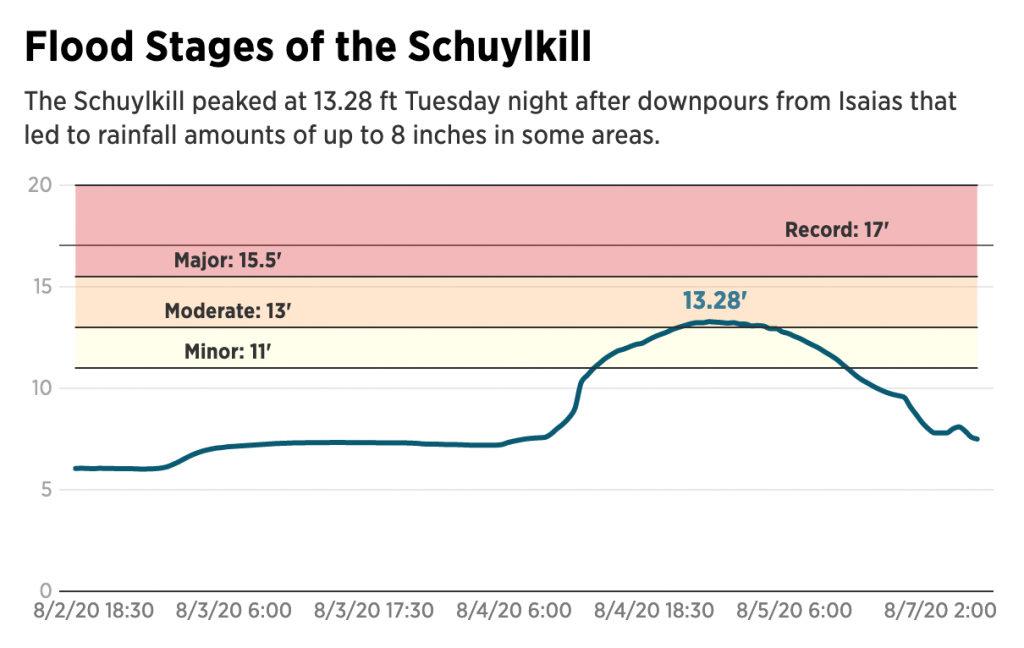
This is the chart I am accustomed to seeing. But then last night, reading about the damage I came across this graphic (screenshot also from this morning to compare to above) from the Philadelphia Inquirer.

It takes the same data and presents it a cleaner, clearer fashion. The flood stages are far easier to read. Gone is the NOAA logo and the unnecessary vertical gridlines. The type is far more legible and the palette less jarring and puts the data series in front and centre.
In general, this is a tremendous improvement for the legibility of the chart. I would probably use a different colour for the record flood stage line, or given their use of solid lines for the axis maybe make it dotted. But that’s a small quibble.
The only real issue here is what happens to the time? Compare the frequent observations in the past in the original, every half hour or so, to the six hourly dots (the blue versus the purple). In the Inquirer version, those spaces between forecast points disappear and become the same as the half-hour increments.
To be fair, the axis labelleing implies this as the label goes from August 4 to 5 and then jumps all the way to 7, but it is not as intuitive as it could be. Here I would recommend following the National Weather Service’s fashion of adjusting for the time gap. It would probably mean some kind of design tweak to emphasise that the observations earlier than now are observed every half hour or so, versus the six-hour forecasts. The NWS did this through dots. One could use a dotted line, or some other design treatment.
This missing time is the only thing really holding back this piece from the Inquirer from standing out as a great update of the traditional National Weather Service hydrograph chart.
Credit for the National Weather Service piece goes to the National Weather Service.
Credit for the Inquirer piece goes to Dominique DeMoe.
Leave a Reply
You must be logged in to post a comment.