As I prepared to reconnect and rejoin the world, I spent most of the weekend prior to full vaccination cleaning and clearing out my flat of things from the past 14 months. One thing I meant to do more with was printed pieces I saw in the New York Times. Interesting pages, front pages in particular, have been piling up and before recycling them all, I took some photos of the backlog. I’ll try to publish more of them in the coming weeks and months.
You may recall this time last month I wrote about a piece from the New York Times that examined the politicisation of vaccinations. I meant to get around to the print version, but didn’t, so let’s do it now.
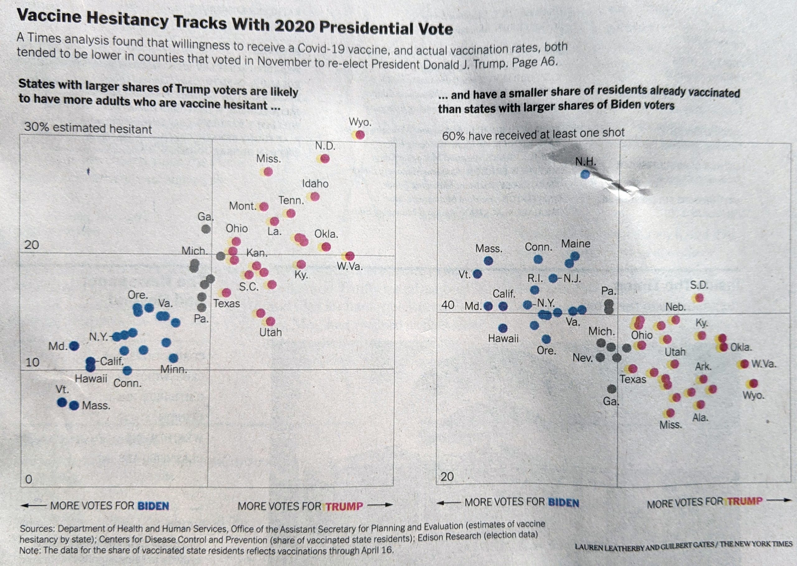
I noted last time the use of ellipses for the title and the lack of value scales on the x-axis. Those did not change from the online version. But look at the y-axis.
For the print piece I noted how the labels were placed inside the chart. I wondered at the time—but didn’t write about—how perhaps that could have been a technical limitation for the web. But here we can see the labels still inside. It was a deliberate design decision.
Keeping with the labelling, I also pointed out Wyoming being outside the plot and it is here too, but I finally noted the lack of a label for zero on the first chart. Here the zero does appear, as I would have placed it. That does make me wonder if the lack of zero online was a technical/development issue.
Finally, something very subtle. At first, I didn’t catch this and it wasn’t until I opened the image above in Photoshop. The web version I noted the use of tints, or lighter shades, for two different blues and two different reds. When I looked at the print, I saw only one red and one blue. But they were in fact different, and it wasn’t until I had zoomed in on the photo I took when I could see the difference.
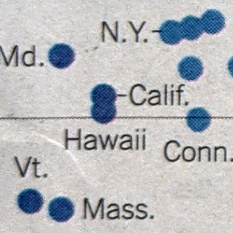
The dots do have two different blues. But it’s very subtle. Same with the red.
So all in all the piece is very similar to what we looked at last month, but there were a few interesting differences. I wonder if the designers had an opportunity to test the blues/reds prior to printing. And I wonder if the zero label was an issue for developers.
Credit for the piece goes to Lauren Leatherby and Guilbert Gates.
Leave a Reply
You must be logged in to post a comment.