
The BBC has posted an article addressing the causes for the horrible death toll in the Haitian earthquake last month. Charts and data-driven graphics supplement the text and provide a parallel, though not synchronous, visual story.
I applaud an intensive use of graphics, especially data-driven graphics, to better relate a story. Perhaps especially because not everybody can learn something simply by reading it. Many among us are instead visual learners, and by incorporating graphics into stories, be them online news articles, printed magazine articles, or interactive experiences, we can reach a larger audience and hopefully inform, impact, and influence said audience.
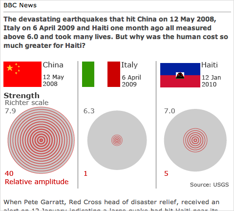
The graphics for the BBC article do some things well and some things not so well. Firstly, as a series, the graphics are varied well enough to not be overly repetitive. We have two sets of bar charts, three sets of area-of-circle charts (I presume), and what Nathan Yau at FlowingData called the everything chart. And if we look at the placement of the charts within the article (B for bar, A for area, and E for everything) we see A–B–E–A–B–A. The placement of the graphic types within the structure for the visual component of the article is sufficiently varied not to bore the audience.
Secondly, the graphics are well done through the restrained use of colour. Each graphic is composed of tints of grey and red. Grey is largely used as the base colour for the graphic while red or its tints accent the key elements of the visual argument. For example, when comparing the number of people dead among the affected people, a single square is coloured red. In the larger areas of grey for China and Italy, that single square or single person, while not lost, is not necessarily readily important. Instead, it serves as a link across the countries for when people look at Haiti and that red square stands out among fourteen other grey squares.
On a few other fronts, however, the graphics stumble where, if a bit more attention had been paid, they could have really strode to the front of the pack.
From the perspective of representing data, I have three qualms with the graphics. The first is somewhat minor—for it may have well been intentional. Although one of the underlying points of the article is the sheer difference in scale of the impact, the Italian earthquake is often difficult to visually compare in detail next to the Chinese and Haitian earthquakes. Why? Because the Italian numbers are visually insignificant. Could this have been resolved in a different fashion? Yes. However, as aforementioned that could have been an intentional design decision and I only point it out as something worth considering.
Secondly, and more importantly, I have concerns about the area-of-the-circle charts. Chief among those concerns is that nowhere is it specified that we are looking at area instead of, as is sometimes the case, the radius of the circle. This error is significant and I shall illustrate below. If we take, for the sake of example, a circle of radius 5 units and compare it to a circle of radius 10 units, we have a difference of 5 radius units. Circle 2 is, by one measure, twice the size of Circle 1.
And while some compare radii of circles, others instead compare areas of circle—as I assume but cannot be certain of in this instance. However, if we look at 5 units and 10 units as the radius for the areas of Circles 1 and 2, we arrive at a difference of four times the size.
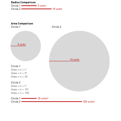
This is not a problem specific to this article—although it could have been partially solved by stating area comparison or providing a scale. Unfortunately, this problem appears with an unsettling degree of frequency. But the problem is also compounded because people are not the best judges of area. It is far easier for an individual to compare two bars and see one as twice the size than it is to compare the area of two circle and see the same difference.
The problem of comparing length to length times width for a datapoint has the fair counterpart of visual repetition aforementioned. One of the three circle charts could easily be replaced by a bar chart. The two others could also be replaced, albeit with a little more work. However, the article would then be visually boring for it would be replete with bar charts.
And so the problem of comparing areas is one to be handled carefully. This piece has some potentially serious problems in comparing data. However, the quick and easy fixes would make the piece less visually interesting and thus, perhaps, cause the reader to lose interest. And with interest lost, the reader clicks away and the article fails to make an impact. On a case-by-case basis, the designer must often make the decision between fidelity to data versus capturing the reader’s attention. And here, I think the pendulum swung just a bit too far to capture the reader’s attention.
My third major point of contention, however, concerns the data itself and an incongruity in the graphics. Understandably, the earthquake in Haiti is a recent event. And indeed, the rebuilding and thus the cost is a current and ongoing event. Therefore, nobody should expect any institution to have anything but cost estimates. The final graphic makes note of the fact that we have no hard figures and that all figures are estimates.
Yet, the graphic provides two visual estimates hinting at two substantially different figures. The straight cost is represented on a bar chart that states “estimated at several billion” but visually depicts $40 billion. The cost as relative to GDP includes an asterisk for a footnote that shows the cost as but $2 billion.
Using the estimates for an early comparison of the financial cost of the earthquake is perfectly valid so long as the numbers are noted as estimates—as they are here. However, one should use the same estimate consistently across the piece. Because here, the use of different estimates can be used to imply that the straight cost is nearly 15 times more than that of Italy’s cost. But when using the cost to compare the cost relative to the economy, Haiti’s straight cost is $500 million less than that of Italy’s cost. If anything, either the bar chart should have had no bar for Haiti, or made use of the dashed red line at the $2 billion line.
And so while I certainly have reservations about the graphics as a whole, I support the decision to use data-driven graphics to support the story and the argument.