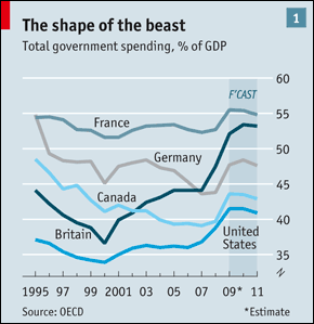
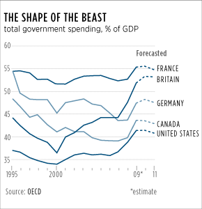
The 25 February posting from FlowingData issues a challenge to improve a chart from the Economist. I find that the Economist usually does pretty solid work and so improving their output is by no means easy. Regardless, I figured I would further delay starting my Friday work by spending 15–20 minutes on an attempt to improve the Economist’s work.
Original from the Economist vs. My Attempt


I did not find a whole lot of flaws in their chart. Most unnecessary bits have been eliminated and we have a clean line chart. The semi-advantage allowed us all is that we do not have to follow the branding guidelines of the Economist. Initially, I attempted to do a straight grey-scale chart but found the overlapping lines could be a bit confusing. And so I added a hint of blue and then tinted lines when they overlapped to aid the reader in following each line.
I also eliminated the shaded Forecast area and replaced it with switching the solid lines of the historic data to a dashed line for forecast data. The exact shape of the lines may not be exact because I traced over the lines with the pen tool in Illustrator—but for these purposes that seemed reasonable to me.
The other ‘big’ change was more typographic in nature. I decided to highlight the countries and drop back the labels by making the latter grey.
Leave a Reply
You must be logged in to post a comment.