The election has come and gone yet very little is resolved; the UK now has a hung parliament. Labour, the Tories, and the Lib Dems are now left to negotiate on the details of forming a coalition government, wherein two parties formally agree to cooperate in governing the country, or a minority government, wherein the Tories try to govern with the most seats but less than a majority. Or does Labour try to work with the Lib Dems and achieve something of a minority coalition government. The one certain thing about the election is that we now have loads of electoral data that wants to be visualised.
A few things at the top, as an American, despite my following of British politics, I am, well, an American. I am more familiar with the American system and so some of what may follow may be inaccurate. If at all, please do speak up. I should very much like to understand an electoral system that may now change entirely.
I wanted to point out a couple of sites real quick and some advantages and disadvantages thereof. Most of these were likely around before the election, however, I have been a tad busy with work and some other things to provide any commentary until now.
Auntie. The Beeb. The BBC. They have done a pretty good job at playing with four variables and the results. Are pie charts great? No. Not at all. However, they naturally limit us to 100% whereas bar charts displaying share are not necessarily as limiting—understanding that, yes, such things can be coded into the system.
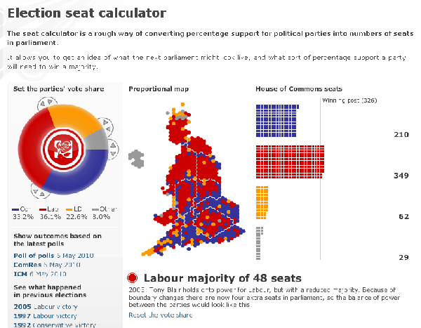
Another interesting thing about the BBC’s electoral map is their cartographic decision to represent each constituency as a hexagon instead of overlaying the constituencies over a political map. This actually makes quite a lot of sense, however, if one considers that British constituencies are supposed to be rather equal in terms of population—not geographic area. And so while a traditional map will portray vast swathes of Tory blue and Lib Deb yellow, Labour counters in holding numerous visually insignificant constituencies in the inner cities of the UK.
Does the BBC need to represent each Commons seat as a square and arrange them to cross the majority line? Most likely not. However, it does keep with the idea of displaying each constituency as the boxes are placed next to the hexagons.
All in all, I think the BBC’s piece is quite effective. I do miss seeing the actual geography of the UK. But I understand how it is less useful in displaying the outcome of one’s playing with the electoral swing. Useful, but not necessarily needed, is the provision of several historical elections as comparisons to one’s playing.
The Guardian is next, in no particular order. Their swingometer is a bit less interesting than that of the BBC’s. Certainly in some senses it makes more sense, any bi-directional swing, while easier to grasp, ignore the complexities in having the Liberal Democrats as a viable third party and thus third axis. The circular swingometer attempts to rectify that. However, what the BBC does with their pie chart version is delve into the politics of the regional and fourth party candidates. For example, the Greens won a single constituency in southern England. In a hung parliament a single vote may be the difference between passing and defeating a bill. The BBC accounts for this while the Guardian does not.
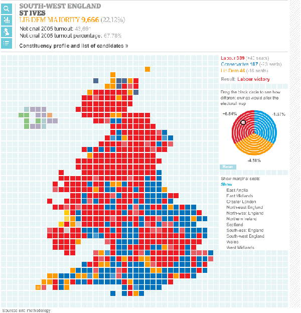
What is particularly interesting about their calculator, however, is the ability to track individual seats and watch as one’s changes affect that particular constituency. As I play with the calculator, I can watch as Brighton Pavilion, where the Green party candidate won, changes from Labour to Conservative. However, nowhere in my exercises, have I managed to switch the seat to a fourth party candidate. The BBC solves this by not allowing one to select particular constituencies; one can only guess which seats they are looking at.
Also interesting about the Guardian’s version is their provision of different data displays. The default is a proportional representation, with each seat equating to a single square. However, they also allow one to view the results on a natural geographic level and strictly in terms of number of results and how close said results are to the magic number of 326. Additionally, the map allows you to filter for only that region of particular interest to you. If I only wish to look at, for example, the West Midlands, I can look at just the West Midlands without being distracted by additional regions. (The West Midlands provides another interesting example of being unable to factor in the role of fourth party players as Wyre Forest switched to the Conservatives, a result I cannot here duplicate.)
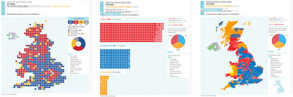
Overall, I really like how the Guardian provides different ways of viewing the data and the ability to track those changes to a particular constituency—even across the changes in data views. However, the Guardian is lacking at least in the ability to address the role of independents and regional parties. Perhaps this is do to a level of difficulty in predicting results at that level of granularity; something that is wholly understandable. However, that the BBC does just that is unfortunate for the rest of the Guardian’s piece because the rest of it is so nice. Even aesthetically, I find the Guardian’s to be appealing.
Next is the Sun. This, admittedly, is not so much a calculator but more a results map. And as such, it is effective in its simplicity. There is no messing about with swing or such—again probably because it is simply filling in constituencies by result. However, where the Sun’s piece fails is that to see any result, one needs to click a specific region. When selecting the UK, one can only see the outlines of the various regions of the UK. There appears to be no way of seeing UK-wide results.
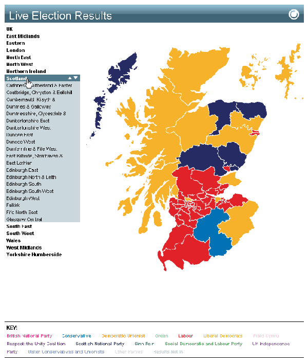
Additionally, the data is presented strictly on a natural geography. This has the deficits as outlined above. And while the Guardian does present the results in such a fashion, it is not the only fashion in which data can be presented. Further, to see any results for a particular constituency, one must click all the way through the map before seeing data. None of this helps one access the actual data. And while one could say that the results are less important than showing the victor, one still needs to click into a specific region to see a victor thereby requiring a click whereas the other pieces provide results at an instant view.
Aesthetically, while both the BBC and Guardian favour a lighter, more open space the Sun’s piece feels trapped in a claustrophobic space surrounded by dark advertisements and flush against menus and heavy-handed navigation. All in all, I must confess that the Sun’s piece strikes me as an underwhelming piece that is less than wholly successful. It could have been made at least wholly successful if I needed not navigate into a particular region to mouseover a constituency.
The last piece I am going to look at is that from the Times. While there appears to be no way of playing with possible outcomes, the Times provides interesting ways of slicing the data in a more narrative structure. In terms of the map, the display suffers from being viewable only as the natural geography of the United Kingdom without being able to even toggle to a proportional view.
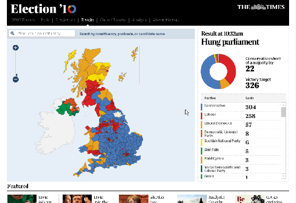
The additional data is displayed nicely in a side panel. I have to say that from an aesthetic standpoint, the Times’ mini site for the election results is my favourite. The black banner and main navigation sits well against the light colours used for the remainder of the piece. The serifed typeface for the numbers fits well with the newspaper feel and the black and serif combined works well to recall No. 10, Downing Street. A very nice touch and design decision.
As noted, the display fails in that only shows the data in a natural geographic sense. Now, the site overall provides links to news coverage of the event; these are accessible through a dropdown menu in the black banner. But, when clicked, these stories alter the map and highlight the particular constituencies in question. This approach provides a nice touch on straight data visualisation in linking the data to the editorial content of the newspaper. Which seats were taken or lost by independents? On a broad and filled-in map of the United Kingdom, I may not be able to know. But by clicking on that story, the map filters appropriately and I can click each constituency and get the story.
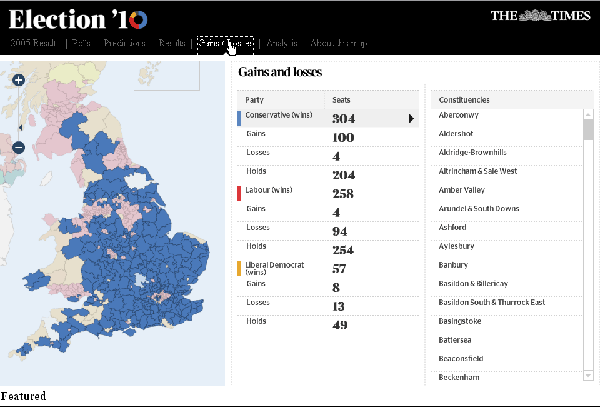
And so while the data visualisation is not necessarily on par with that of the BBC and the Guardian, the tie-in with the editorial emphasis—in my mind—makes up for the lack of detail in data visualisation. Data is wonderful, however, the narrative is what helps us make sense of what is otherwise just numbers and figures.
That editorial link and the subtle design decision to link the minisite to the sort of 10 Downing Street aesthetic makes the Times version my favourite and the best designed experience. Besides the lack of detail in the data visualisation aspect, the only other drawback is perhaps the load time for each change in display.

Wow! Great article Brendan! Thought you might like this:
http://www.thegameslist.com/game/strungparliament
😀