
Last week Scotland voted for its parliament, Holyrood. The Scottish National Party did well enough, the Conservatives picked up quite a few seats, and Labour lost quite a few. The Guardian put together this piece looking at the results and the stories contained therein. But I want to focus on the graphics, the big piece of which was a map of Scotland with each constituency represented by a small Sankey diagram.
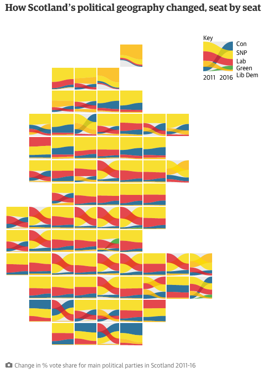
You see that generally, Scotland is a sea of yellow, surging blue, and diminishing red. But what about the numbers for each constituency? The interactive nature of the chart lets you see the 2016 results mousing over the constituency.

Normally I would say that a piece like this is missing an easy way for someone to find their own constituency, however, this is not a results page, but an article on the results, so something like a search bar is not necessary.
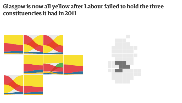
What I really enjoy, however, is that when the story breaks down the results by regions, the map becomes an abstracted series of squares used to highlight the constituencies in focus. It is a really nice reuse of the concept and the overall graphic.
Credit for the piece goes to the Guardian’s graphics department.