
I know I mentioned that I would review the coverage of the Orlando shootings this week in more depth than I did on Monday. But, allow me an interruption for a nice little piece that I wanted to get to last week. If anything, it’s far less serious.
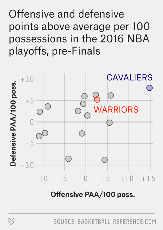
My apologies for my focus of late on small graphics, but I really think they are underappreciated component of providing context to written analysis. And this piece from FiveThirtyEight about the point scoring accompanies some good analysis that actually made some sense to this non-basketball fan.
Note the two finals-playing teams are highlighted—and importantly how the text is cleared with interrupted chart lines, a very nice touch—while other teams remain visible but unidentified for context.
Credit for the piece goes to Neil Paine.