
Today’s post is a choropleth map from the Washington Post examining diversity in the United States and how fast or slow diversity is expanding. Normally with two variables one goes instantly to the scatter plot. But here the Post explored the two variables geographically. And it holds up.
The colours are perhaps the only part holding me up on the piece’s design. Are blue and yellow the best two colours to represent level of diversity and growth? I lose some of the gradation in the yellows, especially between the big increases in diversity. Can I offer a better solution? No, and maybe there is not. But I would love the chance to explore different palette options.
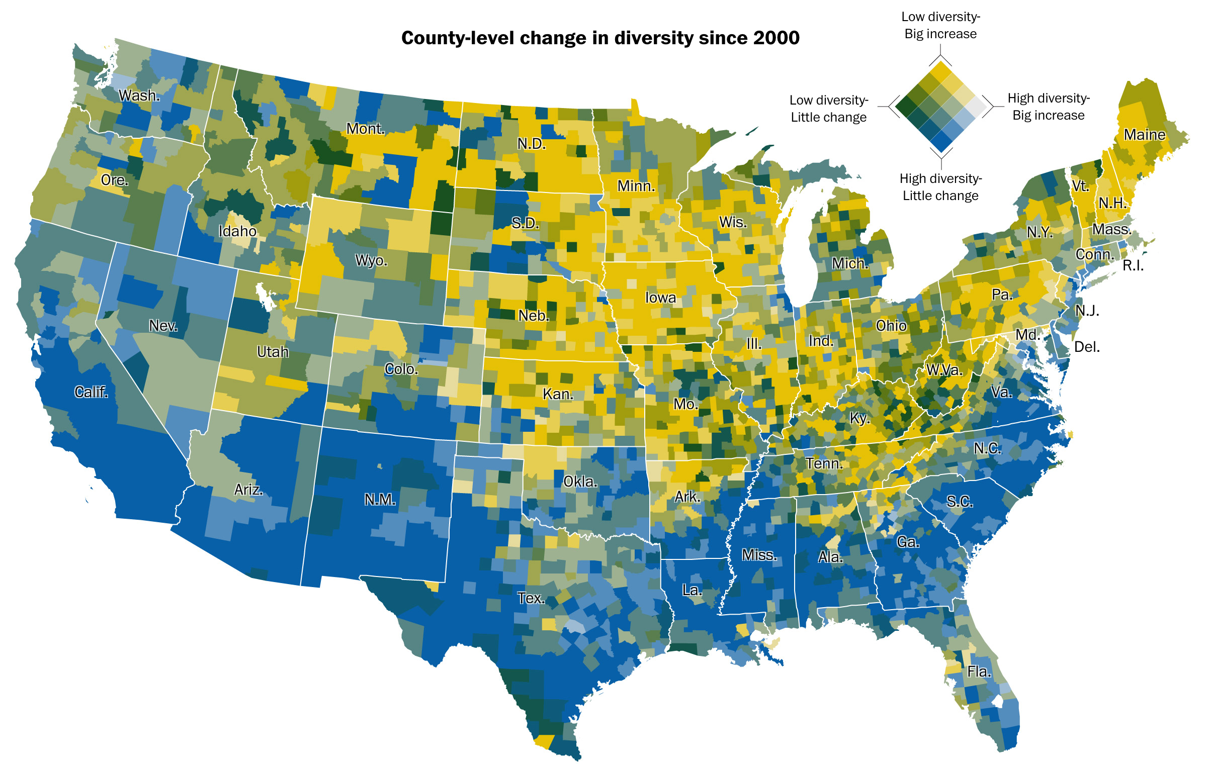
As you well know, I am not a big fan of always plotting things on maps. I call them the silver bullet. However, in this instance, there are clear geographic patterns to the four different scenarios. Of course this soon after the election I would love adding a third variable: how the counties voted in the presidential election. Maybe next time.
Credit for the piece goes to Dan Keating and Laris Karklis.