
This is a graphic from the Guardian that sort of mystified me at first. The article it supports details how the rising rents across England are hurting the rural youth so much so they elect to stay in their small towns instead of moving to the big city.
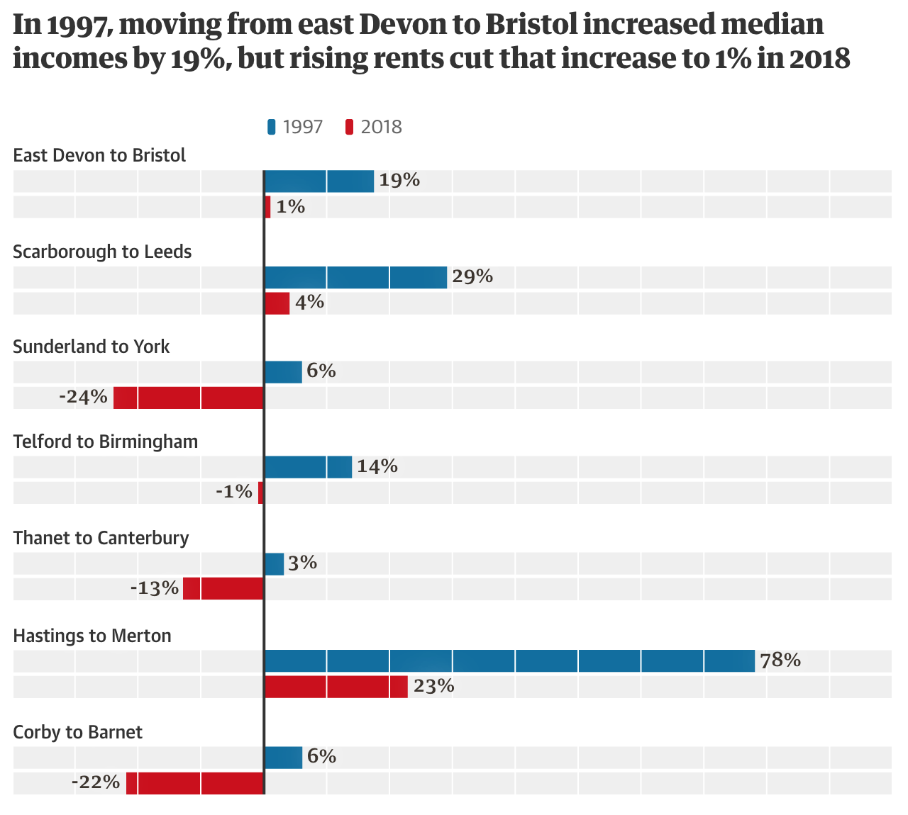
The first thing I noticed is that there really is no description of the data. We have a chart looking at something from 1997 and comparing it to 2018. The title is more of a sentence describing the first pair of bars. And from that title we can infer that these bars are income changes for the specified move, e.g. Sunderland to York, for the specified year. But a casual reader might not pick up on that casual description.
Then we have the issue of the bars themselves. What sort of range are we looking at? What is the min? The max? That too is implied by the data presented in the bars. Well, technically not the bars, but in the numbers at the end of each bar. I will spare you the usual rant about numbers in graphics defeating the purpose of graphics and organisation vs. visual relationship. Instead, the numbers here are essential because we can use them to suss out the scale of the grey bars. After looking at a few bars, we can tell that the white lines separating the grey boxes are most likely 10% increments. And from that we can gather the minimum is about -40% and the maximum 100%. But instead of making the reader work to figure this out, would not some min/max labels at the bottom of the chart be far clearer?
And then there is the issue of the grey boxes/bars themselves. Why are they there in the first place? If the dataset were more about an unmet value, say reservoirs in towns were only at x% of capacity, the grey bars could relate the overall capacity and the coloured bars the actual values. But here, income is not a capacity or similar type of value. It could expand well beyond the 100% or decline beyond the -40%. These bars imply the values are trapped within these ranges. I would instead drop the grey bars entirely and let the coloured bars exist on their own.
Overall this is a confusing graphic for a fascinating article. I wish the graphic had been a little bit clearer.
Credit for the piece goes to the Guardian’s graphics department.