Rising Tides, Rising Disasters?

One more day of Harvey-related content. At least I hope. (Who knows? Maybe someone will design a fantastic retrospective graphic?) Today, however, we look at a piece from the Economist about the rising number of weather-related disasters, but thankfully falling numbers of deaths. The piece has all the full suite of graphics: choropleths, line charts, and bar charts (oh my!). But I want to look at the bar chart.

A timeline of disaster causes around the world

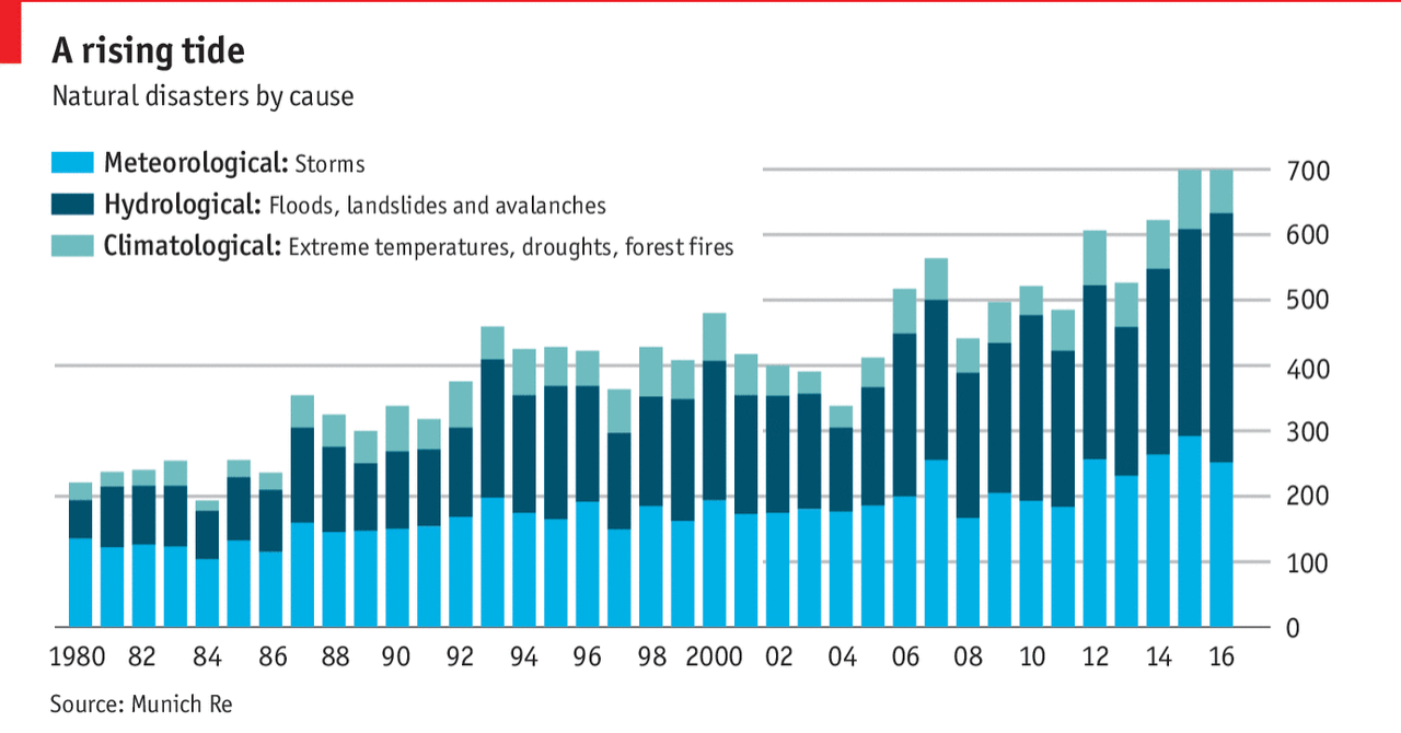
I cannot tell from this chart whether there has been any change in the individual elements, the meteorological, hydrological, or climatological disasters. And unfortunately stacked bar charts do not let us see that kind of detail. They only really allow us to see total magnitude and the changes in the element at the bottom of the stack, i.e. aligned with the baseline. So I took their chart and drew the shapes as lines and realigned everything to get this.

My take
My take

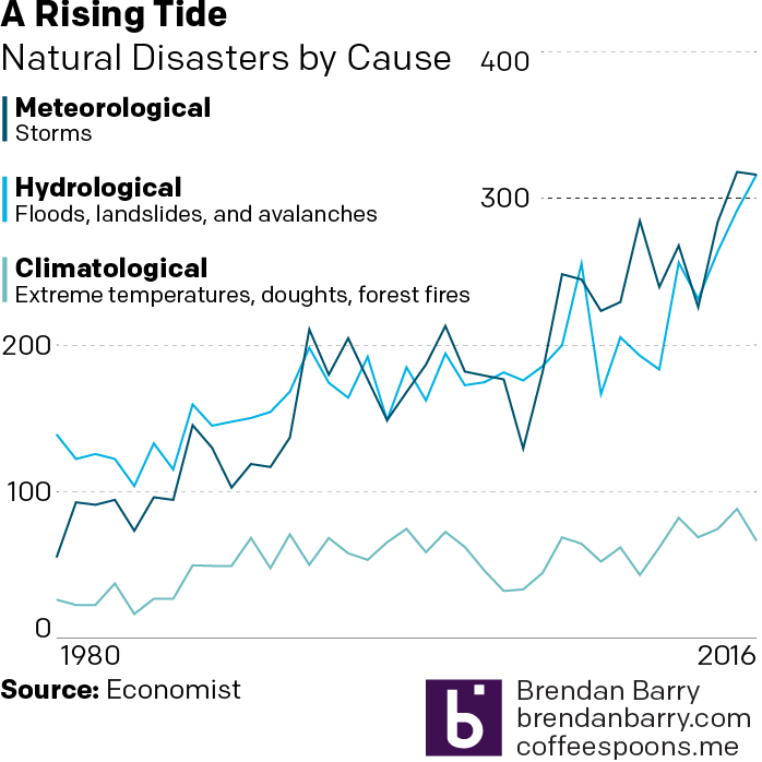
You can begin to see that meteorological might be overtaking hydrological, but it is too early to tell. And that right now, climatological causes are still far behind the other two.

Credit for the piece goes to the Economist Data Team.

Credit for mine goes to me.

Hot Summer Days

We made it to Friday, folks. So here in Philly it is, of course,  hot and disgusting. (Please refer to Tuesday’s post about the increasingly hot weather in summers.) Thankfully we have ThisIsIndexed to explain what happens in hot weather.

To be fair, I'm not sure misanthropy couldn't be in any other overlap…
To be fair, I’m not sure misanthropy couldn’t be in any other overlap…

Credit for the piece goes to Jessica Hagy.

Shifting Temperatures

This past weekend, I came upon a neat little graphic in the New York Times supporting an article about the impact of climate change on temperatures. The article basically lays out the argument that summers are getting hotter. And as a cold-weather person, that is dreadful news.

Can we not shift a wee bit the other way please?

But the good news is the graphic was well done. It uses the outline of the baseline data as a constant juxtaposition against the date interval examined. And the colour breaks remain in place to show that compared to what we consider “normal”, we are seeing a shift to the higher end of the spectrum.

Credit for the piece goes to the New York Times graphics department.

It’s Warm Out Here Isn’t It?

I could have covered the pieces on Gorsuch or the budget—and we will get to those—but I wanted to cover some data released by the World Meteorological Organisation that puts 2016 as the warmest year on record.

But that’s cool, climate change is a hoax.

January was warm
January was warm

The graphic comes from a BBC article covering the news, and is a reuse of work from the National Oceanian and Atmospheric Administration. It portrays how much this past January deviated from long-term averages. Because, and I am probably preaching to the choir, remember that day-to-day highs, lows, and precipitation are weather. Longer term trends, patterns, and averages are evidence of climate.

Just so happens that today is also supposed to be the warmest day of the week here in Philadelphia.

Credit for the piece goes to NOAA.

Climate Change

So this is the last Friday before the election next Tuesday. Normally I reserve Fridays for less serious topics. And often xkcd does a great job covering that for me. But because of the election, I want today’s to be a bit more serious. Thankfully, we still have xkcd for that.

Recent temperature history

The screenshot above gets to the point. But the whole piece is worth a scroll-through and so it goes at the end. Credit for the piece goes to Randall Munroe.

Earth's global average temperature
Earth’s global average temperature

Raining Maps Monday

One of the things I like about Chicago’s WGN network is its weather blog. They often include infographic-like content to explain weather trends or stories. But as someone working in the same field of data visualisation and information design, I sometimes find myself truly confused. That happened with this piece last Friday.

Pay attention to the map in the upper-right

The map in the upper-right in particular caught my attention and not in the good way. The overall piece discusses the heavy rainfall in the Chicago area on Thursday and the map looks at the percentage increase in extreme weather rainfall precipitation. All so far so good. But then I look at the map itself. I see blue and thing blue > water > rainfall. The darker/more the blue, the greater the increase. But, no—check out Hawaii. So blue means less rainfall. But also no, look at the Midwest and Southeast. So does green mean anything? Beyond being all positive growth, not that I can tell. As best I can tell, the colour means nothing in terms of rainfall data, but instead delineates the regions of the United States—noting of course they are not the standard US Census Bureau regions.

So here is my quick stab at trying to create a map that explains the percentage growth. I have included a version with and without state borders to help readers distinguish between states and regions.

My take on the map
My take on the map

And what is that at the bottom? A bar chart of course. After all, with only eight regions, is a map truly necessary especially when shown at such an aggregate level? You can make the argument that the extreme rainfall has, broadly speaking, benefitted the eastern half of the United States. But, personally speaking, I would prefer a map for a more granular set of data at the state or municipality level.

Credit for the piece goes to Jennifer Kohnke and Drew Narsutis.

Where’s the Cold Weather?

I prefer colder weather to warmer weather. I like to feel a bit of chill on my skin rather than a bit of warmth. This makes me that asshole who says “it’s great out today”, when the temperature is 5ºC (41ºF). (I also enjoy grey, cloudy days, but that’s a different matter entirely.) Anyway, thanks to a friend of mine I could take a look at some temperature maps of the contiguous United States.

High temperatures between 32º and 60ºF

The Pacific Northwest or the coast of the Mid-Atlantic and New England would be great along with the desert and the mountains. But, don’t deserts get hot? Because the whole point would be to not live somewhere too warm. So here’s a map of the number of days where I prefer to sit inside and crank the air conditioning.

Way too hot
Way too hot

Basically I should avoid the South, the deserts and the plains states of the Midwest. Chicago looks borderline uncomfortable. (And from experience, summers typically are.)

Credit for the piece goes to Christopher Ingraham.

How Much Warmer Was 2015

When I was over in London and Dublin, most days were cool and grey. And a little bit rainy. Not very warm. (Though warmer than Chicago.) But, that is weather—highly variable on a daily basis. Climate is longer-term trends and averages. Years, again, can be highly variable—here’s looking at you kid/El Niño. But, even in that variability, 2015 was the warmest year on record. So the New York Times put together a nice interactive piece allowing the user to explorer data for available cities in terms of temperature and precipitation.

You can see the big chart is temperature with monthly, cumulative totals of precipitation. (I use Celsius, but you can easily toggle to Fahrenheit.) Above the chart is the total departure of the yearly average. Anyway, I took screenshots of Philadelphia and Chicago. Go to the New York Times to check out your local cities.

Philadelphia, PA
Philadelphia, PA
Chicago, IL
Chicago, IL

Credit for the piece goes to K.K. Rebecca Lai and Gregor Aisch.

Climate Change in Charts

So yesterday we reimagined a less-than-stellar BBC chart. Today, we look at a good chart from the BBC about climate change, timed to coincide with the start of the Paris climate talks. This comes from an article with six charts related to climate change, but it is the best in my mind.

The trend…not so good.

Nothing but nice design here with the use of colour to highlight the top ten hottest and coldest years over the last 225+ years. But it really comes alive when animated and tells the story how those coldest years occurred at the beginning of the set and the hottest are among the most recent years.

Credit for the piece goes to Emily Maguire,  Tom Nurse, Steven Connor, and Punit Shah.

The Future of Climate Change

At the end of the month the world will gather in Paris, France for the next round of climate change talks. In advance of the talks, the Financial Times put together this model of how emissions reductions will help—or not—get climate change under control. The piece is two-fold. The first is a ten-step narrative that showcases the tool’s split of the time series into short-, medium-, and long-term impacts and how those work in the best and worst case scenarios. But it then allows the user to jump right on in and create their own scenarios.

Is it getting hot out there?

Credit for the piece goes to John Burn-Murdoch and Pilita Clark.