So yesterday we reimagined a less-than-stellar BBC chart. Today, we look at a good chart from the BBC about climate change, timed to coincide with the start of the Paris climate talks. This comes from an article with six charts related to climate change, but it is the best in my mind.
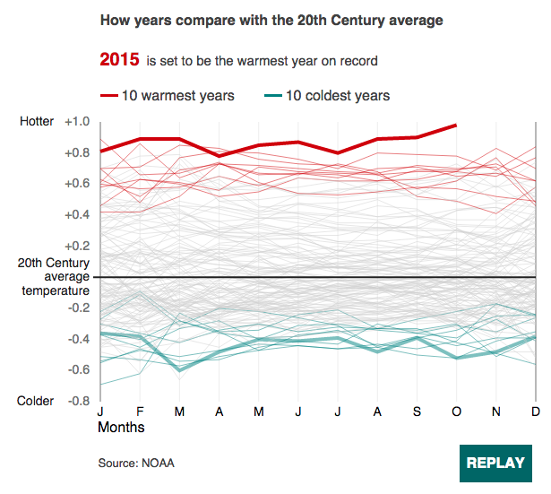
Nothing but nice design here with the use of colour to highlight the top ten hottest and coldest years over the last 225+ years. But it really comes alive when animated and tells the story how those coldest years occurred at the beginning of the set and the hottest are among the most recent years.
Credit for the piece goes to Emily Maguire, Tom Nurse, Steven Connor, and Punit Shah.
Leave a Reply
You must be logged in to post a comment.