Shifting Temperatures

This past weekend, I came upon a neat little graphic in the New York Times supporting an article about the impact of climate change on temperatures. The article basically lays out the argument that summers are getting hotter. And as a cold-weather person, that is dreadful news.

Can we not shift a wee bit the other way please?

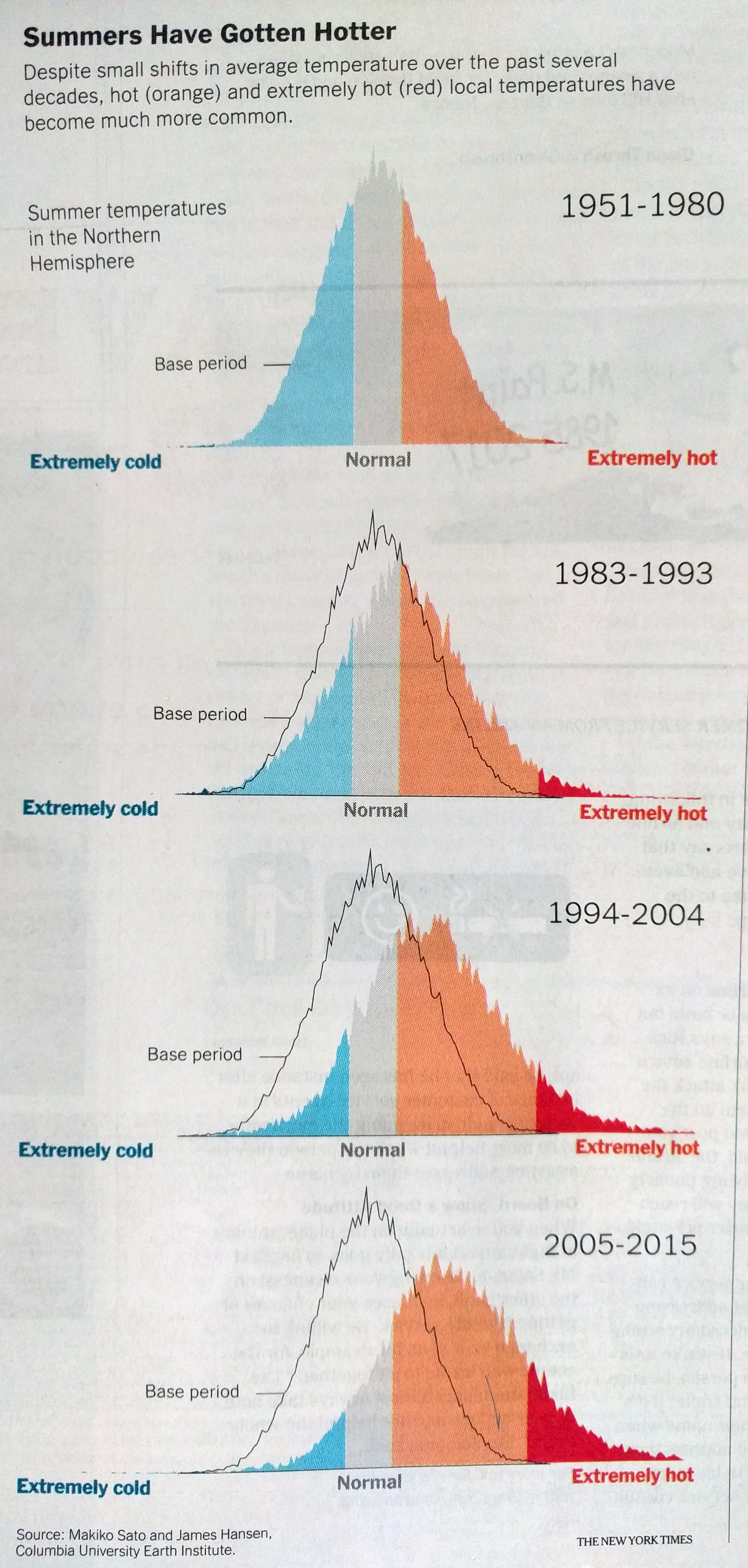
But the good news is the graphic was well done. It uses the outline of the baseline data as a constant juxtaposition against the date interval examined. And the colour breaks remain in place to show that compared to what we consider “normal”, we are seeing a shift to the higher end of the spectrum.

Credit for the piece goes to the New York Times graphics department.

Author: Brendan Barry

I am a graphic designer who focuses on information design. My day job? Well, they asked me not to say. But to be clear, this blog is my something I do on my own time and does not represent the views of…my employers. I think what I can say is that given my interest in information design—be it in the shape of clear charts, maps, diagrams, or wayfinding systems—I am fortunate that my day job focuses on data visualisation. Outside of work, I try to stay busy with personal design work. Away from the world of design, I have become an amateur genealogist and family historian. You will sometimes see that area of work bleed into my posts.

2 thoughts on “Shifting Temperatures”

Leave a Reply