Understanding Museum Pieces in French

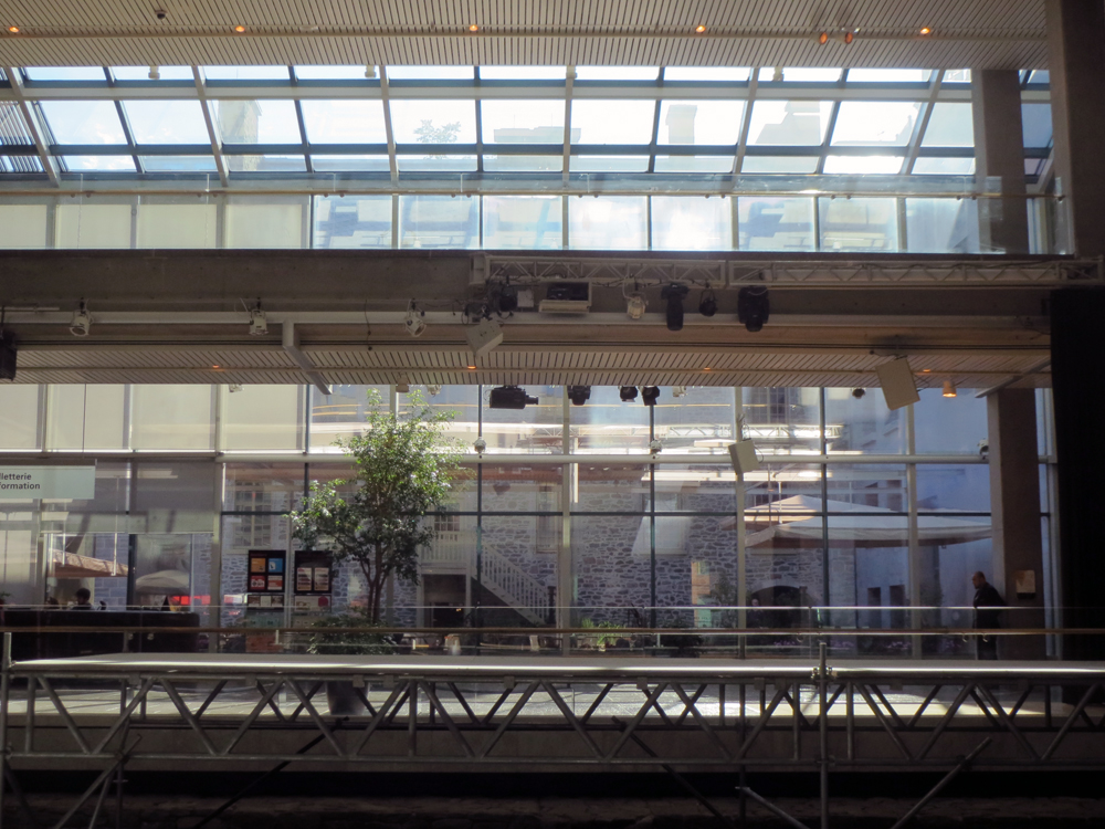
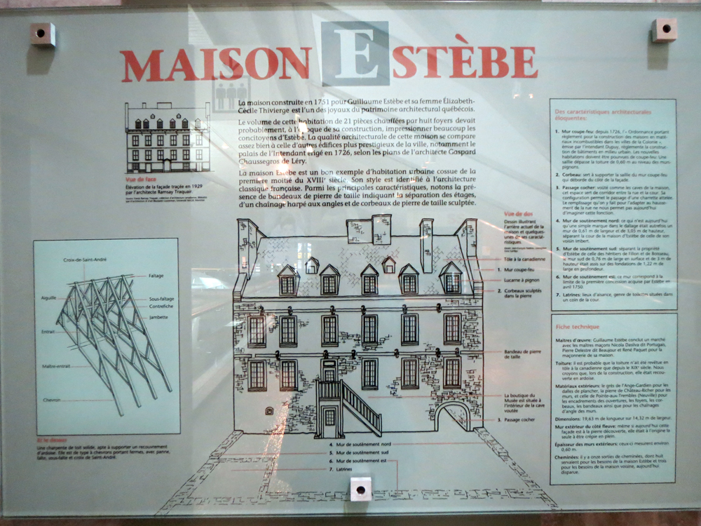
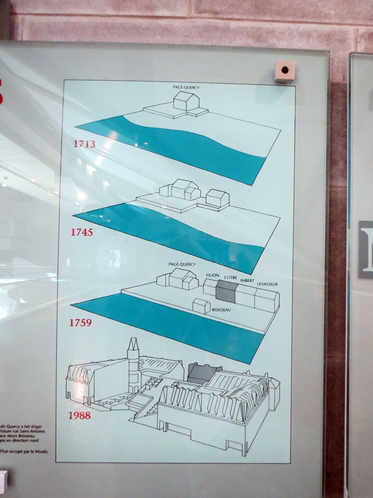
Yesterday’s piece was from the Musée de la Civilisation à Québec and looked at a bilingual exhibit on Greek and Roman mythology. The museum, of course, had many other exhibits. Today I want to show an interesting bit that explained why the museum, a modern construction dating to the late 1980s, incorporated an 18th century house called Maison Estèbe.

Maison Estèbe today
Maison Estèbe today

Well, the museum had a series of graphics with text explaining why. But they were only in French. But by some smart use of graphics and some thought as to how show the progression of time, the reader can piece together a good bit of the story.

Maison Estèbe
Maison Estèbe
Waterfront near Maison Estèbe
Quay at Maison Estèbe

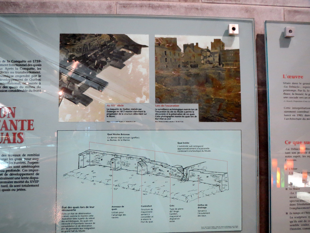
And of course to make it abundantly clear, the excavation of Québec’s foundations also revealed longboats along the old shoreline, which when placed in front of a quay like below, just make perfect sense.

long ship
long ship

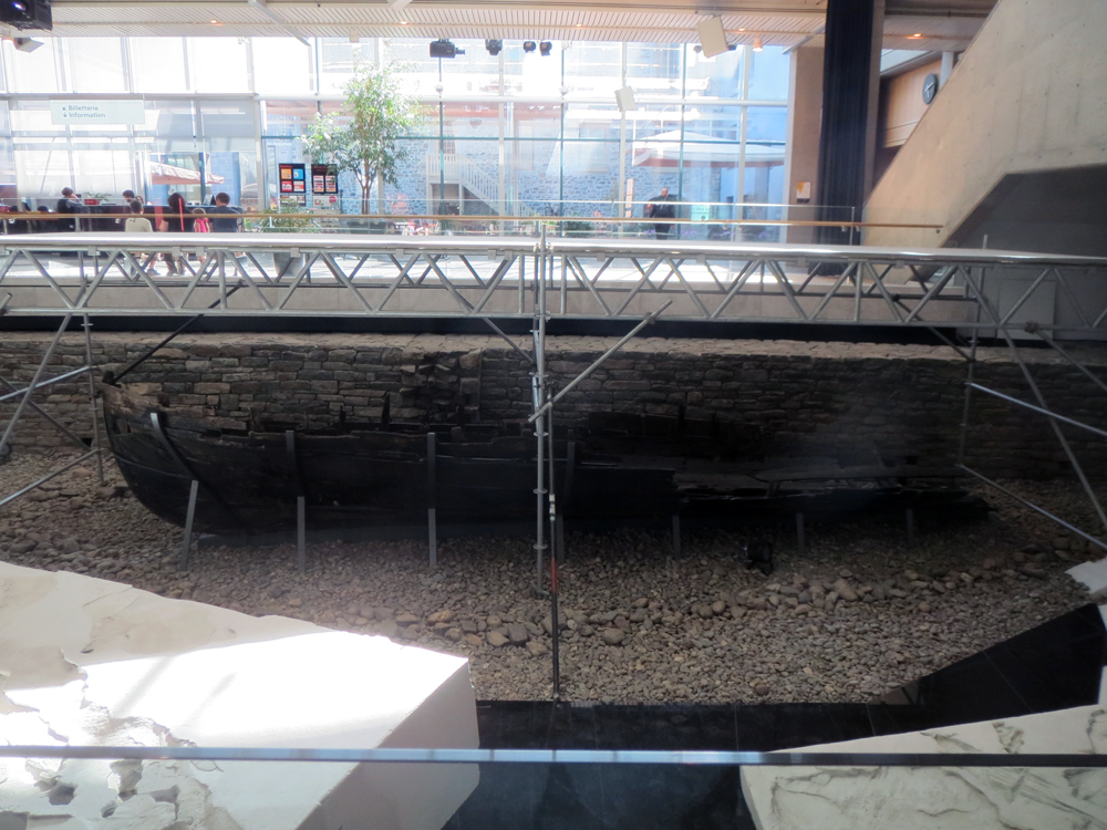
Credit for the pieces goes to the graphics department of the Musée de la Civilisation à Québec.

There’s No Diversity in Baseball!

Well, okay, actually there is. But the cultural reference would have made even less sense if I omitted the negative. Anyway, in honour of the two baseball games I am seeing this week—last night’s and tonight’s Red Sox games—here comes this piece from Pew Research Center.

It’s a simple but fairly clear graphic. We are looking at the ethnic breakdown of baseball since 1947, when Jackie Robinson broke the colour barrier. My only qualm, as ever, with this stacked area chart is that while you can see the clear trend upward in white share, it is a bit more difficult to see the directions the other ethnicities are moving.

Diversity in baseball

Credit for the piece goes to Pew Research Council.

World War II Bombs in Hong Kong

Last month, police in Hong Kong defused a 2000 pound (900 kilogram) bomb found undetonated since World War II. The South China Morning Post created a small graphic to diagram just what the bomb was and how it was delivered (by US aircraft) to Hong Kong.

The 2000 pound bomb
The 2000 pound bomb

Credit for the piece goes to Adolfo Arranz.

Explaining What is Going on in Ukraine

Not “the Ukraine” as it is (admittedly) fun to do in pop-culture references to Seinfeld. This comes from the Washington Post and the article tries to show that the protests in Kiev are not necessarily a vast majority against the government. Certainly the opposition is strong, but there is also a very strong pro-government movement. Why? Because in the broadest of senses, Ukraine is where the West, i.e. the European Union, meets the East, i.e. Russia.

A divided Ukraine
A divided Ukraine

Credit for putting this all together goes to Max Fisher. Credit for each of the original graphics is to their respective designers whom I cannot identify.

Speed Skating

Today’s post comes from a co-worker and looks at the increase of speed in speed skating in the Winter Olympics since 1924. It does a nice job of showing the increase in the speed. Because to a degree, the increase has not been linear. Instead, it really only increased in two spurts and recently has remained fairly constant.

Then to show how slight differences in speed impact an actual race. The times are plotted against the distance in a simulated race. That shows that seemingly incremental increases in speed can have a drastic impact on where one finishes a race.

Race around the rink

Credit for the piece goes to  Andrew Garcia Phillips.

The Origin of Beer

Today’s post comes via Business Insider. They linked to work by reddit user sp07 who mapped out words used for common objects across Europe and then looked at those words by their origin. But of all words, this is probably the most important.

The linguistic origin of beer

Credit for the piece goes to sp07.

The Sinking of the Bounty

This time last year, the Northeast began to pick up what was left from Hurricane Sandy. There was a lot of rain, a lot of wind, flooding, and electrical outages. But not all the damage was ashore. In an excellent long-form narrative piece, the Tampa Bay Times covered the story of the Bounty, a functional replica of HMS Bounty from that famous story of a mutiny. This Bounty was used in the 1960s movie and had sailed ever since until it sank off Cape Hatteras, North Carolina.

A diagram of the Bounty

The piece doesn’t makes use of some charts and graphics to explain positioning and familiarise the reader with terminology. It’s a fascinating though ultimately tragic story. And like so many of these long-form pieces, the credit list is extensive.

Credit for the piece goes to Michael Kruse, Don Morris, Maurice Rivenbark, Carolyn Edds, Caryn Baird, Barbara Moch, Mike D’Andrea, Bill Duryea, Alexis N. Sanchez, and Lee Glynn.

Deconstructing the International Space Station

Gravity was released recently. You know, that film about a station in space that gets hit by something and drama ensues. The Washington Post has this fantastic infographic that illustrates how the station was built over the past 15 years. Scroll down the page and watch the station deconstruct itself into its initial Russian power module. Fantastic.

Deconstructing the ISS

Credit for the piece goes to Alberto Cuadra and Katie Park.

All in the Family (and the Friends and the Neighbours)

Recently my hobby of my family’s history has focused on my Rusyn (or Ruthenian) roots. However, this recent work out of Stanford University piques my interest in my English heritage, even though much of it is very far back in time. Using my 23 × great-grandfather Reynold de Mohun you can begin to see how it links persons within families, how those lives intersected over time, and the geographical areas where that person lived. In Reynold’s case, it was the 12th–13th centuries in Somerset, England.

Reynold de Mohun
Reynold de Mohun

But as the title kindred implies, this piece is not just about direct family connections, but also the marriages and close cultural links between certainly the elite of British society. Below is how Reynold is connected to King William I, better known as William the Conqueror.

Connecting Reynold de Mohun to William I

Family history or genealogy is a topic ripe for data visualisation and information design because it is all about connections. But I have found beyond the common family tree diagram little interesting has been created. This work is a solid start in the right direction.

Credit for the piece goes to Nicholas Jenkins, Elijah Meeks, and Scott Murray.

Urban Population

At lunch, I felt inspired enough to create a quick chart that looks at some urban population statistics.

Top-10 Cities Population

A caveat about the data, it comes from the Census Bureau’s tables on the top-100 cities. So until a city appeared on that list, I did not chart it. The exceptions are 2000 and 2010, where I pulled directly from those census results. Mostly because it was lunch and I needed to be quick about it.

Hint, US Census Bureau, make your interface more friendly.

Credit for this goes to me.