At lunch, I felt inspired enough to create a quick chart that looks at some urban population statistics.
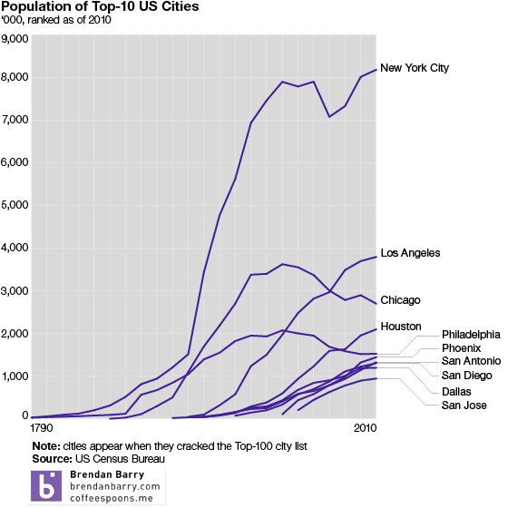
A caveat about the data, it comes from the Census Bureau’s tables on the top-100 cities. So until a city appeared on that list, I did not chart it. The exceptions are 2000 and 2010, where I pulled directly from those census results. Mostly because it was lunch and I needed to be quick about it.
Hint, US Census Bureau, make your interface more friendly.
Credit for this goes to me.
Author: Brendan Barry
I am a graphic designer who focuses on information design. My day job? Well, they asked me not to say. But to be clear, this blog is my something I do on my own time and does not represent the views of…my employers. I think what I can say is that given my interest in information design—be it in the shape of clear charts, maps, diagrams, or wayfinding systems—I am fortunate that my day job focuses on data visualisation. Outside of work, I try to stay busy with personal design work. Away from the world of design, I have become an amateur genealogist and family historian. You will sometimes see that area of work bleed into my posts.
View all posts by Brendan Barry