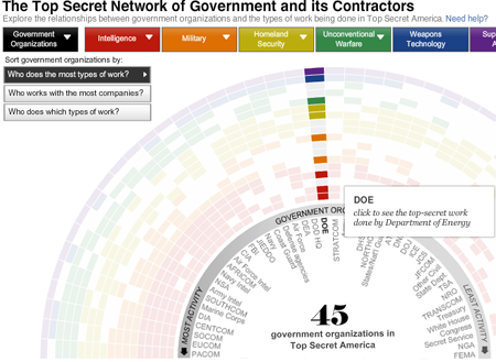
The Washington Post has released an in-depth article, or series of articles, about the intelligence community of the United States and its growth since 11 September 2001. There are several visualisations of data and relationships between government agencies and companies along with a video introduction and, well, a traditional written article or two.

Overall, the piece is quite interesting to look through—although I have not yet had the time to do just that. Some of the visualisations appear a bit thin. But, that may be just because I have not yet had time to play with them enough to draw out any particular insights.
What is nice, however, is again having visualisations supporting editorial content in such a fashion.
Leave a Reply
You must be logged in to post a comment.