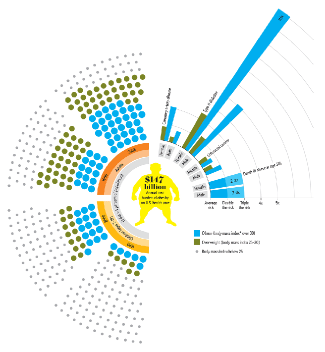
This piece comes from my coworker, Ben, who found the graphic in Scientific American. Broadly speaking the piece is looking at the obese and the overweight in the United States, comparing the numbers of both children and adults in 1980 to 2008. These numbers are supplemented by the risk of death posed to both men and women from a few different causes. (I know at least diabetes is linked to weight, but as to whether the others are linked I am unaware.)
I have a few quibbles with the piece; for in general I think educating the public about the health risks of obesity a worthy endeavour. From a more scientific-ish point of view, as I recall, BMI (body mass index) is not a particularly useful tool in determining obesity because it fails to differentiate people who are heavy with fat from those who are heavy with muscles. A strong and regular weight-lifter is not necessarily overweight, but simply has a lot of muscles. Does that make the weight-lifter less healthy than those with lots of body fat? Methinks not.
From the data side, I am curious to know why only the two years? It may very well be that they are the only two years for which relevant data exists. But I doubt that. 1980 compared to 2008 is interesting, but perhaps already well-known. What would perhaps be more interesting is whether over the past few years, the increasing attention paid to weight and other health issues has begun to affect the growth of the obesity problem—poor pun very much intended.
The accompanying text makes a point about the number of adult Americans being obese. Certainly the dots as a percentage of the population achieve that goal of showing percents—though I hasten to add that their arrangement around the body in the centre does very little to aid in comparing the adults of 1980 to 2000 let alone the children. And as to the children, the article points out that they are growing fastest. At this, however, I can only take the authors at their word for the graphic does nothing to visualise this statement. Perhaps they outgrew the adults—but then the adults were themselves at one point children, but that is another matter—but their growth could now be slowing as a recent turn of events. But since we only have two years, we cannot know for certain.
The risk of death by [type of death] is interesting. But running bar charts as more of a radial chart could become a bit confusing. Is there any reason the bars grow in width as they extend further out? Or was that part of an all-too-obvious play on the problem. After all, the growth in area could be significant; a simple line of constant stroke to a point along the radial distance markers would have sufficed. And then I would be particularly curious to know whether any of these types of death are related to obesity. Neither the article nor the graphic provide any clues besides whatever knowledge the viewer brings to the table. (Okay, I think I am done with the puns.) And if one happens across the article with almost no knowledge of what diseases or medical conditions are caused by obesity, how does the graphic tie into the cost of healthcare costs brought upon the country by obesity.
Overall, I think the graphic is well-intentioned. The public is becoming more accustomed to seeing data visualised. However, we need to make certain that we are communicating clearly by making datapoints easier to compare. (Looking at things across half of a circle is a bit tricky.) And then we need to make certain that the data we are visualising supports our statements. (Are children really the fastest growing? Over what span of time?) And then take the time to explain to the audience those things that may not be common knowledge. Does that mean dumb a piece down to the lowest common denominator of someone who has absolutely no knowledge? No. Design needs to elevate and educate its audience. Perhaps some of the finer details remain unexplained because of sheer complexity, but when amidst a host of details well-understood, that confounding bit may push an unsure viewer to do some additional research and educate him- or herself about the subject matter. And that, surely, is not a bad thing.
Leave a Reply
You must be logged in to post a comment.