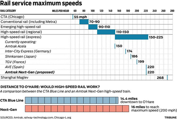
This is another comparison of high-speed lines and how woefully inadequate American infrastructure is in this particular department. The graphic comes via the Chicago Tribune in support of this article, wherein the outgoing mayor states the need for a high-speed line to link downtown Chicago to O’Hare International Airport. Apparently his desire for such speedy transit was inspired by his trip to Shanghai, where the Chinese have had a magnetically-levitated (maglev) train connecting the airport to the city for a few years. It’s fast. (Though as the article makes a point to call out, the Shanghai train does not stop in downtown Shanghai, but rather the city’s edges where travelers then link up with a more conventional train to reach downtown.)

The chart is nice because it breaks down the types of trains into categories based upon speed, and in the area of interest, namely high-speed, the express section is broken out in detail with the several main types of high-speed trains described. Of course these are all maximum speeds and I would be curious to see a comparison of average operating speeds. For example, while Acela is billed as fast, it frequently operates well below maximum speeds because of its route—the Northeast Corridor was not designed for trains running at such high speeds all those years ago.
At the bottom is a comparison of the overall length of the Blue Line, the Chicago route that connects the Loop (downtown) to O’Hare, to the distance needed to accelerate and decelerate a high-speed train to its maximum speed. Overall, I think the plan sounds like a glossing over of other deficiencies in the Chicago mass transit network for the sake of shiny new toys for (outgoing) mayoral boys.
Leave a Reply
You must be logged in to post a comment.