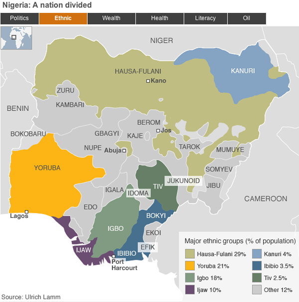
The BBC has a new feature on Nigeria, one of Africa’s most important—and most complicated—countries. And a few days ago it was supposed to hold elections. But these have been postponed, apparently on logistical problems. This piece attempts to explain the complexities of modern Nigeria across several different metrics via maps. Overall, it is very similar to a piece I mentioned that the BBC ran on South Sudan in the run up to that soon-to-be-country’s independence referendum.

Overall, the piece works for me as a means of quickly and broadly explaining the geographic breakdown of Nigeria in terms of ethnicity, politics, health, et cetera. The colours work, especially shifting between hues for the one-variable maps. The one thing that the Nigeria map adds over the Sudan map is the name of each state. However, these begin to become a bit cluttered and distracting—not to mention that in all-caps they sit at roughly the same level of the neighbouring country names despite being a touch smaller. Perhaps the maps could have been made to do more with less, and only label those states mentioned in the explanatory text. Or they could have been included but treated in a subtler fashion.
Leave a Reply
You must be logged in to post a comment.