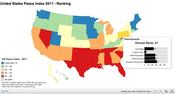
Do you live in a horribly violent and crime-afflicted state? Do you want to know? Well there’s a map for that.

From the Guardian, here we have a familiar choropleth that colours each state based on where it falls into the range from most peaceful, Maine and Vermont, to the the most violent, Louisiana and Tennessee. The map was developed using a site called chartsbin from data provided by the Global Peace Initiative.
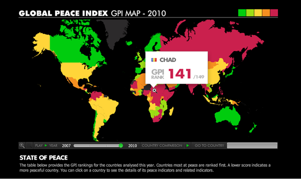
In short, nothing fancy, but an interesting topic to visualise after the earlier world rankings. Truth be told, I think the added data in the rollover state for the US states is more meaningful than the big rank number and flag that appears in the global version.

Leave a Reply
You must be logged in to post a comment.