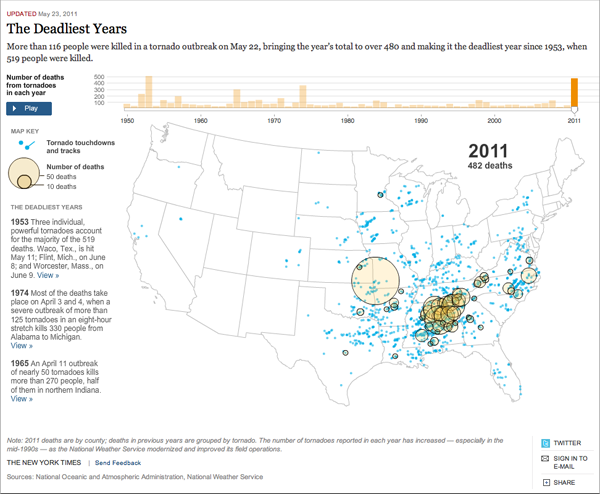
2011 appears to be the year of the tornado, with killer tornados roaming from Birmingham, Tuscaloosa, and small towns in the deep South now to Joplin, Missouri. The latter now holds the record for being the most deadly, 117 confirmed deaths, in US-recorded history.
The New York Times, in its coverage of the aftermath—and the potential for more destruction with the forecasted weather—has mapped, charted, and animated data from the National Weather Service (NWS) and the National Oceanic and Atmospheric Administration (NOAA) to illustrate the totality of the devastation witnessed this year.
The piece makes use of a map to illustrate where tornados struck and then their subsequent track, relevant geographic data, and that matches that with known fatalities using the always popular area of a circle datapoints. I am less keen on these for their cross-comparable nature, but here, in this instance, that is less the focus than the overall number of deaths and their locations. Then we also have the dataset over time with the noted caveats that, one, only in 2011 are deaths linked to counties rather than tornados as in all years past and, two, that as our ability to detect and record tornados has increased, we have more data with which to work. In short, it is not necessarily true that 1953 had less tornados than 2011.

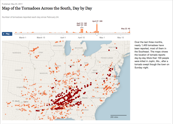
Given the severity of the current year, and this outbreak in particular, the New York Times also created a smaller, but by no means lesser, piece to highlight just those tornados striking the Southeast. This piece maps the tornados by touchdown, date, and time. Omitted is data on fatalities or damage. However, this piece complements the larger, broader view of the above by breaking down the 2011 year, thus far, into increments of days. This is a great complementary piece that, by being separate from the first piece, allows each to shine in its own respective area.

Credit to this second piece goes to Archie Tse, Matt Ericson, and Alan McLean.
Leave a Reply
You must be logged in to post a comment.