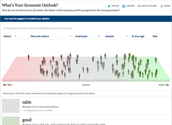
How do you feel about the economy?

The New York Times has posted an interesting interactive visualisation detailing the sentiment expressed by participants—defaulting to the most recent 100—answering several questions on the state of the economy. As a survey, this is—and it is framed as such—an unscientific sampling of trending opinions of only those who feel inclined to comment and are registered members of the New York Times.
What makes this more interesting is the ability to demographically filter the responses to find, for example, that the unemployed feel worse about their job status than the employed…perhaps that is not the best of examples, but, hey, it works.
One can also find the specific response tied to a marker on the field/band/spectrum of responses by mousing over and then clicking on the symbol. A little and unfortunate quirk here is that clicking on the person forces one down the page to the specific comment, but then leaves one with no easy way of returning to the broader picture short of scrolling all the way back to the top.
Leave a Reply
You must be logged in to post a comment.