Guess what? It’s Christmas season.
I am taking two weeks holiday starting tomorrow and so posting here shall be rather light until early January.
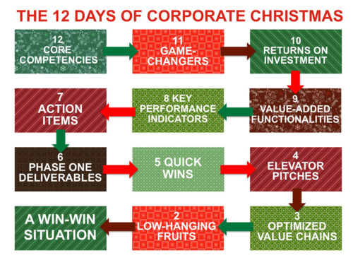
In business world, people like PowerPoint presentations with charts that show the flow of synergy. Scales of efficiency. Action item prioritisation. The kinds of things that the rest of us don’t every really need or want to understand. But, at happyplace.com, they have posted a series of Christmas charts and graphs that would feel right at home in such a presentation. Below is a flowchart showing the progression of the 12 Days of Corporate Christmas.

Leave a Reply
You must be logged in to post a comment.