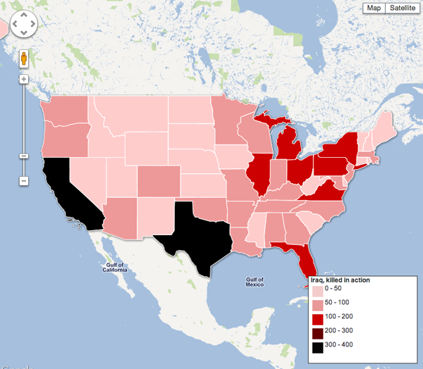
The Iraq War is over. And now it is time to reflect on what we have gained and what we have lost. This map by the Guardian details the number of soldiers killed in action in Iraq. (Other options include total wounded, killed by non-hostile, &c.)

Unfortunately, I call it a ‘no kidding’ type of map. The data, accessible via the Guardian here, corresponds nicely with a list of states by total population. Of the top ten countries in KIA, only Virginia is not among the top ten in population; it is 12th. The country thus not in the top ten in KIA, but in population is North Carolina. It’s rank in terms of KIA? 11th.
The data is interesting and worth depicting if we are to reflect. But, perhaps a more suitable visualisation could have been chosen.
On a personal note, these Google Maps overlays are annoying when, in the cases of, e.g., Wisconsin and Massachusetts, the shapes are incorrect. Perhaps coastlines are not as easy as states with ‘straight lines’ for boders, but we would do well to try and make irregular coasts at least somewhat correct.
Leave a Reply
You must be logged in to post a comment.