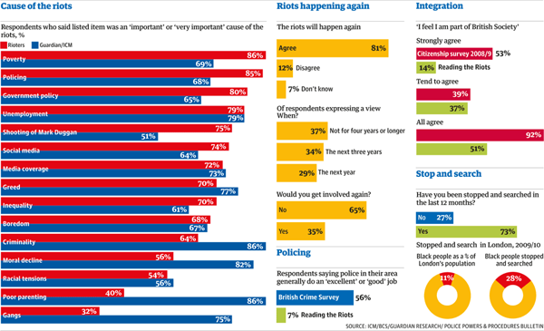
The riots in the UK earlier this year prompted questions about British society and the causes behind the riots. The Guardian has been reporting on different elements of the riots for some time now and has released the results of their work on discovering those causes. And naturally, survey results should be visualised for more awesomeness.

The discrepancies between the causes should be interesting. However, the number of bars and their tight spacing along with contrasting colours makes me wonder if the chart would be more effective not if it plotted the value of the responses, but rather the value of the difference in the responses.
Leave a Reply
You must be logged in to post a comment.