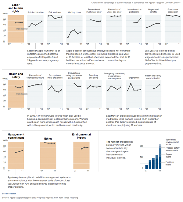
American companies have long been moving their manufacturing overseas. Apple is no exception. However, Apple does audit its suppliers to ensure they are in compliance with the company’s code of conduct. The New York Times reported on this and included a graphic along with its article.

We have small multiples of line charts with small blurbs of text to highlight key stories. Clean, clear, and communicative. I contrast this with the number of charts one might see in business presentations, which presumably would have similar content in terms of audits and performance for a company, where these lines would normally be smashed together into one chart. At that point lines become indistinguishable from each other and the individual stories are missed among a muddle of a main story. Furthermore, in my experience, a business presentation would make full use of the width of the medium, in this case some 900 pixels or so. And for this story in particular that would mean, at most, by my count, 900 pixels for 5 plotted points in a timeline.
Seeing work like this is refreshing.
Leave a Reply
You must be logged in to post a comment.