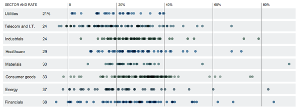
Part of the State of the Union was about the administration’s plan to lower the corporate tax rate while closing loopholes and ending subsidies. The goal is to lower the corporate tax rate from 35% to 28% without losing revenue.
Along with the New York Times article about the proposal the Times offers a graphic showing the amount of taxes paid by almost all members of the S&P 500. This includes local, state, federal, and foreign taxes and over earnings from 2005 to 2010. The visualisation is a simple dot plot showing the distribution of tax rates for the various companies, grouped into economic sectors.

Leave a Reply
You must be logged in to post a comment.