Houses are meant to be lived in. Which is good to know if you’re a real estate investor because the housing market in the US is still not so good. According to an article in the New York Times, we’re back to 2003 levels (on average of course) for single-family homes.
Accompanying the article is an interactive chart that lets users view the full breadth of the survey while highlighting specific markets of interest and showing actual values along the length of the chart.
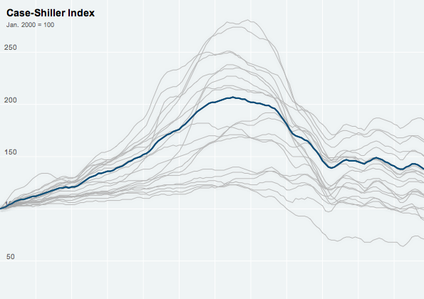
Credit for the piece goes to Kevin Quealy and Jeremy White.
Author: Brendan Barry
I am a graphic designer who focuses on information design. My day job? Well, they asked me not to say. But to be clear, this blog is my something I do on my own time and does not represent the views of…my employers. I think what I can say is that given my interest in information design—be it in the shape of clear charts, maps, diagrams, or wayfinding systems—I am fortunate that my day job focuses on data visualisation. Outside of work, I try to stay busy with personal design work. Away from the world of design, I have become an amateur genealogist and family historian. You will sometimes see that area of work bleed into my posts.
View all posts by Brendan Barry