Missing Planets

In science news, we turn to graphics about planets and things. Specifically we are talking about exoplanets, i.e. planets that exist outside our solar system. Keep in mind that we have only been able to detect exoplanets since the 1990s. Prior to then, how rare was our system with all our planets? It could have been very rare. Now we know, probably not so much.

But, in all of that discovery, we are missing entire types of planets. This article published by Forbes does a nice job explaining why. But one of the key types of planets that we have been unable to discover heretofore have been: intermediately distant, giant planets. Think the Jupiters and Saturns of our system. Prior to now we could detect massive Jupiter-like planets orbiting super near to their distant stars. Or, we could detect super massive planets orbiting very far away. The in-betweeners? Not so much.
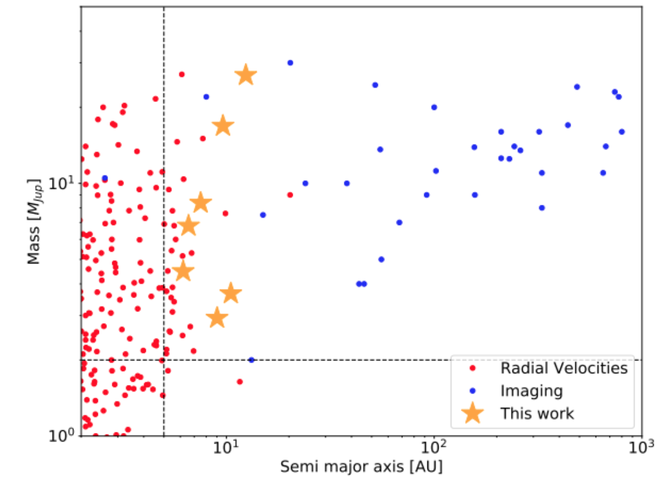
There's still a pretty wide gap out there…
There’s still a pretty wide gap out there…

The above screenshot does a good job of showing where new detection methods have allowed scientists to begin to fill in the gaps. It shows how there is an enormous gap between what we have discovered and how they have been discovered. And the article does a nice job explaining how the science works in that only now with our longer periods of observation will help resolve certain issues.

From a design standpoint, this isn’t a super complicated graphic. It does rely upon a logarithmic scale, which isn’t common in non-scientific or academic papers. But this graphic comes from that environment, so it makes a lot of sense. The article is full of graphics from third-party sources, but I found this the most informative because of that very gap it highlights and how the new work (the stars) begin to fill it in.

Credit for the screenshotted piece goes to E. L. Rickman et al.

Bar Chart Bombshells

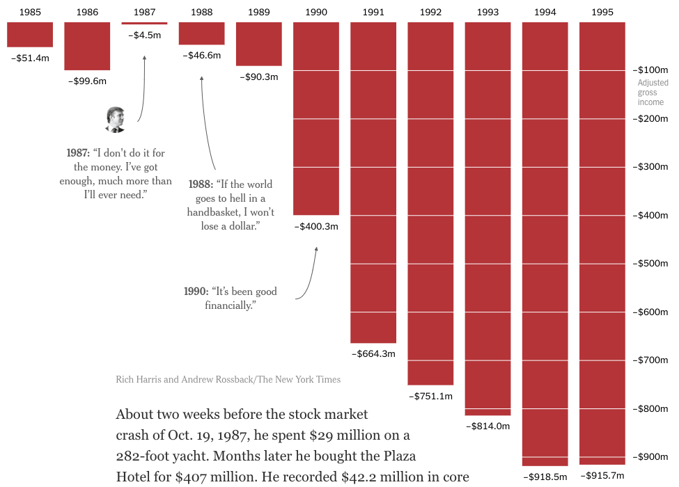
Tuesday night/Wednesday morning, the New York Times broke the story that they had some of President Trump’s tax return information. For decades now, US presidents and candidates for that office have released their tax returns for the public to inspect. Trump has refused, often claiming that they are under audit from the IRS and then adding, and falsely claiming, they cannot be released whilst under audit. Consequently, when the Times publishes an article at the secret world of Trump’s finances, it’s a big news thing.

Unfortunately, the Times only had access to what are essentially summary transcripts of the returns. And only for a period in the mid-1980s through mid-1990s. So we cannot get the granular data and make deeper insights. But what we did get was turned into this bold graphic in the middle of the article.

That's a whole lotta red. And not the good kind for a Republican.
That’s a whole lotta red. And not the good kind for a Republican.

Conceptually, there is not much to say. The bar charts are a solid choice to represent this kind of data. Red makes sense given the connotation of “being in the red”. And the annotations providing quotes from Trump about his finances for the years highlighted provide excellent context.

What the screenshot does not truly capture, however, is the massiveness of the chart in the context of the rest of the article. It’s big, bold, and red. That design choice instead of, say, making it a smaller sidebar-like graphic, goes a long way in hitting home the sheer magnitude of these business losses.

Sometimes it’s not always fancy and shiny charts that garner the most attention. Sometimes an old staple can do wonders.

Credit for the piece goes to Rich Harris and Andrew Rossback.

Trump-won Counties Are Winning

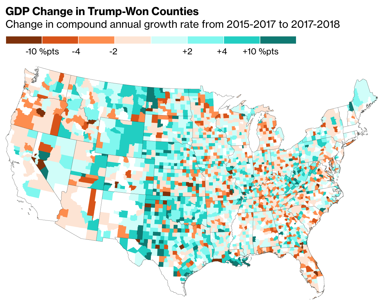
Yesterday we looked at how China and the European Union are planning their tariff/trade war retaliation to target Trump voters. Today let’s take a look at how those voters are doing as this article from Bloom does.

Lots of green, but some noticeably red counties in Florida.

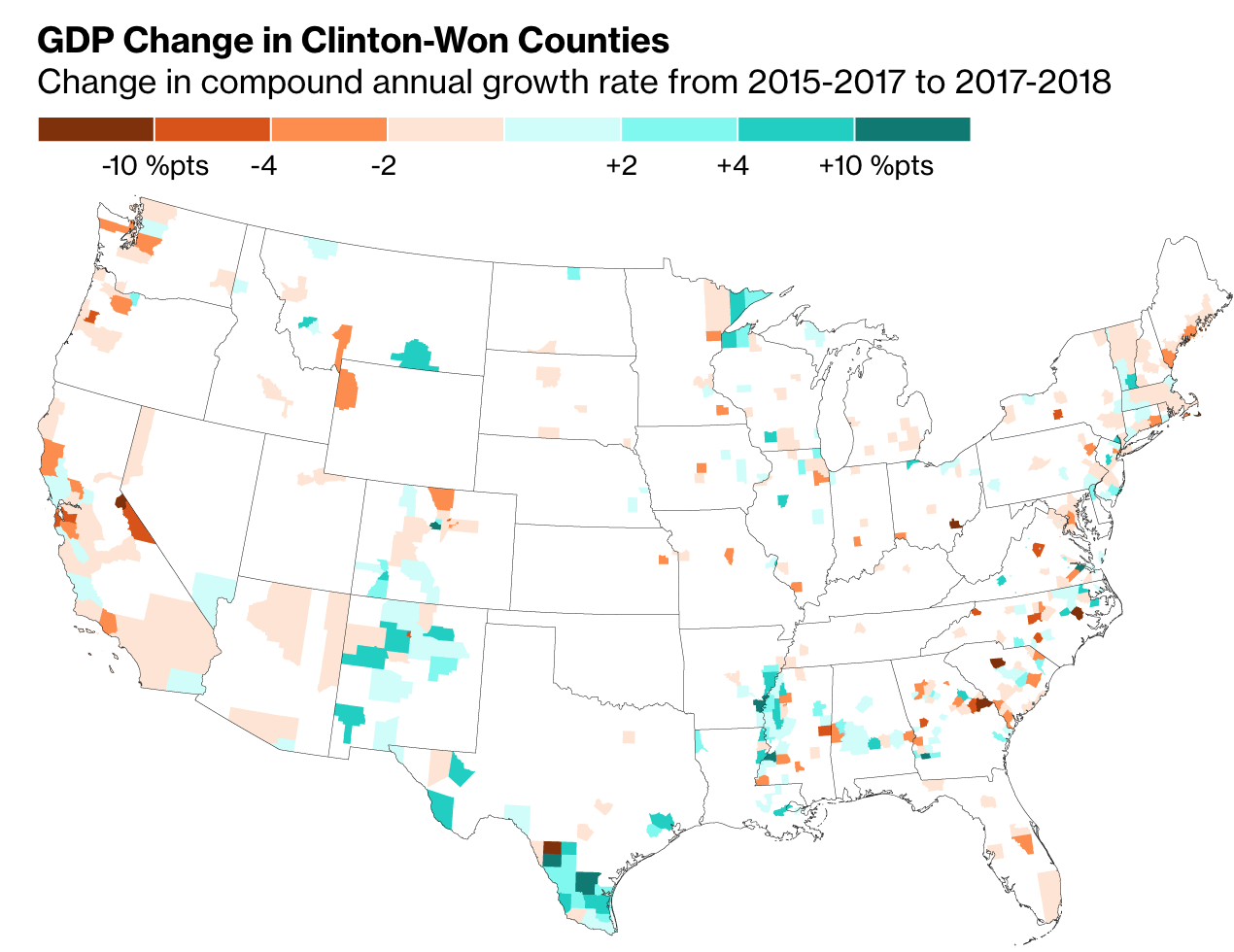
The article is not terribly complicated. We have four choropleth maps at the county level. Two of the maps isolate Trump-won counties and the other two are Clinton-won. For each candidate we have a GDP growth and an employment growth map.

In the Trump-won maps, the Clinton-won counties are white, and vice versa. Naturally, because the Democratic vote is greatest in the large cities, which, especially on the East Coast, are in tiny counties, you see a lot less colour in the Clinton maps.

Not a whole lot to see here…

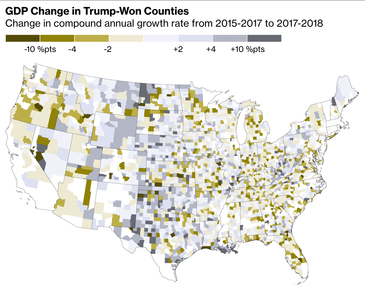
Design wise, I should point out the obvious that green-to-red maps are not usually ideal. But the designers did a nice job of tweaking these specific colours so that when tested, these burnt oranges and green-blues do provide contrast.

Here they appear more of a yellow to grey

But I am really curious to see this data plotted out in a scatter plot. Of course the big counties in the desert southwest are noticeable. But what about Philadelphia County? Cook County? Kings County? A scatter plot would make them equally tiny dots. Well, hopefully not tiny. But then when you compare GDP growth and employment growth and benchmark them against the US average, we might see some interesting patterns emerge that are otherwise masked behind the hugeness of western counties.

But lastly. And always. Where. Are .Alaska. And. Hawaii? (Of course the hugeness problem is of a different scale in Hawaii. Their county equivalents are larger than states combined.)

Credit for the piece goes to the Bloomberg graphics department.

Trade War Retaliation

About a week and a half ago the Economist published an article about the retaliatory actions of the European Union and China against the tariffs imposed by the Trump administration. Of course last week we had a theme of sorts with lineages and ancestry. So this week, back to the fun stuff.

What makes today’s piece particularly relevant is that over the weekend, Trump announced he might increase the tariffs proposed, but not yet implemented, upon Chinese goods. So some economists looked at the retaliatory tariffs proposed by the EU and China.

Ultimately Trump's tariffs are not paid by foreign governments, but by US citizens.
Ultimately Trump’s tariffs are not paid by foreign governments, but by US citizens.

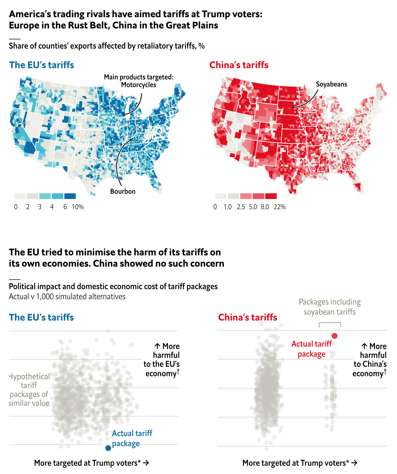
Each targets Trump voters, albeit of different types. But China appears more willing to engage in a brutal fight. Its tariff proposal would not just harm Trump voters, but would also harm Chinese citizens. The EU’s plan appears tailored to maximise the pain on Trump voters, but minimise that felt by its own citizens.

A few minor points. I like how the designers chose to highlight high impact categories with colour. Lower impact shares are two shades of light grey. But after that, the scale changes. I wonder how the maps would compare if each had been set to the same scale. It looks doable as the bottom range of the maximum bin is 6% for the EU and 8% for China. (Their high limit is much higher at 22% compared to the EU’s 10%.)

That said, it does a good job of showing the different geographic footprints of the two retaliatory tariff packages. Tomorrow—barring breaking news—we will look at why that is important.

Credit for the piece goes to the Economist Data Team.

The Great Migration Map

Yesterday in a post about Angela’s forced journey from Africa to Jamestown I mentioned that the Pilgrims arrived at Plymouth Bay just one year later in 1620. From 1620 until 1640 approximately 20,000 people left England and other centres like Leiden in the Netherlands for New England. Unlike places like Jamestown that were founded primarily for economic reasons, New England was settled for religious reasons. Consequently, whereas colonies in Virginia drew young men looking to make it rich—along with slaves to help them—New England saw entire families moving and transplanting parts of towns and England into Massachusetts, Rhode Island, Connecticut, and New Hampshire.

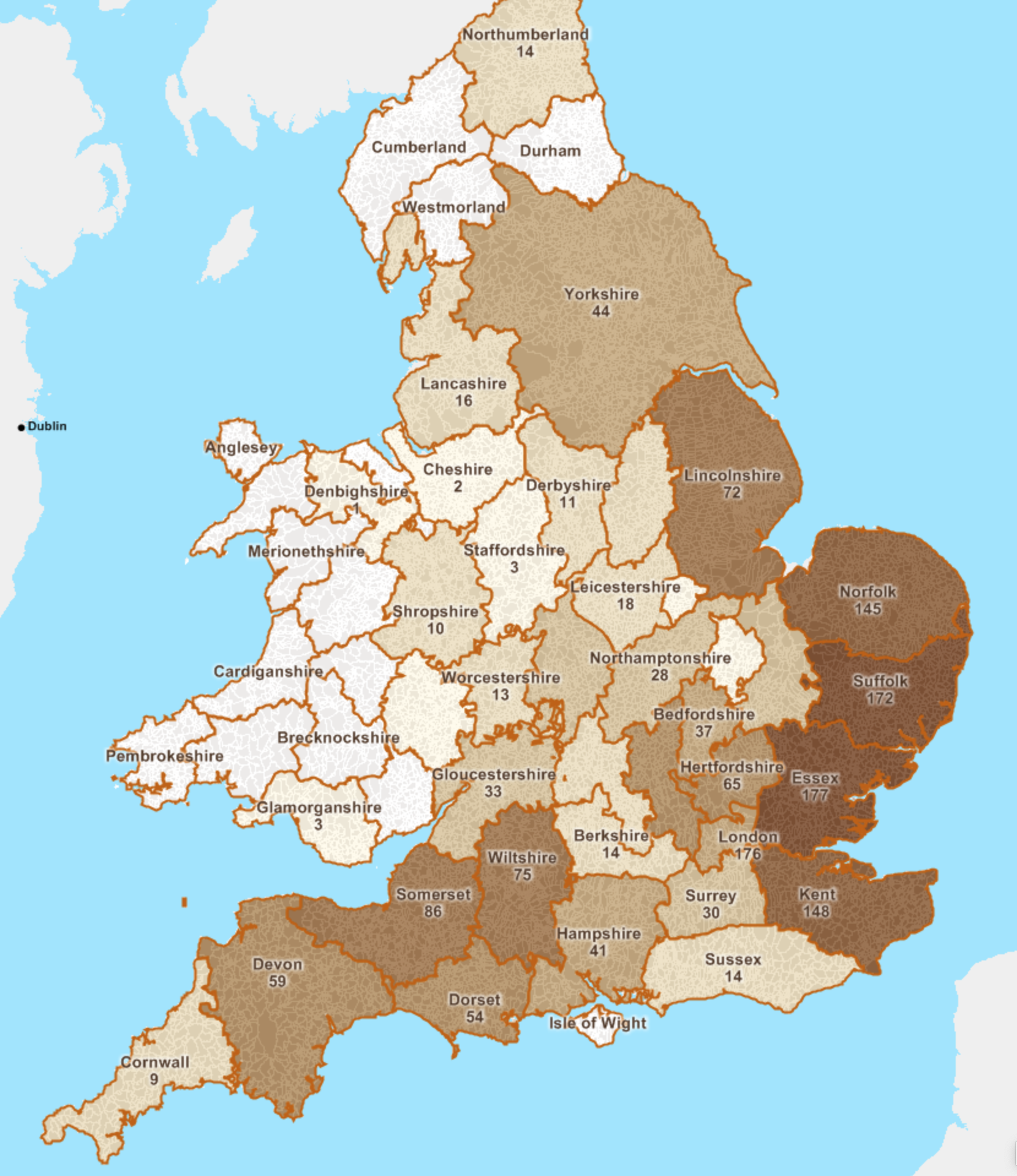
New England kept fantastic records and we know thousands of people. But we do not know whence everyone arrived, but we do know a few thousand. And this mapping project from American Ancestors attempts to capture that information at the English parish level. At its broadest level it is a county-level choropleth that shows, for those for whom we have the information, the majority of the migration, called the Great Migration, came from eastern England, with a few from the southwest.

Quite a few from Norfolk, Suffolk, and Essex

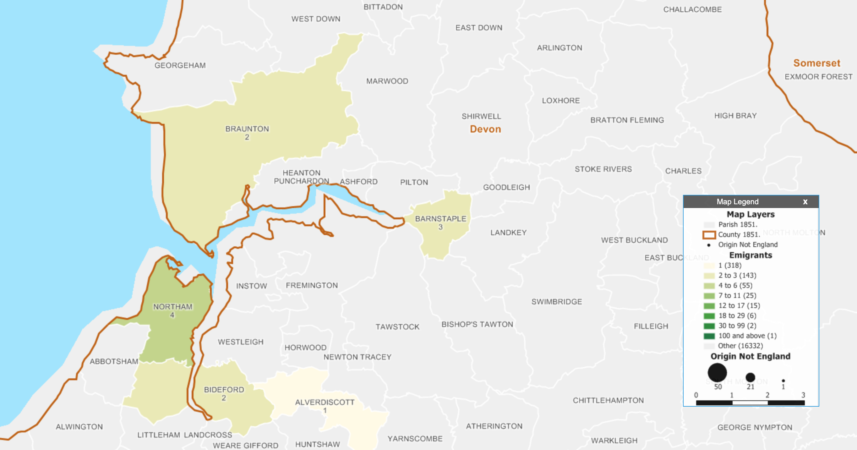
You can also search for specific people, in which case it brings into focus the county and the parishes within that have more detail. In this case I searched for my ancestor Matthew Allyn, who was one of the founders of Hartford, Connecticut. He came from Braunton in Devon and consequently appears as one of the two people connected to that parish.

Devon did not have nearly as many people emigrate as the eastern counties
But was Thomas related to Matthew? We don't know.
But was Thomas related to Matthew? We don’t know.

Overall, it’s a nice way of combining data visualisation and my interest/hobby of genealogy. The map uses the historical boundaries of parishes prior to 1851, which is important given how boundaries are likely to change over the centuries.

This will be a nice tool for those interested in genealogy and that have ancestors that can be traced back to England. I might be biased, but I really like it.

Credit for the piece goes to Robert Charles Anderson, Giovanni Flammia, Peter H. Van Demark.

Angela from Jamestown

Today we move from royalty to slavery. Earlier this week the Washington Post published an article about an African woman (girl?) named Angela. She was forcibly removed from West Africa to Luanda in present-day Angola. From there she was crammed into a slave ship and sent towards Spanish colonies in the Caribbean. Before she arrived, however, her ship was intercepted by English pirates that took her and several others as their spoils to sell to English colonists.

The article is a fascinating read and for our purposes it makes use of two graphics. The one is a bar chart plotting the Atlantic slave trade. It makes use of annotations to provide a rich context for the peaks and valleys—importantly it includes not just the British colonies, but Spanish and Portuguese as well.

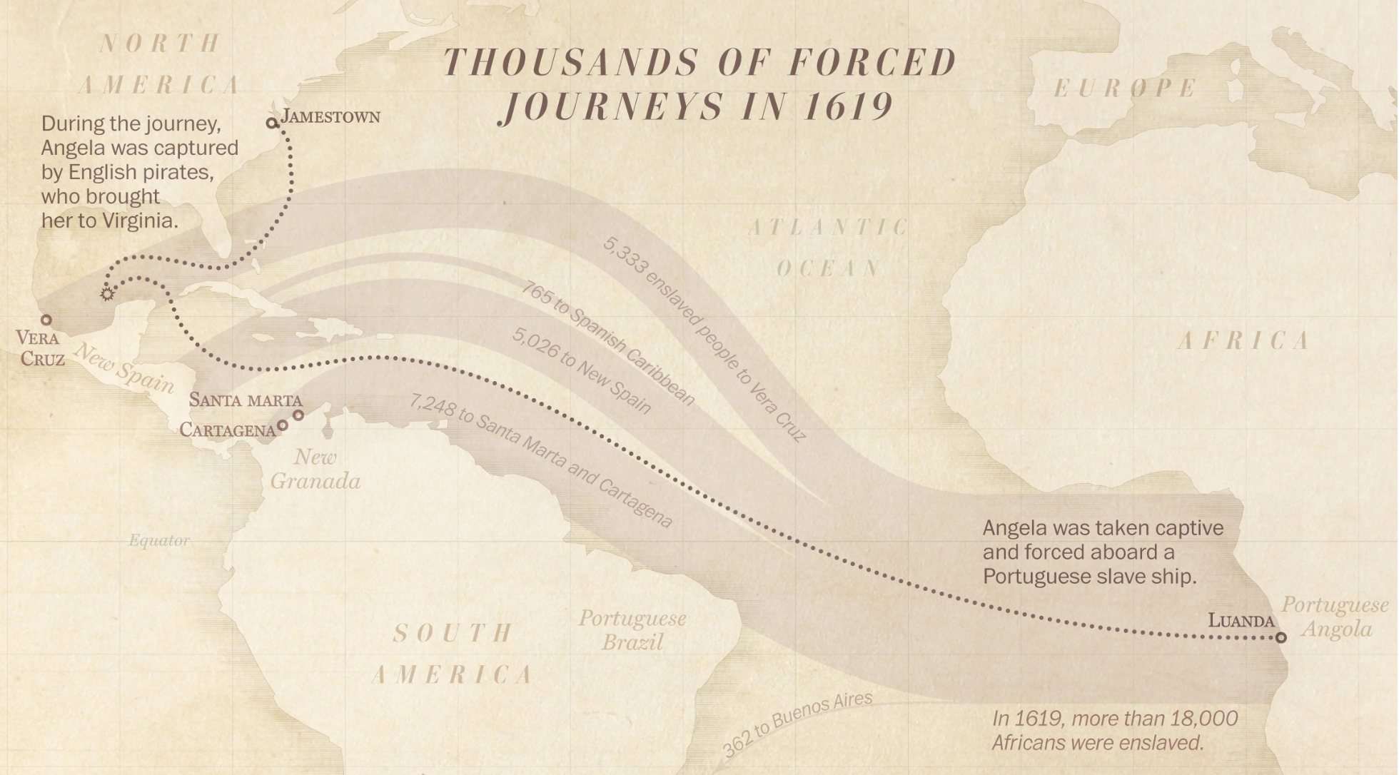
My favourite, however, is the Sankey diagram that shows the trade in 1619 specifically, i.e. the year Angela was transported across the Atlantic.

Too many people took similar routes to the New World.

It takes the total number of people leaving Luanda and then breaks those flows into different paths based on their geographic destinations. The width of those lines or flows represents the volume, in this case people being sold into slavery. That Angela made it to Jamestown is surprising. After all, most of her peers were being sent to Vera Cruz.

But the year 1619 is important. Because 2019 marks the 400th anniversary of the first slaves being brought into Jamestown and the Virginia colony. The Pilgrims that found Plymouth Bay Colony will not land on Cape Cod until 1620, a year later. The enslavement of people like Angela was built into the foundation of the American colonies.

The article points out how work is being done to try and find Angela’s remains. If that happens, researchers can learn much more about her. And that leads one researcher to make this powerful statement.

We will know more about this person, and we can reclaim her humanity.

For the record, I don’t necessarily love the textured background in the graphics. But I understand the aesthetic direction the designers chose and it does make sense. I do like, however, how they do not overly distract from the underlying data and the narrative they present.

Credit for the piece goes to Lauren Tierney and Armand Emamdjomeh.

Who Bettors Think Will Sit Upon the Iron Throne

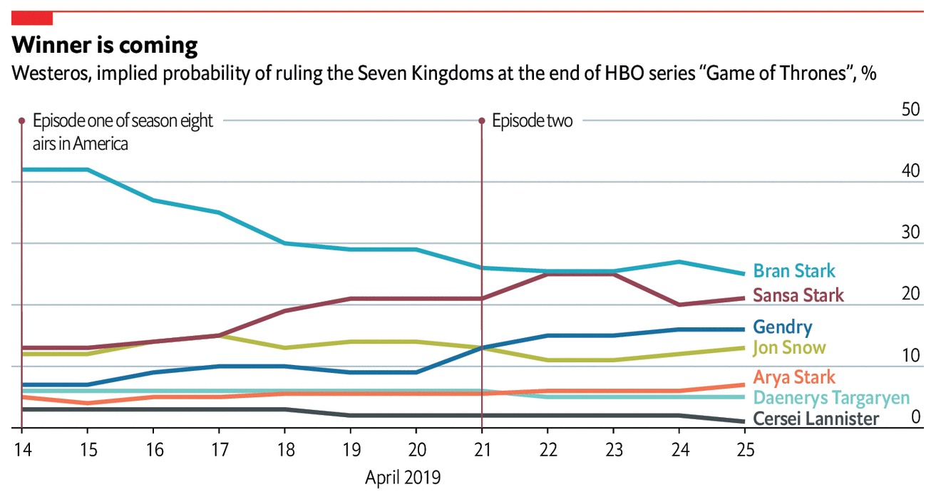
Last night was the third episode of the final series of Game of Thrones and thus marked its midway point. I shall save you from any spoilers, but I thought we could do a lighter post to start the week. This comes from the Economist and simply plots the characters and their implied probability of winning the Iron Throne.

What about Young Griff?

For me, there are too many lines, too many colours and we get the usual spaghettification. But, c’mon, it’s a chart about Game of Thrones. That said, some small multiple grid of characters, sorted by probability would be pretty neat.

Credit for the piece goes to the Economist’s graphics department.

American Nuclear Generating Stations

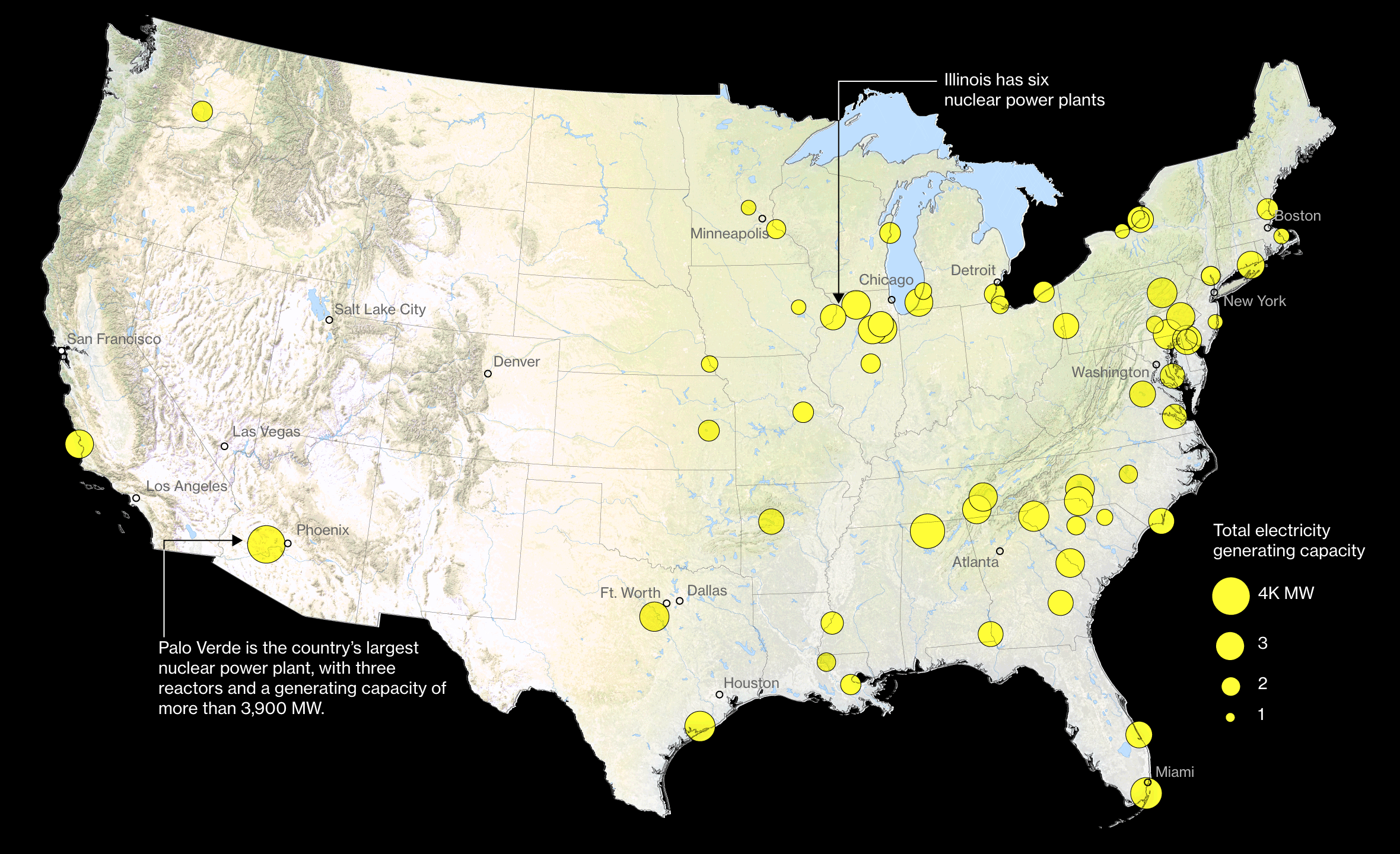
Those that have followed me for a long time know that I am a big fan of nuclear power. It does have some drawbacks, namely its radioactive waste, but otherwise creates enormous amounts of stable, carbon-free electricity. So when I saw this article from Bloomberg about the impact of climate change on US nuclear powered electricity generating station. It makes use of a number of nice maps to show that, yeah, not good things.

Pennsylvania is a big state for nuclear power

I normally am not a huge fan of scaling circle size to the data point, but here it makes sense since the circles are tied to the geographical location. Like I mentioned with the one Notre Dame graphic, I’m not sure the advantage of the black background, but it could be that there is a benefit to the contrast over the white background.

There are additional maps in the piece that look at a few specific locations in a moderate hurricane and the expected storm surge. Again, not good. These also use light colours on a dark background.

Credit for the piece goes to Christopher Flavelle and Jeremy C.F. Lin.

Redaction Action

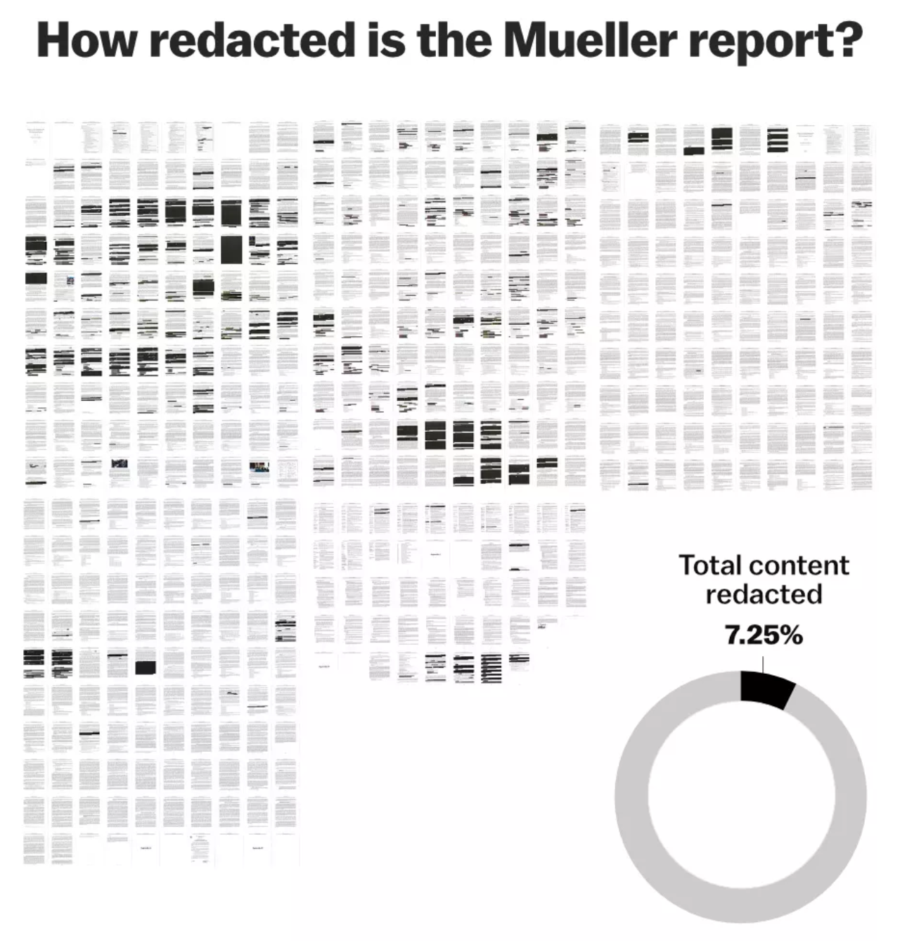
Last week, the Department of Justice released the Mueller Report. It was—and still is—sort of a big deal. But this week I want to take a look at a few different approaches to covering the report in the media. We will start with a piece from Vox on the redactions in the report. After all, we only know what we know. And we know there is about 7% of the report we do not know. And we do not know what we do not know.

7% is still a fair amount of black when it's concentrated in one section.
7% is still a fair amount of black when it’s concentrated in one section.

The above graphic looks at overall redactions as images of each page show how much was withheld from the public. Then we have a small donut chart to show that 7.25% was redacted. Did it need to be a donut? No. A simple factette could have worked in its place. It could be worse, though, it could be a similarly sized pie chart.

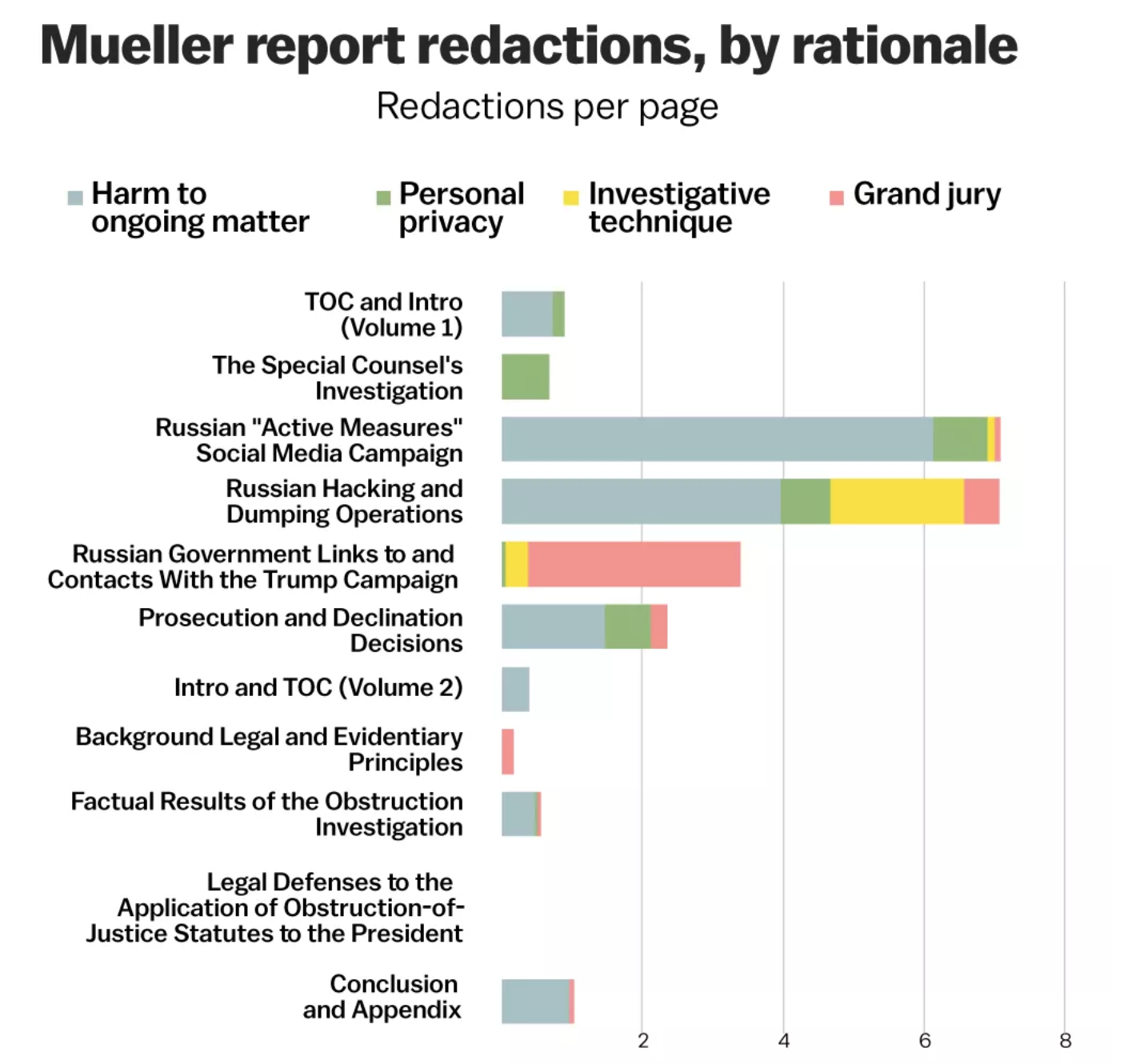
The rest of the article moves on to a more detailed analysis of the redactions, by section, type, &c. And this screenshot is one of the more interesting ones.

Different coloured sharpies

Fundamentally we have stacked bars here, with each section’s redactions per page broken down by type. And that is, on the one hand, useful. Of course, I would love to see this data separated out. That is, show me just “investigative technique” and filter out the rest. Imagine if instead of this one chart we had four slightly smaller ones limited to each type of redaction. Or, if we kept this big one and made four smaller ones showing the redaction types.

Overall the article does a really nice job of showing us just what we don’t know. Unfortunately, we ultimately just don’t know what we don’t know.

Credit for the piece goes to Alvin Chang and Javier Zarracina.

An Illustrated Guide to the Deaths in Game of Thrones

Did something important happen yesterday in the news? We’ll get to it. But for now, it’s Friday. You’ve made it to the weekend. So sit back and binge. On gin or Game of Thrones, whatever.

Last Sunday the hit HBO show Game of Thrones returned for its final series. I did not have time to post about this piece then, but thankfully, not much has changed.

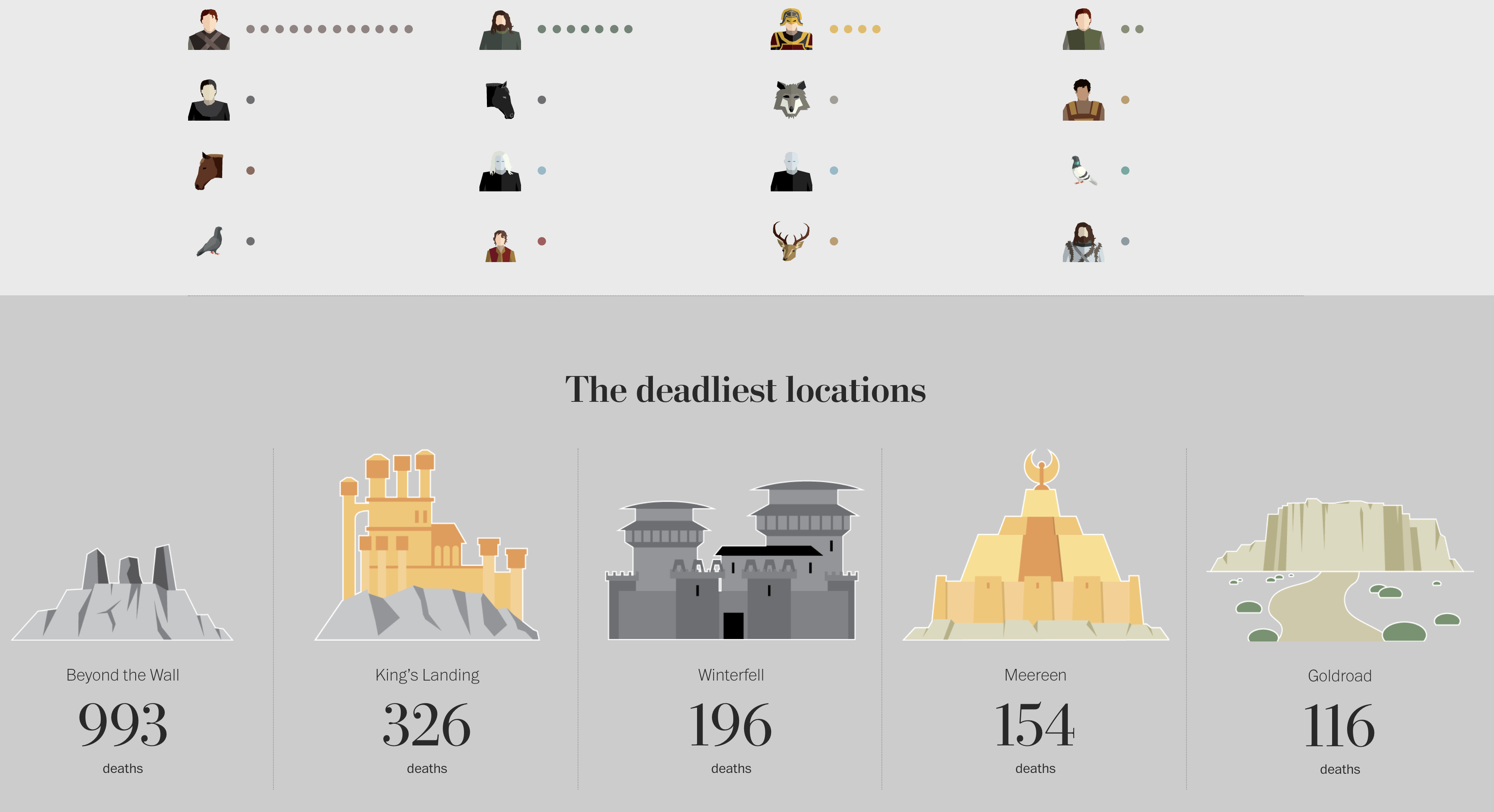
It details all the on-screen deaths in the show. (Spoiler: a lot.) It includes the series in which they died, the manner of their death, who killed them, and some other notable information. Remarkably, it is not limited to the big characters, e.g. Ned Stark. (If that is a spoiler to you, sorry, not sorry.) The piece captures the deaths of secondary and tertiary characters along with background extras. The research into this piece is impressive.

Don’t worry, if you haven’t seen the show, this spoils only some extras and I guess the locations the show has, well, shown.

Don't go beyond the Wall
Don’t go beyond the Wall

Thankfully, by my not so rigourous counting, last week added only four to the totals on the page (to be updated midway and after the finale).

In terms of data visualisation, it’s pretty straightforward. Each major and minor character has an illustration to accompany them—impressive in its own right. And then extras, e.g. soldiers, are counted as an illustration and circles to represent multiples.

For me, the impressive part is the research. There is something like over 60 hours of footage. And you have to stop whenever there is a battle or a a feast gone awry and count all the deaths, their manners, identify the characters, &c.

Credit for the piece goes to Shelley Tan.