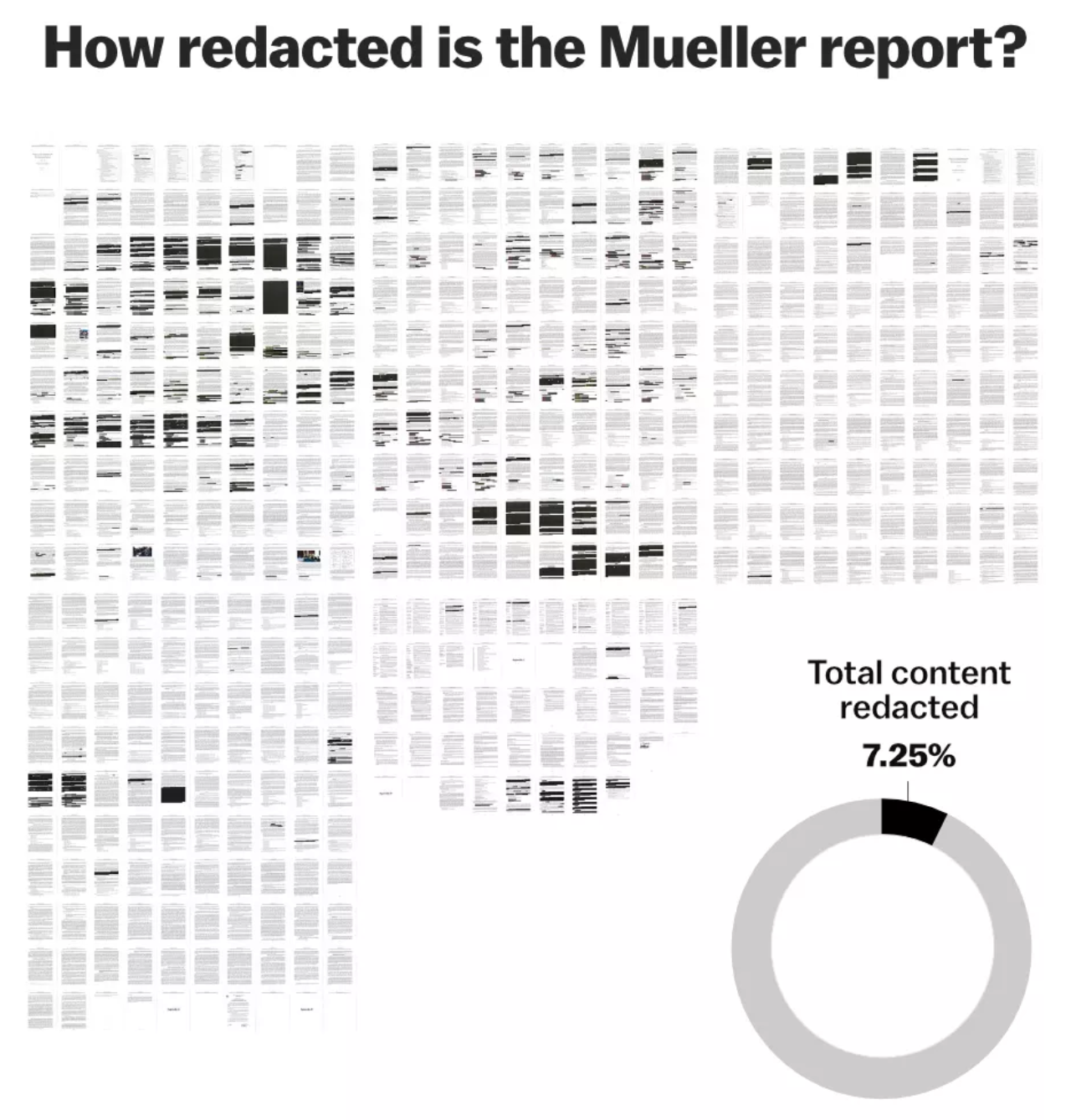
Last week, the Department of Justice released the Mueller Report. It was—and still is—sort of a big deal. But this week I want to take a look at a few different approaches to covering the report in the media. We will start with a piece from Vox on the redactions in the report. After all, we only know what we know. And we know there is about 7% of the report we do not know. And we do not know what we do not know.

The above graphic looks at overall redactions as images of each page show how much was withheld from the public. Then we have a small donut chart to show that 7.25% was redacted. Did it need to be a donut? No. A simple factette could have worked in its place. It could be worse, though, it could be a similarly sized pie chart.
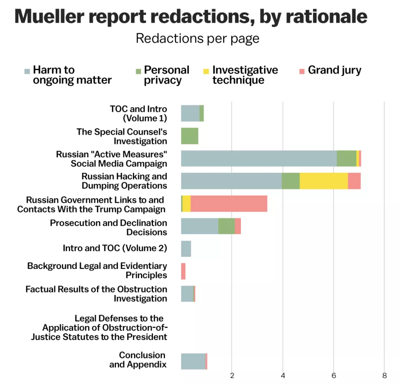
The rest of the article moves on to a more detailed analysis of the redactions, by section, type, &c. And this screenshot is one of the more interesting ones.

Fundamentally we have stacked bars here, with each section’s redactions per page broken down by type. And that is, on the one hand, useful. Of course, I would love to see this data separated out. That is, show me just “investigative technique” and filter out the rest. Imagine if instead of this one chart we had four slightly smaller ones limited to each type of redaction. Or, if we kept this big one and made four smaller ones showing the redaction types.
Overall the article does a really nice job of showing us just what we don’t know. Unfortunately, we ultimately just don’t know what we don’t know.
Credit for the piece goes to Alvin Chang and Javier Zarracina.
Leave a Reply
You must be logged in to post a comment.