Tuesday night/Wednesday morning, the New York Times broke the story that they had some of President Trump’s tax return information. For decades now, US presidents and candidates for that office have released their tax returns for the public to inspect. Trump has refused, often claiming that they are under audit from the IRS and then adding, and falsely claiming, they cannot be released whilst under audit. Consequently, when the Times publishes an article at the secret world of Trump’s finances, it’s a big news thing.
Unfortunately, the Times only had access to what are essentially summary transcripts of the returns. And only for a period in the mid-1980s through mid-1990s. So we cannot get the granular data and make deeper insights. But what we did get was turned into this bold graphic in the middle of the article.
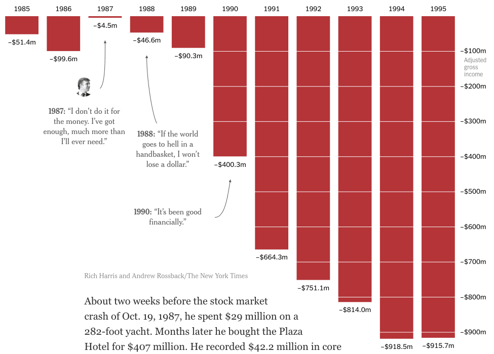
Conceptually, there is not much to say. The bar charts are a solid choice to represent this kind of data. Red makes sense given the connotation of “being in the red”. And the annotations providing quotes from Trump about his finances for the years highlighted provide excellent context.
What the screenshot does not truly capture, however, is the massiveness of the chart in the context of the rest of the article. It’s big, bold, and red. That design choice instead of, say, making it a smaller sidebar-like graphic, goes a long way in hitting home the sheer magnitude of these business losses.
Sometimes it’s not always fancy and shiny charts that garner the most attention. Sometimes an old staple can do wonders.
Credit for the piece goes to Rich Harris and Andrew Rossback.
Leave a Reply
You must be logged in to post a comment.