Did something important happen yesterday in the news? We’ll get to it. But for now, it’s Friday. You’ve made it to the weekend. So sit back and binge. On gin or Game of Thrones, whatever.
Last Sunday the hit HBO show Game of Thrones returned for its final series. I did not have time to post about this piece then, but thankfully, not much has changed.
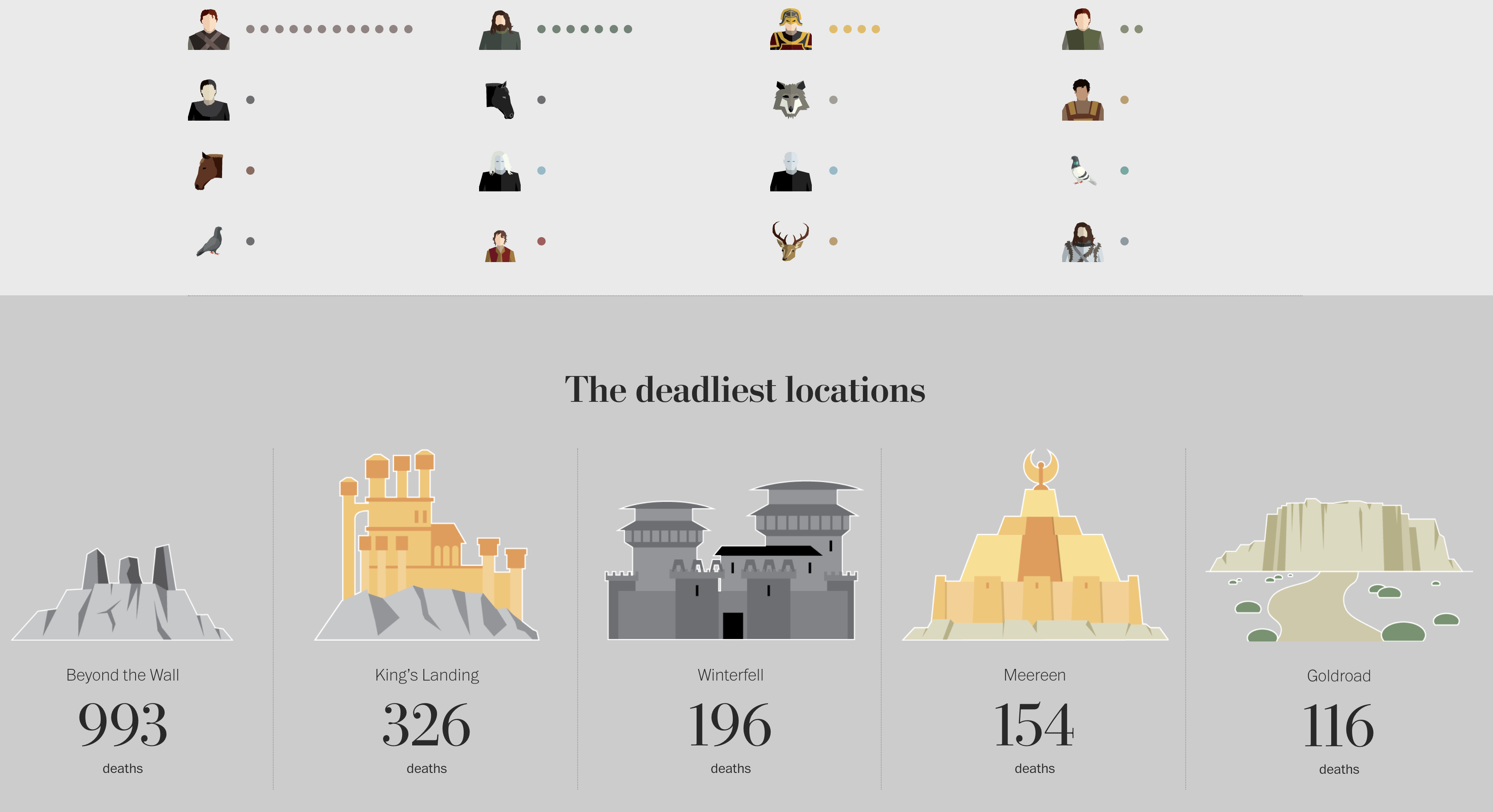
It details all the on-screen deaths in the show. (Spoiler: a lot.) It includes the series in which they died, the manner of their death, who killed them, and some other notable information. Remarkably, it is not limited to the big characters, e.g. Ned Stark. (If that is a spoiler to you, sorry, not sorry.) The piece captures the deaths of secondary and tertiary characters along with background extras. The research into this piece is impressive.
Don’t worry, if you haven’t seen the show, this spoils only some extras and I guess the locations the show has, well, shown.
Thankfully, by my not so rigourous counting, last week added only four to the totals on the page (to be updated midway and after the finale).
In terms of data visualisation, it’s pretty straightforward. Each major and minor character has an illustration to accompany them—impressive in its own right. And then extras, e.g. soldiers, are counted as an illustration and circles to represent multiples.
For me, the impressive part is the research. There is something like over 60 hours of footage. And you have to stop whenever there is a battle or a a feast gone awry and count all the deaths, their manners, identify the characters, &c.
Credit for the piece goes to Shelley Tan.
Leave a Reply
You must be logged in to post a comment.