One of the long-running critiques of Fox News Channel’s on air graphics is that they often distort the truth. They choose questionable if not flat-out misleading baselines, scales, and adjust other elements to create differences where they don’t exist or smooth out problematic issues.
But yesterday a friend sent me a graphic that shows Fox News isn’t alone. This graphic came from CBS News and looked at the California recall election vote totals.
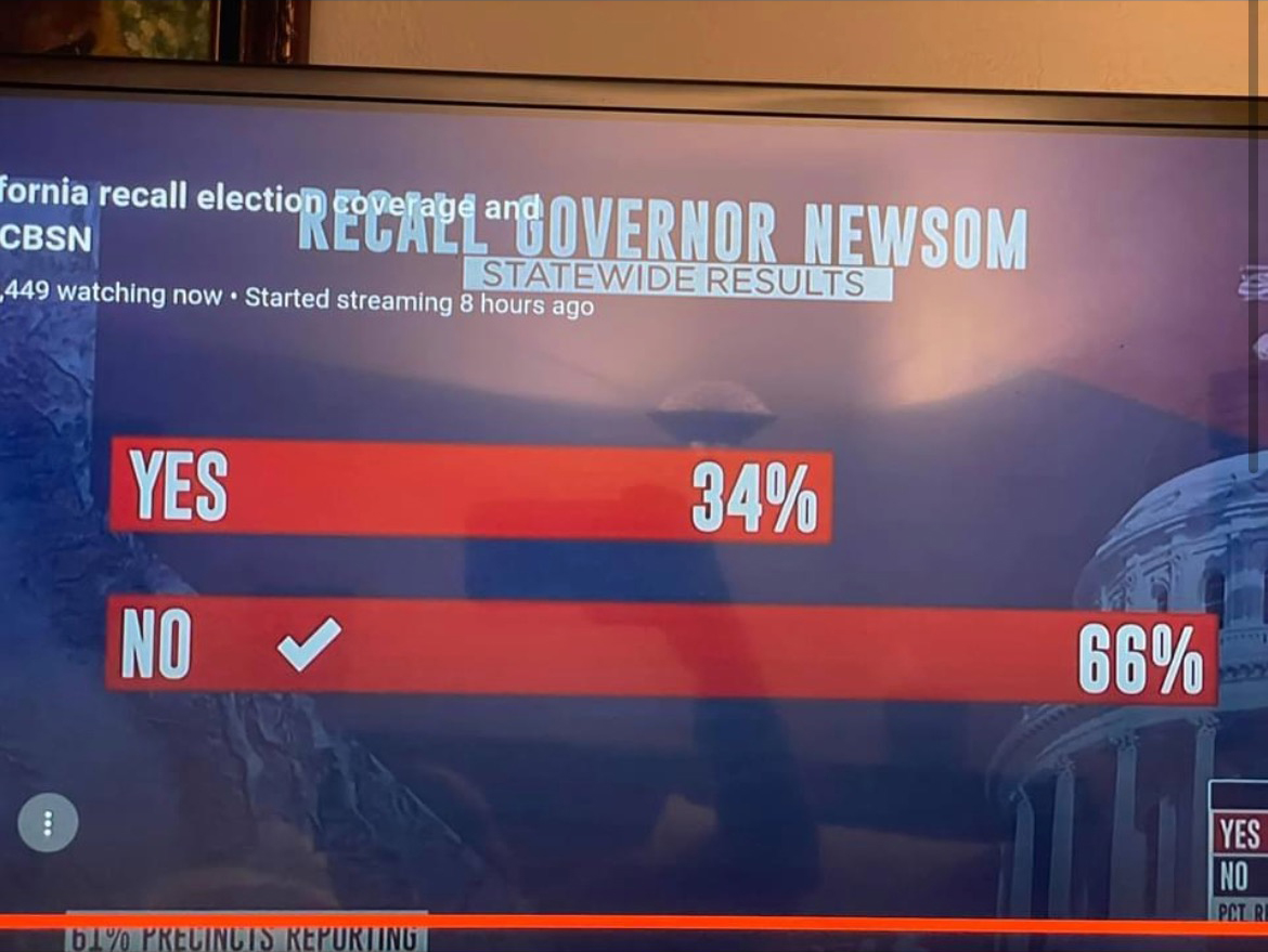
If you just look at the numbers, 66% and 34%, well we can see that 34 is almost half of 66. So why does the top bar look more like 2/3 of the length of the bottom? I don’t actually know the animus of the designer who created the graphic, but I hope it’s more ignorance or sloppiness than malice. I wonder if the designer simply said, 66%, well that means the top bar should be, like, two-thirds the length of the bottom.
The effect, however, makes the election seem far closer than it really was. For every yes vote, there were almost two no votes. And the above graphic does not capture that fact. And so my friend asked if I could make a graphic with the correct scale. And so I did.
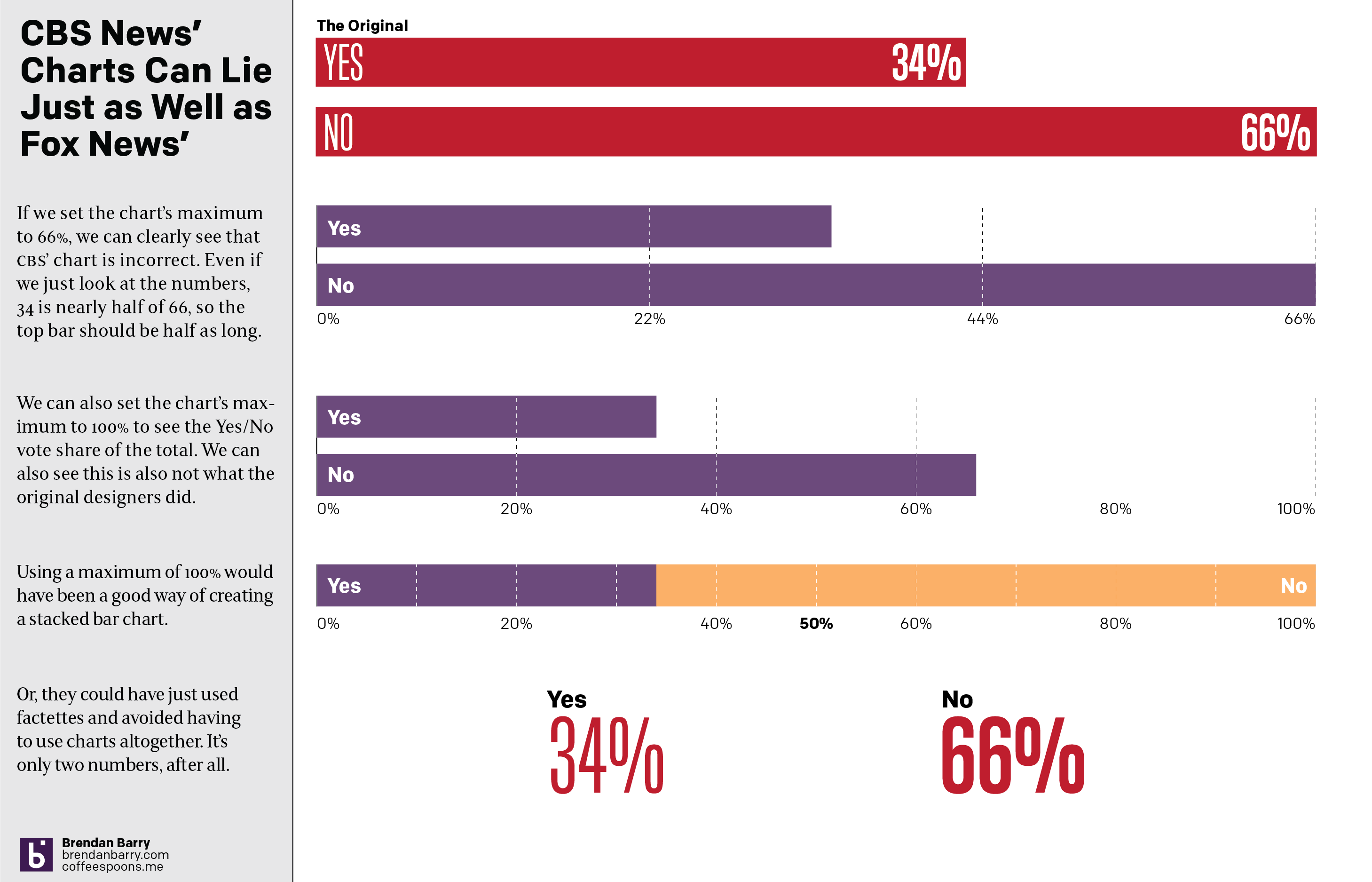
One really doesn’t need a chart to compare the two numbers. And I touch on that with the last point, using two factettes to simply state the results. But let’s assume we need to make it sexy, sizzle, or flashy. Because I think every designer has heard that request.
A simple scale of 0 to 66 could work and we can see how that would differ from the original graphic. Or, if we use a scale of 0 to 100, we can see how the two bars relate to each other and to the scale of the total vote. That approach would also have allowed for a stacked bar chart as I made in the third option. The advantage there is that you can easily see the victor by who crosses the 50% line at the centre of the graphic.
Basically doing anything but what we saw in the original.
Credit for the original goes to the CBS News graphics department.
Credit for the correction is mine.
Leave a Reply
You must be logged in to post a comment.