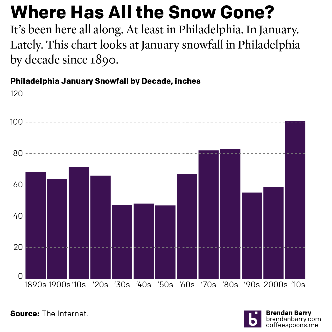
Just a Little Axis if You Please

In my last post, I commented upon a graphic from the Philadelphia Inquirer where a min/max axis line would have been helpful. This post is a quick follow-up of sorts, because a week ago I flagged something similar for me to perhaps mention on Coffee Spoons. So here I shall mention away.

We have another graphic from the Inquirer in an article about the Philadelphia region’s oppressive humidity this summer. The chart presents its information straightforwardly—bars representing the percentage of hours wherein the dew point sat above 70ºF. Muggy. Muggy as hell. Because I guarantee you the heat in Hell is a humid one. None of the dry dessert heat.

Overall, the graphic works well. It is interactive so you can mouse over the bar and read the precise data point. I love that far more than the increasingly prevalent let’s-label-every-data-point-on-the-chart-and-distract-the-eyeball-from-the-actual-pattern-of-what-is-going-on approach.

This summer has been the third muggiest in Philadelphia in the last three-quarters of a century. The designer highlighted 2025 at the end of the series—not necessary, but I can live with it. But what then stands out are the two muggiest years—two very tall bars. But note that there is no axis line above them. No upper bound. Nothing to help inform the user what percentage point they approach.

I do not always use a maximum or minimum axis line, but usually the outlier has to be extreme, and in that case I will add extra lines around that point to give the user the vital context of scale. Otherwise, the outlier should be just a wee bit above or below the line. I thought I would find a relevant example in my work quickly, but it took nearly 20 minutes of reviewing old work to find one such example.

Here you can see in Figure 6 the pink line barely and briefly rises above the 80% maximum. The reader can see the value just pokes above 80% but was otherwise below it during the entire span of time. And that works great.

Again, this is a small critique of the mugginess chart, but I feel an axis line significantly helps the reader see just how muggy those summers were. Spoiler: nearly 54% of the time was “oppressive”.

To play devil’s advocate, perhaps if the article were not about how this is third muggiest summer, the designer could have skipped adding an axis line at 60% or so. But, because such the author placed such emphasis on the third-most bit, the graphic really would benefit from the context of how the 45% thus far for 2025 compares to the top-two summers.

Credit for the piece goes to Stephen Stirling.

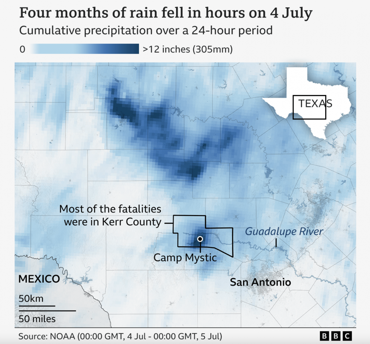
A Warming Climate Floods All Rivers

Last weekend, the United States’ 4th of July holiday weekend, the remnants of a tropical system inundated a central Texas river valley with months’ worth of rain in just a few short hours. The result? The tragic loss of over 100 lives (and authorities are still searching for missing people).

Debate rages about why the casualties ranked so high—the gutting of the National Weather Service by the administration shines brightly—but the natural causes of the disaster are easier to identify. And the BBC did a great job covering those in a lengthy article with a number of helpful graphics.

I will start with this precipitation map, created with National Oceanic and Atmospheric Administration (NOAA) data.

A map of precipitation over central Texas.

I remain less than fully enthusiastic about continual gradients for map colouration schemes, however the extreme volume of rainfall during the weather event makes the location of the flooding obvious to all. Nonetheless the designers annotated the map, pointing out river, the camp at the centre of the tragedy and the county wherein most of the deaths occurred.

In short, more than 12 inches of rain fell in less than 24 hours. The article also uses a time lapse video to show the river’s flash flooding when it rose a number of feet in less than half an hour.

The article uses the captivating footage of the flash flooding as the lead graphic component. And I get it. The footage is shocking. And you want to get those sweet, sweet engagement clicks and views. But from the standpoint of the overall narrative structure of the piece, I wonder if starting with the result works best.

Rather, the extreme rainfall and geographic features of the river valley contributed at the most fundamental level and showcasing that information and data, such as in the above map, would be a better place to start. The endpoint or culmination of the contributing factors is the flash flooding and the annotated photo of flood water heights inside the cabins of the camp.

Overall I enjoyed the piece tremendously and walked away better informed. I had visited an area 80 miles east of the floods several years ago for a wedding. Coincidentally on the 4th I remarked to a different friend from the area now living in Philadelphia about the flatness and barrenness of the landscape between Austin and San Antonio. I had no idea that just to the west rivers cut through the elevated terrain that would together cause over a hundred deaths a few hours later.

Credit for the piece goes to the BBC, but the article listed a healthy number of contributors whom I shall paste here: Writing by Gary O’Donoghue in Kerr County, Texas, Matt Taylor of BBC Weather and Malu Cursino. Edited by Tom Geoghegan. Images: Reuters/Evan Garcia, Brandon Bell, Dustin Safranek/EPA/Shutterstock, Camp Mystic, Jim Vondruska, Ronaldo Schemidt/AFP and Getty.

I Need My Sharpie. Where’s My Sharpie?

Because who does not recall the great Sharpie forecast track by the National Hurricane Center (NHC)?

Earlier this summer, in the middle of the hurricane season, the National Oceanic and Atmospheric Administration’s (NOAA’s) NHC released a new, experimental warning cone map. For those unfamiliar, these are the maps that have a white and white-shaded forecast for where the centre of the storm will track. Importantly, it is not a forecast of where the storm will impact. If you have ever been through a hurricane—would not recommend—you know you need not be near the centre to feel the storm’s impact.

I have been waiting for a significant storm to threaten the United States before taking a look at these. (It is also important to note, these new maps apply only to the United States.) But this is the current map for Hurricane Helene as of Wednesday morning.

For those of you who, like me, are familiar with these, you will see the red lines along the coast that indicate hurricane warnings. Blue lines indicate current tropical storm warnings. Not on this map are pink lines for hurricane watches and yellow lines for tropical storm watches. But all these lines only represent watches and warnings along the coast. Little dots indicate the storm’s forecast position at certain times and through letter indicators its strength. The full white areas are the forecast track for the centre of the storm through the first three days. The shaded area is for days 4–5.

Contrast that with the new, experimental version.

The background of the map remains the same. In my perfect world, I would probably drop the grey and blue back a little bit, but that is not the end of the world. Instead, the biggest change is that the tropical storm and hurricane watches and warnings, which have always been declared for full counties inland, are now shown on the map.

You can see the red hurricane warnings are now forecast to move through the eastern Florida panhandle and southern Georgia with tropical storm watches forecast for the inland counties north and east of those. And then the three- and five-day forecasts have blended into a single white cone track. Subtly, the stroke or outline for that has changed from black to solid white. That helps reduce the distracting visuals on the map and emphasise the forecast track and watches and warnings.

Overall, I think is a really strong and important and potentially life-saving improvement to the graphics. Could things be improved more? Absolutely. But sometimes the only way to make improvements is through slow and steady incremental changes. This update does that in spades.

Credit for the piece goes to the NHC graphics team.

The Great British Baking

Recently the United Kingdom baked in a significant heatwave. With climate change being a real thing, an extreme heat event in the summer is not terribly surprising. Also not surprisingly, the BBC posted an article about the impact of climate change.

The article itself was not about the heatwave, but rather the increasing rate of sea level rise in response to climate change. But about halfway down the article the author included this graphic.

It’s getting hotter…

As graphics go, it is not particularly fancy—a dot plot with ten points labelled. But what this piece does well is using a dot plot instead of the more common bar chart. I most typically see two types of charts when plotting “hottest days” or something similar. The first is usually a simple timeline with a dot or tick indicating when the event occurred. Second, I will sometimes see a bar chart with the hottest days presented all as bars, usually not in the proper time sequence, i.e. clustered bar next to bar next to bar.

My issue with the the latter is always where is the designer placing the bottom of the bar? When we look at the best temperature graphics, we usually refer to box plots wherein the bar is aligned to the day and then top of the bar is the daily high and the bottom of the bar the daily low. It does not make sense to plot temperatures starting at, say 0º.

In this particular case, however, the dates would appear to overlap too closely to allow a proper box plot. Though I suspect—and would be curious to see—if the daily minimum temperatures on each of those ten hottest days have also increased in temperature.

As to the timeline option, this does a better job of showing not just the increasing frequency of the hottest days, but also the rising maximum value. In the early 20th century the hottest day was 36.7ºC, and you can see a definite trend towards the hottest days nearing and finally surpassing 40ºC.

I do wonder if a benchmark line could have been added to the chart, e.g. the summertime average daily high or something similar. Or perhaps a line showing each day’s temperature faintly in the background.

Finally, I want to point out the labelling. Here the designers do a nice job of adding a white stroke or outline to the outside of the text labels. This allows the text to sit atop the y-axis lines and not have the lines interfere with the text’s legibility. That’s always a nice feature to see.

Credit for the piece goes to the BBC graphics department.

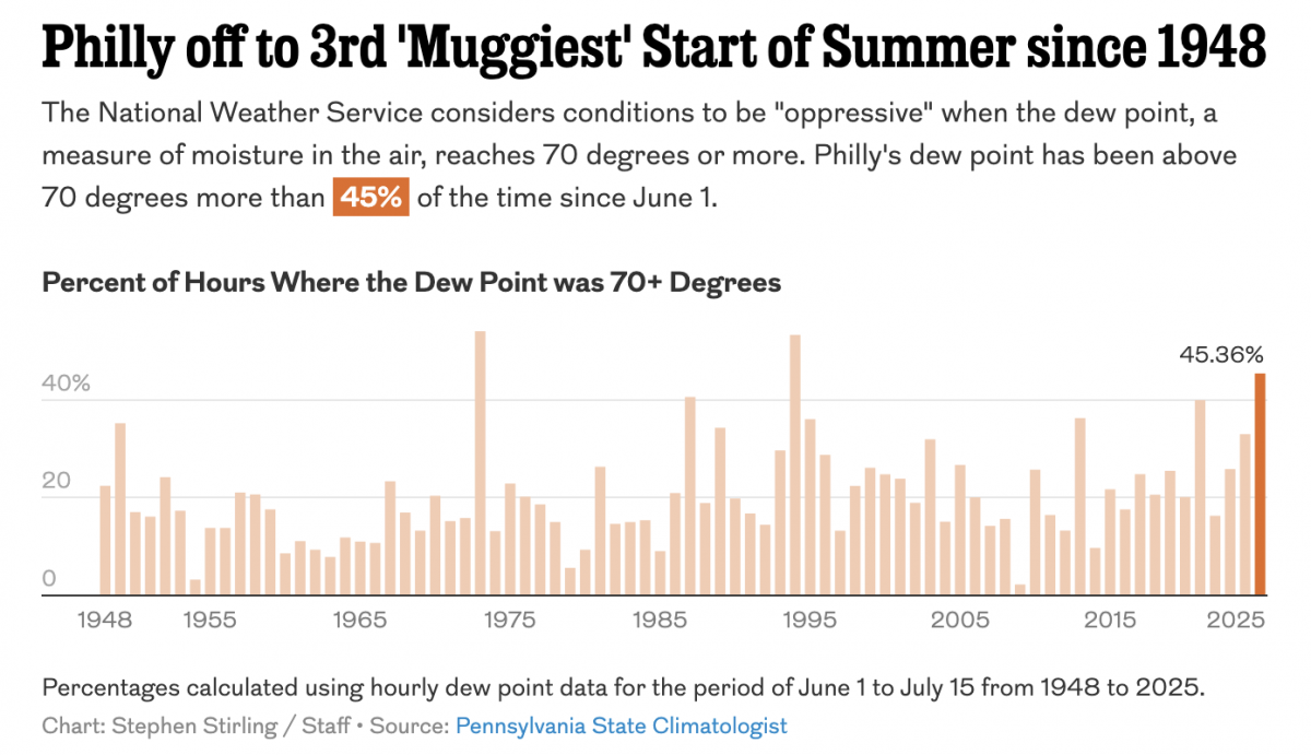
Small Dog Days of Summer

For my readers in the northern hemisphere, which is the vast majority of you, we are in the middle of meteorological summer, the dog days. And whilst my UK and Europe readers continue to bake under temperatures greater than 40ºC (104ºF), the northeast United States and Philadelphia in particular is looking at a heatwave starting today that’s forecast to peak at a temperature of 38ºC (100ºF) this weekend and a heat index reaching 41ºC (106ºF) tomorrow.

Not cool.

Yesterday we examined a completely different topic, property tax increases in Philadelphia, but we contrasted that work with a heat index map from the New York Times. With the heatwave beginning this afternoon, however, it seemed apropos to revisit that contrasting article.

It begins with the map that we looked at yesterday. Of course yesterday was Tuesday. Today is Wednesday, and so you can already compare these two maps to see how and where the heat has shifted. Spoiler: the Southeast and Midwest.

Definitely not cooler.

It does so with a nice simple three-colour unidirectional spectrum from a light yellow to a burnt orange. And you can see the orange spreading up from the Gulf Coast and along the southeastern Atlantic Seaboard.

For those not familiar, the heat index is basically what the air “feels like” taking into consideration the actual temperature and the relative humidity in the air. Humans cool themselves via perspiration and when the air is excessively humid our ability to perspire decreases and thus the body begins to run hotter. Warmer temperatures allow the atmosphere to increase the amount of moisture it can contain and you can see all that Gulf and subtropical moisture carrying itself into the hot air moving up from the south.

Very not cool.

The piece also offers a look at the forecast for the heat index, showing the next six days. These small multiples allow the reader to see the geographic progression of the heat. Whereas today will be particularly for parts of the Midwest in southern Illinois and Indiana, tomorrow will see the worst for the Eastern Seaboard. Luckily the heat index retreats a bit, though as I noted above, the temperatures will continue to rise until Sunday, meaning higher temperatures, but lower relative humidity. For Philadelphia in particular we talking about 50% relative humidity tomorrow and only 35% on Sunday. That makes a big difference.

The not coolest.

Overall this is a great piece despite the content.

Personally, I just can’t wait until summer.

Credit for the piece goes to Matthew Bloch, Lazaro Gamio, Zach Levitt, Eleanor Lutz, and John-Michael Murphy.

Turn Down the Heat

First, as we all should know, climate change is real. Now that does not mean that the temperature will always be warmer, it just means more extreme. So in winter we could have more severe cold temperatures and in hurricane season more powerful storms. But it does mean that in the summer we could have more frequent and hotter heat waves.

Enter the United States, or more specifically the North American continent. In this article from the BBC we see photographs of the way the current heatwave is playing out across the continent. But it opens up with a nice map. Well, nice as in nicely done, not as in this is actually nice weather.

Yeah, no thanks.

The only complaint most of my American readers might have is that the numbers make no sense. That’s because it’s all in Celsius. Unfortunately for Americans most of the rest of the world uses Celsius and not Fahrenheit. Suffice it to say you don’t want to be in the dark reds. 44C equals 111F. 10C, the greenish-yellow side of the spectrum, is a quite pleasant 50F.

And that can relate to a small housekeeping note. I’m back after a long weekend up in the Berkshires. I took a short holiday to go visit the area near that north–south band of yellow over the eastern portion of the United States. It was very cool and windy and overall a welcome respite from the heat that will be building back in here across the eastern United States later this week.

At least yesterday was the summer solstice. The days start getting shorter. And in about five weeks or so we will reach the daily average peak temperature here in Philadelphia. At that point the temperatures begin cooling towards their eventual mid-January nadir.

I can’t wait.

Credit for the piece goes to the BBC graphics department.

Obfuscating Bars

On Friday, I mentioned in brief that the East Coast was preparing for a storm. One of the cities the storm impacted was Boston and naturally the Boston Globe covered the story. One aspect the paper covered? The snowfall amounts. They did so like this:

All the lack of information

This graphic fails to communicate the breadth and literal depth of the snow. We have two big reasons for that and they are both tied to perspective.

First we have a simple one: bars hiding other bars. I live in Greater Centre City, Philadelphia. That means lots of tall buildings. But if I look out my window, the tall buildings nearer me block my view of the buildings behind. That same approach holds true in this graphic. The tall red columns in southeastern Massachusetts block those of eastern and northeastern parts of the state and parts of New Hampshire as well. Even if we can still see the tops of the columns, we cannot see the bases and thus any real meaningful comparison is lost.

Second: distance. Pretty simple here as well, later today go outside. Look at things on your horizon. Note that those things, while perhaps tall such as a tree or a skyscraper, look relatively small compared to those things immediately around you. Same applies here. Bars of the same data, when at opposite ends of the map, will appear sized differently. Below I took the above screenshot and highlighted two observations that differed in only 0.5 inches of snow. But the box I had to draw—a rough proxy for the columns’ actual heights—is 44% larger.

These bars should be about the same.

This map probably looks cool to some people with its three-dimensional perspective and bright colours on a dark grey map. But it fails where it matters most: clearly presenting the regional differences in accumulation of snowfall amounts.

Compare the above to this graphic from the Boston office of the National Weather Service (NWS).

No, it does not have the same cool factor. And some of the labelling design could use a bit of work. But the use of a flat, two-dimensional map allows us to more clearly compare the ranges of snowfall and get a truer sense of the geographic patterns in this weekend’s storm. And in doing so, we can see some of the subtleties, for example the red pockets of greater snowfall amounts amid the wider orange band.

Credit for the Globe piece goes to John Hancock.

Credit for the NWS piece goes to the graphics department of NWS Boston.

Philadelphia’s Wild Winters

Winter is coming? Winter is here. At least meteorologically speaking, because winter in that definition lasts from December through February. But winters in Philadelphia can be a bit scattershot in terms of their weather. Yesterday the temperature hit 19ºC before a cold front passed through and knocked the overnight low down to 2ºC. A warm autumn or spring day to just above freezing in the span of a few hours.

But when we look more broadly, we can see that winters range just that much as well. And look the Philadelphia Inquirer did. Their article this morning looked at historical temperatures and snowfall and whilst I won’t share all the graphics, it used a number of dot plots to highlight the temperature ranges both in winter and yearly.

Yep, I still prefer winter to summer.

The screenshot above focuses attention on the range in January and July and you can see how the range between the minimum and maximum is greater in the winter than in the summer. Philadelphia may have days with summer temperatures in the winter, but we don’t have winter temperatures in summer. And I say that’s unfair. But c’est la vie.

Design wise there are a couple of things going on here that we should mention. The most obvious is the blue background. I don’t love it. Presently the blue dots that represent colder temperatures begin to recede into and blend into the background, especially around that 50ºF mark. If the background were white or even a light grey, we would be able to clearly see the full range of the temperatures without the optical illusion of a separation that occurs in those January temperature observations.

Less visible here is the snowfall. If you look just above the red dots representing the range of July temperatures, you can see a little white dot near the top of the screenshot. The article has a snowfall effect with little white dots “falling” down the page. I understand how the snowfall fits with the story about winter in Philadelphia. Whilst the snowfall is light enough to not be too distracting, I personally feel it’s a bit too cute for a piece that is data-driven.

The snowfall is also an odd choice because, as the article points out, Philadelphia winters do feature snowfall, but that on days when precipitation falls, snow accounts for less than 1/3 of those days with rain and wintry mixes accounting for the vast majority.

Overall, I really like the piece as it dives into the meteorological data and tries to accurately paint a portrait of winters in Philadelphia.

And of course the article points out that the trend is pointing to even warmer winters due to climate change.

Credit for the piece goes to Aseem Shukla and Sam Morris.

Mapping the Mullica Hill Tornado

When the remnants of Hurricane Ida rolled through the Northeast two weeks ago, here in the Philadelphia region we saw catastrophic flooding from deluges west of the city and to the east we had a tornado outbreak in South Jersey. At a simplistic level we can attribute the differences in outcomes to the path of the storm. As Ida was no longer a hurricane she developed what we call warm and cold sectors along the frontal boundary. Long story short, we can see different types of weather in these setups with heavy rain in the cold and severe weather in the warm. And that’s what we saw with Ida: heavy, flood-causing rains in the cold sector north and west of Philadelphia and then severe weather, tornadoes, in the warm sector south and east of the city.

But I want to talk about the tornadoes, and one in particular: an EF3 tornado that struck the South Jersey town of Mullica Hill. EF3 refers to the enhanced Fujita scale that describes the severity of tornadoes. EF1s are minor and EF5s are the worst. The Philadelphia region has in the past rarely seen tornadoes, but even moderate strength ones such as an EF3 are almost unheard of in the area.

This tornado caused significant damage to the area, but was also remarkable because it persisted for 12 miles. Most tornadoes dissipate in a fraction of that length. The Mount Holly office of the National Weather Service (NWS) produced a few graphics detailing tornadoes Ida spawned. You can see from the timeline graphic that the Mullica Hill tornado was particularly long lasting in time as well as distance travelled, surviving for twenty minutes.

To briefly touch on the design of this graphic, I think it generally works well. I’m not certain if the drop shadow adds anything to the graphic and I might have used a lighter colour text label for the times as they fight with the graphical components for visual primacy. Secondly, I’m not certain that each tornado needs to be in a different colour. The horizontal rules keep each storm visually separate. Colour could have instead been used to indicate perhaps peak severity for each tornado or perhaps at specific moments in the tornadoes’ lives. But overall, I like this graphic.

NWS Mt Holly also produced a graphic specifically about the tornado detailing its path.

Here we have a graphic incorporating what looks like Google Earth or Google Maps imagery of the area and an orange line denoting the path. At various points faint text labels indicate the strength of the tornado along its path. A table to the left provides the key points.

From a graphical standpoint, I think this could use a bit more work. The orange line looks too similar to the yellow roads on the map and at a quick glance may be too indistinguishable. Compare this approach to that of the Philadelphia Inquirer in its writeup.

Here we have a map with desaturated colours with a bright red line that clearly sets itself apart from the map. I think a similar approach would have benefitted the NWS graphic. Although the NWS graphic does have a stroke weight that varies depending upon the path of the tornado.

I also have a graphic made by a guy I know who lives in the area. He took that maximum tornado width of 400 yards and used screenshots of Google Maps in combination with his own direct evidence and photos and videos from his neighbours and their social media posts to try and plot the tornado’s path more granularly. Each red mark represents storm damage and a width of 400 yards.

I’m not going to critique this graphic because he made it more for himself to try and understand how close he was to the storm. In other words, it wasn’t meant to be published. But I’m thankful he allowed me to share it with you. But even here you can see he chose a colour that contrasted strongly with the background satellite views.

All of this just goes to show you the path and devastation one tornado caused. And that one tornado was just a fraction of the devastation Ida wrought upon the Northeast let alone the rest of the United States.

The Western Heat Dome(s)

For the last two days Philadelphia and much of the East Coast suffered from a heavy haze of smoke that blanketed the region. This wasn’t just any smoke, however, but smoke from the wildfires on the West Coast. This post isn’t about the wildfires, but rather something that exacerbated them. We are talking about the heat domes that formed earlier this summer. The ones that melted trolley cables in Portland.

This was a nice print graphic in the Guardian Weekly, a magazine to such I subscribe that had several articles about the domes.

Missing that cold, cold Canadian air

It does a nice job of showing the main components of the story and sufficiently simplifying them to make them digestible. One quibble, however, is how in the second map how oddly specific the heat dome is depicted.

The first graphic in particular is more of an abstraction and simplified illustration. But here we have contours and shapes that seem to speak with precision about the location of this heat dome. It also contains shades of red that presumably indicate the severity of the heat.

There’s nothing wrong with that, but it stuck me as odd juxtaposed against the top illustration.

Credit for the piece goes to the Guardian Weekly graphics department.