When the remnants of Hurricane Ida rolled through the Northeast two weeks ago, here in the Philadelphia region we saw catastrophic flooding from deluges west of the city and to the east we had a tornado outbreak in South Jersey. At a simplistic level we can attribute the differences in outcomes to the path of the storm. As Ida was no longer a hurricane she developed what we call warm and cold sectors along the frontal boundary. Long story short, we can see different types of weather in these setups with heavy rain in the cold and severe weather in the warm. And that’s what we saw with Ida: heavy, flood-causing rains in the cold sector north and west of Philadelphia and then severe weather, tornadoes, in the warm sector south and east of the city.
But I want to talk about the tornadoes, and one in particular: an EF3 tornado that struck the South Jersey town of Mullica Hill. EF3 refers to the enhanced Fujita scale that describes the severity of tornadoes. EF1s are minor and EF5s are the worst. The Philadelphia region has in the past rarely seen tornadoes, but even moderate strength ones such as an EF3 are almost unheard of in the area.
This tornado caused significant damage to the area, but was also remarkable because it persisted for 12 miles. Most tornadoes dissipate in a fraction of that length. The Mount Holly office of the National Weather Service (NWS) produced a few graphics detailing tornadoes Ida spawned. You can see from the timeline graphic that the Mullica Hill tornado was particularly long lasting in time as well as distance travelled, surviving for twenty minutes.
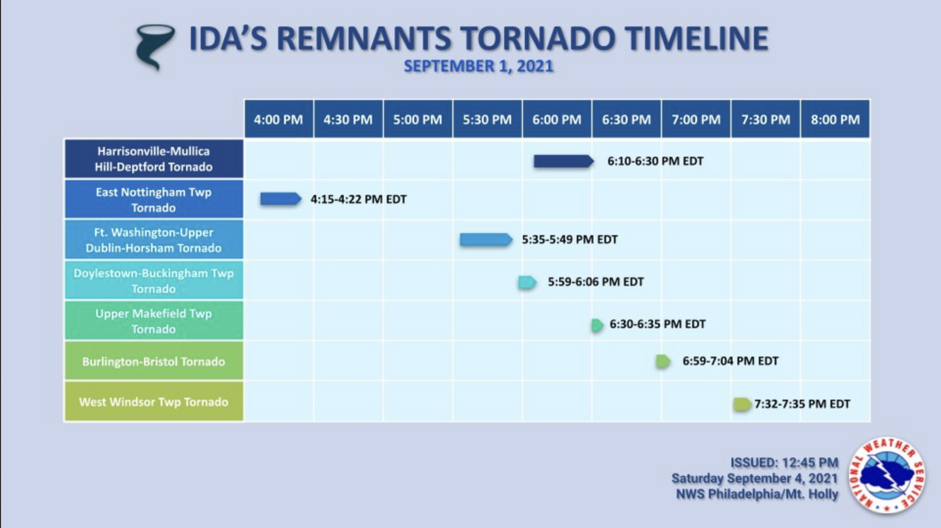
To briefly touch on the design of this graphic, I think it generally works well. I’m not certain if the drop shadow adds anything to the graphic and I might have used a lighter colour text label for the times as they fight with the graphical components for visual primacy. Secondly, I’m not certain that each tornado needs to be in a different colour. The horizontal rules keep each storm visually separate. Colour could have instead been used to indicate perhaps peak severity for each tornado or perhaps at specific moments in the tornadoes’ lives. But overall, I like this graphic.
NWS Mt Holly also produced a graphic specifically about the tornado detailing its path.
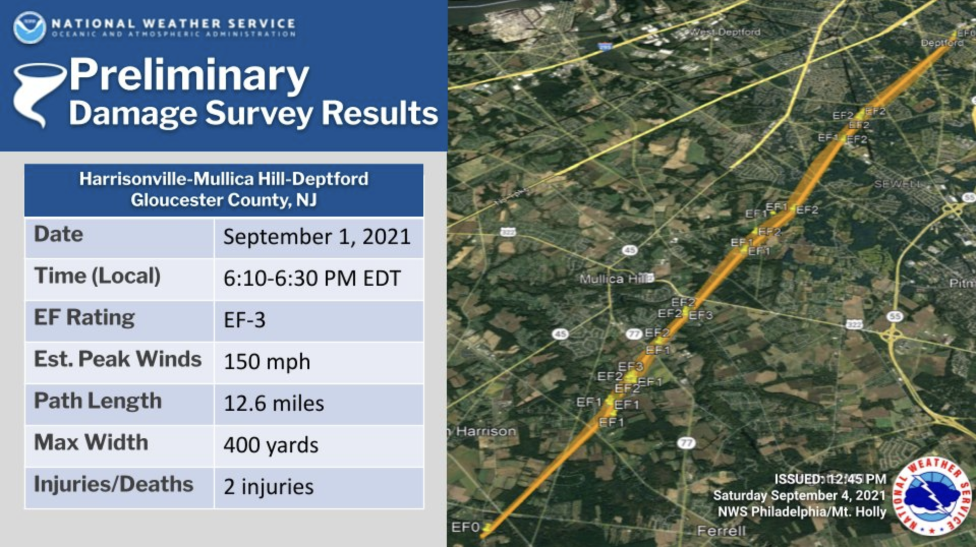
Here we have a graphic incorporating what looks like Google Earth or Google Maps imagery of the area and an orange line denoting the path. At various points faint text labels indicate the strength of the tornado along its path. A table to the left provides the key points.
From a graphical standpoint, I think this could use a bit more work. The orange line looks too similar to the yellow roads on the map and at a quick glance may be too indistinguishable. Compare this approach to that of the Philadelphia Inquirer in its writeup.
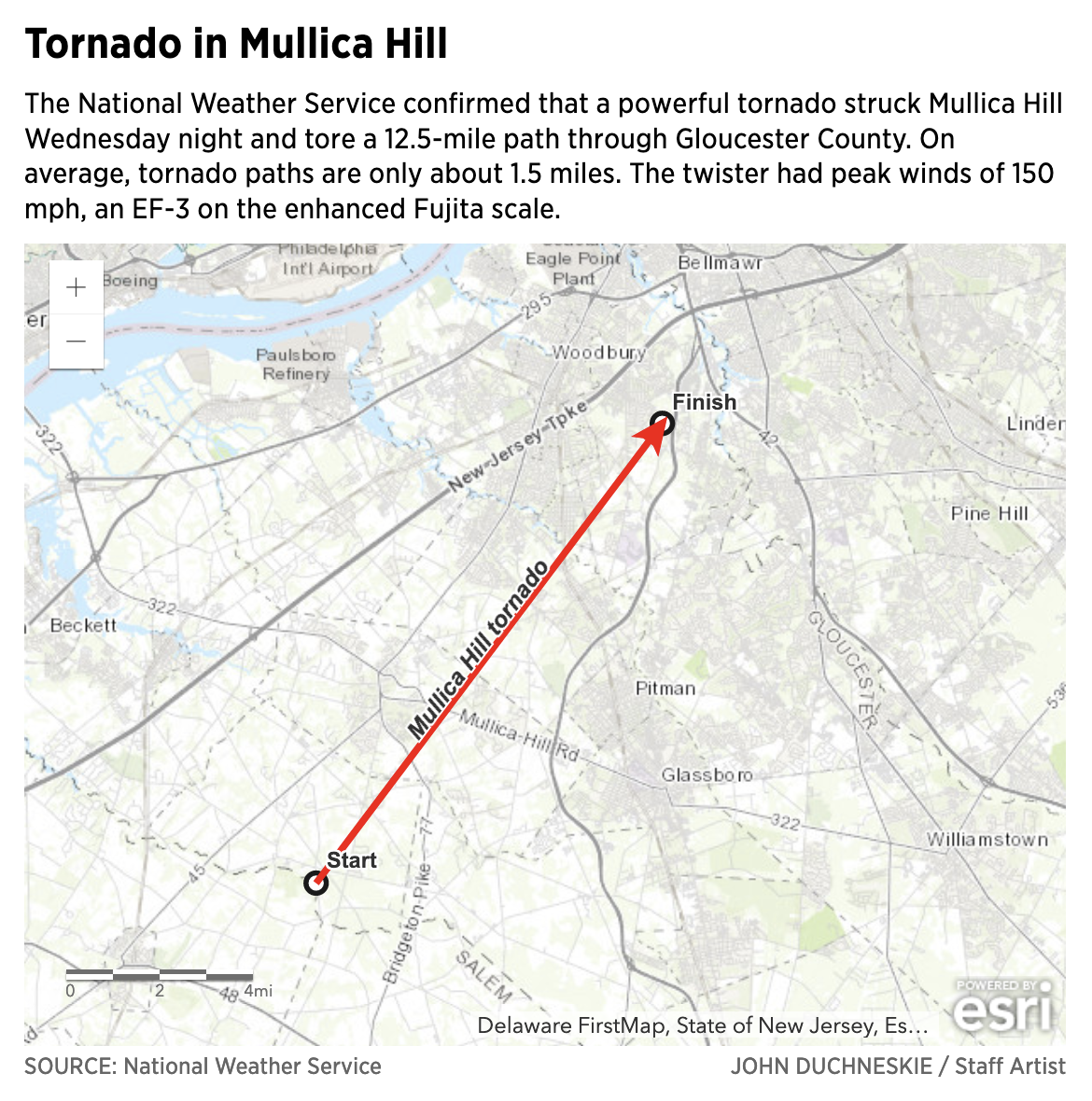
Here we have a map with desaturated colours with a bright red line that clearly sets itself apart from the map. I think a similar approach would have benefitted the NWS graphic. Although the NWS graphic does have a stroke weight that varies depending upon the path of the tornado.
I also have a graphic made by a guy I know who lives in the area. He took that maximum tornado width of 400 yards and used screenshots of Google Maps in combination with his own direct evidence and photos and videos from his neighbours and their social media posts to try and plot the tornado’s path more granularly. Each red mark represents storm damage and a width of 400 yards.
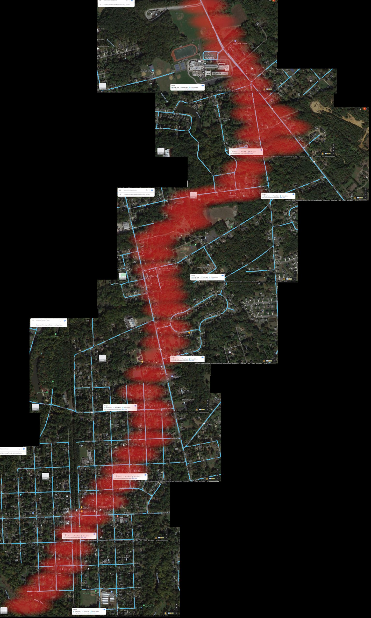
I’m not going to critique this graphic because he made it more for himself to try and understand how close he was to the storm. In other words, it wasn’t meant to be published. But I’m thankful he allowed me to share it with you. But even here you can see he chose a colour that contrasted strongly with the background satellite views.
All of this just goes to show you the path and devastation one tornado caused. And that one tornado was just a fraction of the devastation Ida wrought upon the Northeast let alone the rest of the United States.
Leave a Reply
You must be logged in to post a comment.