
With Xi Jinping visiting the United States the BBC published an article looking at China’s changes over the years. In general, I don’t like the article—why are they using pigs to look at pork consumption? My general dislike aside, they do have a map that plots urban centres with more than one million people and how that map has changed since 1970 and will change out to 2030.
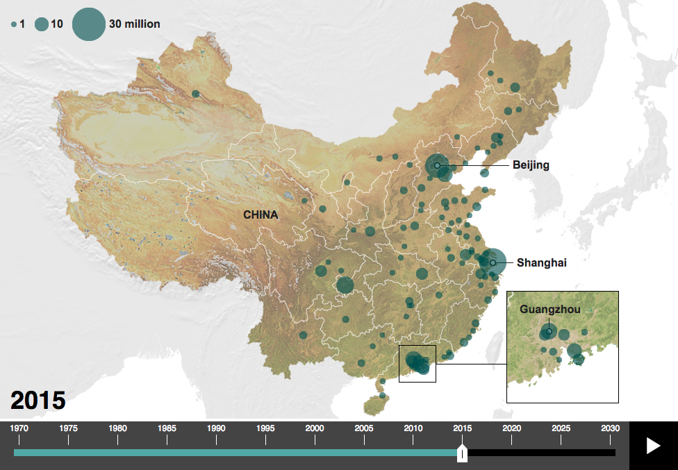
I probably would not have used that terrain map as the background as blue-green circles on the green coast are a bit difficult to read. A lost opportunity of a sort—assuming it is possible at all—is to use a satellite image of China for each year and overlay the circles on that. One can only imagine that China’s urbanisation has gone together with drastic changes to the landscape.
Credit for the piece goes to the BBC graphics department.