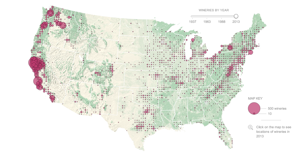
So my wine palate is neither as refined nor sophisticated as it was before I moved to Chicago. (Oh hi, whisky.) However, wineries are springing up all over the country—and not just in California. This interactive graphic from the New York Times details the country, mapping out wineries up top and then exploring the growth in several key states near the bottom. In particular, note the chart for the number of wineries in California that runs down the right-hand side.
Map of US wineries
Credit for the piece goes to Kevin Schaul, Tim Wallace, and Adrienne Carter.
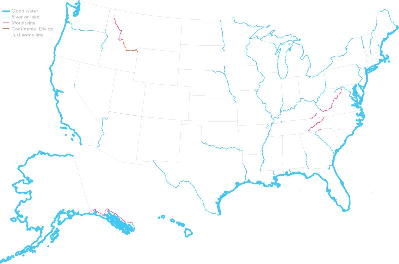
This map by Dorothy Gambrell looks at US state borders formed by natural, well, borders. None of those lines drawn by a bunch of old men wearing wigs. What I really like is how those artificial borders are drawn as a thin grey line and labelled as “just some line”.
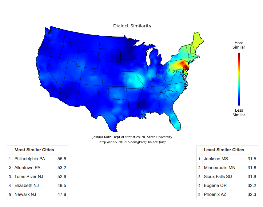
Joshua Katz from North Carolina State University has created an interactive version of the dialect survey maps first perhaps popularised several years ago. Katz has also created an interactive map that looks at a city’s dialect and maps its areas of similarity and difference. An interesting extension of the original survey data, however, is the ability to take the survey yourself and see where your dialect fits. There are two versions, a 25-question survey and a 140-question survey.
The screenshot below is my result from the 25-question version. And it fits me fairly well since I spent most of my years in the suburbs of Philadelphia but every summer in South Jersey (and quite a bit of time in Allentown). Click the map to take the quiz for yourself. Feel free to reply and share your results.
Clearly I am Philadelphia raised
From the technical side, for those wondering, this is a piece that is done in Shiny, the interactive version of R.
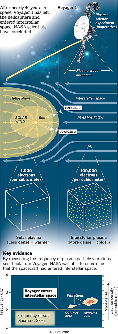
Last week NASA announced that last year, Voyager 1 left the Solar System about 25 August 2012. A lot of the graphics that were published to support that story chronicled the distance travelled by that probe. However, this excellent graphic by the Los Angeles Times instead looks at how NASA determined through the data returned that Voyager had left the Solar System.
Voyager 1 departs the Solar System
The piece does a really good job of setting up the story in illustrating the instrument packaged used to collect the data. Moving down the piece, it shows locations and the different environments and then how those environments differ in electron density. Lastly it looks at how NASA interpolated the date from the data collected. A really solid piece.
Credit for the piece goes to Monte Morin, Doug Stevens, and Anthony Pesce.
Tuesday was election day in New York (among other places) where voters went to the polls for the mayoral primary (among other positions). For those living underneath what I can only presume was a very comfortable rock, this is the whole Anthony Weiner comeback election. Anyway, a bunch of different websites, most tied to the New York area, were covering the election results. So I wanted to share just a few.
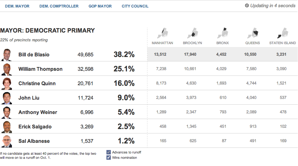
First we have the Huffington Post with the most straightforward presentation. Their table covers the main candidates and their results at a borough level and at a city-wide level.
The Huffington Post’s tabular results
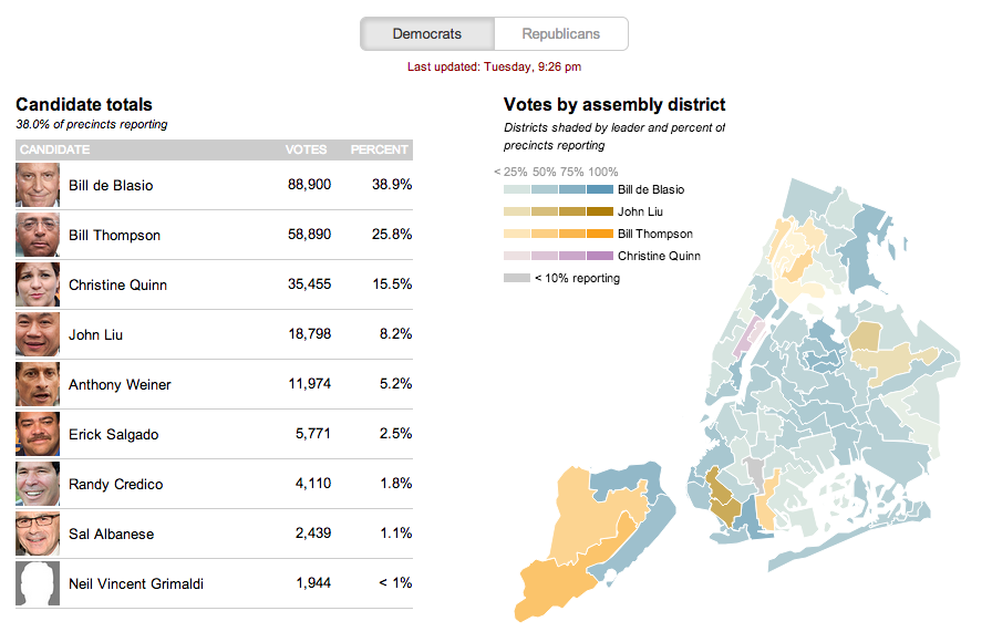
The second is from the Wall Street Journal. This uses a choropleth map with different colours assigned to a select few persons running—also the only ones with a real chance of winning. Tints of these colours in each district indicate how much of the district has voted.
The Wall Street Journal reports at the district level
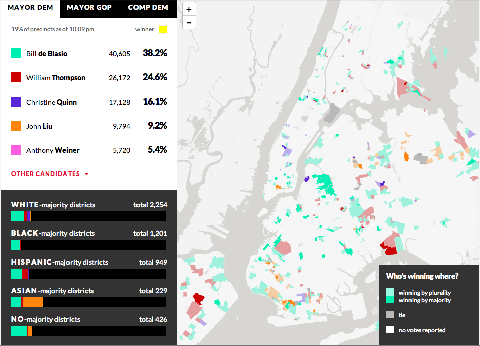
From WNYC we have our third example—another choropleth where different colours represent different candidates. However, unlike the Wall Street Journal, the colours here have only one tint. And instead of showing assembly districts, WNYC provides a further level of data and looks at precinct results. It does not represent the amount of the precinct that has voted, but rather whether the candidate is winning by a plurality or by a majority. Beneath the legend a second charting element is used; this details the breakdown of the vote by districts as separated into racial majority. This is an interesting addition that hints at filtering results by related data.
WNYC looks at who’s winning and how
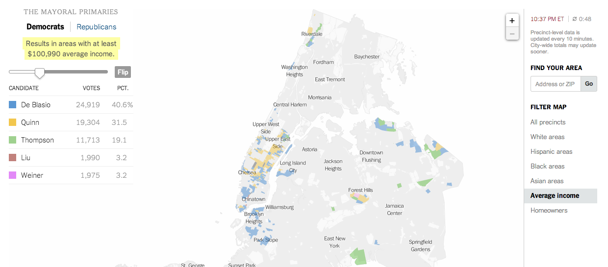
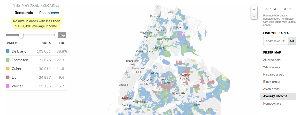
And that filtering brings us to the New York Times’ piece, which does offer filtering. It highlights districts on its maps—also precinct-level and not district aggregates—based upon the metric and the specific properties of said metric. In this case, I have chosen income. And the story of different voting patterns (at this particular point in the evening) based on income is quite clear. Look at Christine Quinn’s support.
Results from people earning more than $100kVotes from people earning less than $100k
Credit for these:
Huffington Post: Aaron Bycoffe, Jay Boice, Andrei Scheinkman, and Shane Shifflett
Wall Street Journal: the Wall Street Journal’s graphics team
WNYC: Steven Melendez, Louise Ma, Jenny Ye, Marine Boudeau, Schuyler Duveen, Elizabeth Zagroba, and John Keefe
New York Times: New York Times’ graphics department
It’s Friday. And that means you will likely be contorting on the dance floor this weekend. But if you tried to bend to conform to any of these congressional districts, you would likely break your back. Gerrymandering is an old practice that basically allows state governments to decide what area (and therefore populations) belong to which congressional district. If you carve up your opposition well enough, you can consolidate them into far fewer districts than they might otherwise win. Pennsylvania is just one such example of an unbalanced state. This interactive infographic game from Slate forces you to solve the jigsaw puzzle of congressional districts.
A little while ago the Washington Post published this graphic on Metro ridership. But not just anybody’s ridership, that of the individuals who sit on the DC transit agency’s board. After all, should not those overseeing Washington’s transit agency be intimately familiar with the conditions faced by DC commuters?
How agency board members ride their transit agency…
The graphic is a really nice use of small multiples and shading and tinting to indicate which lines are travelled by specific persons. An icon of a bus denotes bus ridership. This is a very good piece.
Credit for the piece goes to Wilson Andrews, Dana Hedgpeth, Mark Berman, and Luz Lazo.
It’s Friday, and mercifully this is a Friday before a three-day weekend. (For all of those who, like me, have a day off coming up on Monday.) So before everyone starts travelling to places here and there and everywhere in between, you best check this series of maps. Why? Because Business Insider has polled us, well 1600 of us, to find the best and worst states for a number of metrics. My personal favourite:
“Most likely due to the fact that most Americans have never been to Philadelphia, the rest of the country believes New York also has the worst sports fans. I blame John Rocker.”
I did not have quite enough time to develop this piece to what I wanted, but for now it will have to suffice. I wanted to look at the situation in Syria, but I only had time to outline who has what near Syria. Click the image for the larger version.
Recently my hobby of my family’s history has focused on my Rusyn (or Ruthenian) roots. However, this recent work out of Stanford University piques my interest in my English heritage, even though much of it is very far back in time. Using my 23 × great-grandfather Reynold de Mohun you can begin to see how it links persons within families, how those lives intersected over time, and the geographical areas where that person lived. In Reynold’s case, it was the 12th–13th centuries in Somerset, England.
Reynold de Mohun
But as the title kindred implies, this piece is not just about direct family connections, but also the marriages and close cultural links between certainly the elite of British society. Below is how Reynold is connected to King William I, better known as William the Conqueror.
Connecting Reynold de Mohun to William I
Family history or genealogy is a topic ripe for data visualisation and information design because it is all about connections. But I have found beyond the common family tree diagram little interesting has been created. This work is a solid start in the right direction.
Credit for the piece goes to Nicholas Jenkins, Elijah Meeks, and Scott Murray.