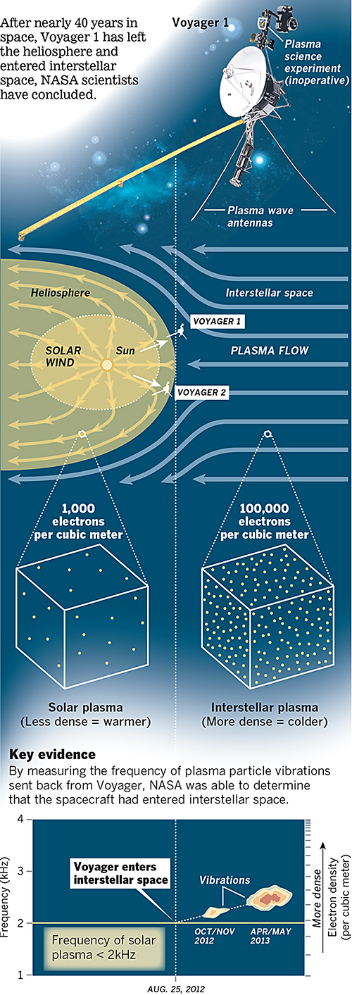
Last week NASA announced that last year, Voyager 1 left the Solar System about 25 August 2012. A lot of the graphics that were published to support that story chronicled the distance travelled by that probe. However, this excellent graphic by the Los Angeles Times instead looks at how NASA determined through the data returned that Voyager had left the Solar System.

The piece does a really good job of setting up the story in illustrating the instrument packaged used to collect the data. Moving down the piece, it shows locations and the different environments and then how those environments differ in electron density. Lastly it looks at how NASA interpolated the date from the data collected. A really solid piece.
Credit for the piece goes to Monte Morin, Doug Stevens, and Anthony Pesce.
Leave a Reply
You must be logged in to post a comment.