Sugary Sweet Donut Charts

I know, I know. You probably expect some sort of climate post given the whole Paris thing. But instead, this morning I came across an article where the supporting chart failed to tell the story. So today we redesign it.

The BBC has an article about MPs backing a tax on sugary drinks. Within the text is a graphic showing the relative importance of sugary drinks in the sugar consumption of various demographics. Except the first thing I see is alcohol—not the focus of the article. Then I focus on a series of numbers spinning around donuts, which are obviously sugary and bad. Eventually I connect the bright yellow to soda. Alas, bright yellow is a very light colour and fails to hold its own on the page. It falls behind everything but milk products.
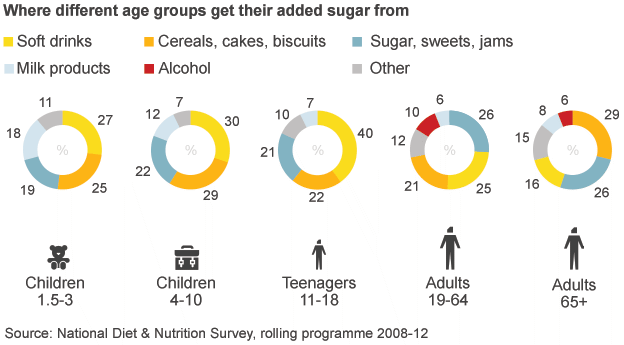
The BBC likes sugary donuts

So here is 15 minutes spent on a new version. Gone are the donuts, replaced by a heat map. I kept the sort of the legend for my vertical because it placed soda at the top. I ran the demographic types horizontally. The big difference here is that I am immediately drawn to the top of the chart. So yeah, soda is a problem. But so are cakes and jams, you British senior citizens. Importantly, I am less drawn to alcohol, which in terms of sugars, is not a concern.
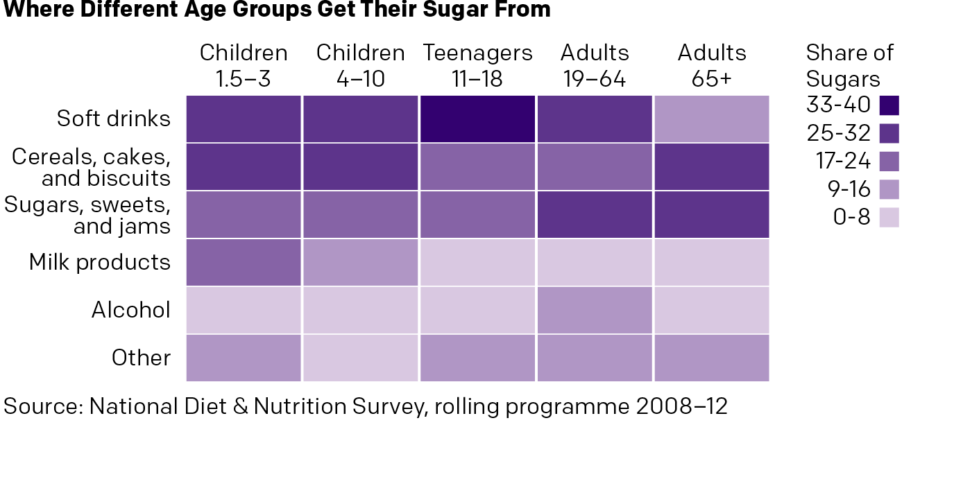
My version of sugar is so much sweeter

Credit for the original goes to the BBC graphics department. The other one is mine.

Job Gains

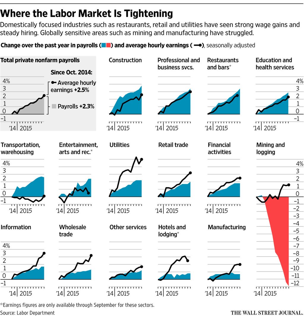
You should all know by now I am sucker for small multiples. So it should come as no surprise to you that I liked this piece from Friday from the Wall Street Journal. It looks at payroll and wage growth across various sectors in the American economy. And what I really like is that they took a space at the beginning to explain how to read the charts.

Mining, not so good
Mining, not so good

Credit for the piece goes to the Wall Street Journal graphics department.

Your State’s Power Sources

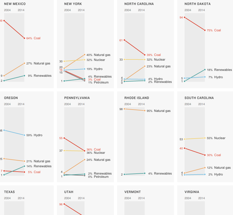
By now you should all know that I am a sucker for small multiples. They are a great way of separating out noise and letting each object be seen for its own. You should also know that I am a sucker for things industrial, e.g. nuclear power. So when you put the two together like NPR did earlier this month, well, I am going to be a huge fan.

All 50 states
All 50 states

Credit for the piece goes to Alyson Hurt.

Spicing It Up (Or Not If You Like Caraway)

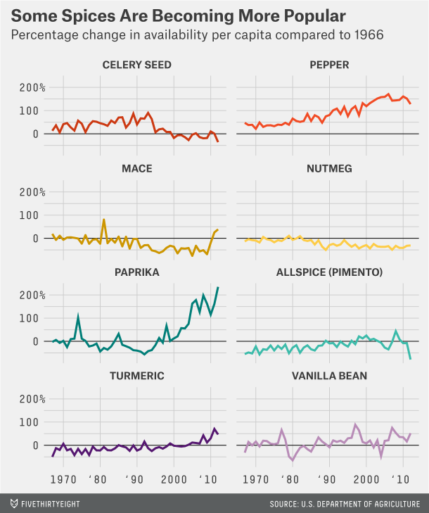
Here is a post for all you cooks and bakers out there: spices. Over the weekend I came upon a piece FiveThirtyEight ran earlier this year about American spice consumption. They use spice availability as a proxy for consumption, because no such data exists—and unfortunately the standard for reporting changed in 2012 so data is only available until then. But the piece uses some nice small multiples and a combined line chart to show some changes. Of note is the decision not to include ginger in the first, most likely because its scale would distort the rest of the chart. Anyway, if you are hungry, probably a good idea not to check this out.

How some spices have changed

Credit for the piece goes to the FiveThirtyEight graphics department.

Post-Katrina New Orleans

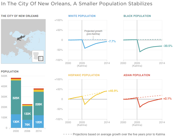
As the 10th anniversary of Hurricane Katrina approaches, NPR looked at how the population of the New Orleans area has changed. The piece is a nice combination of clean, clear, sharp graphics and insightful text.

The population of New Orleans proper

Credit for the piece goes to Paula Martinez, David Eads, and Christopher Groskopf.

Foul Balls at Fenway

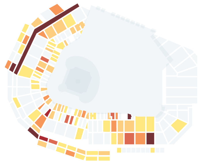
Happy Friday, everyone. Foul balls are the souvenirs of fortune at baseball games. (Home runs as well I suppose.) You can’t buy them, you can only hope to be one of the lucky few who catch one. So the Boston Globe ran an article with an integrated interactive piece that told the story of a select few foul balls caught by fans at ten games at Fenway. But from the data visualisation side, they plotted where each foul ball landed. But, the real gem is that they then had a few small multiples showing where various Boston hitters tended to deposit their fouls.

Ten games' worth of foul balls
Ten games’ worth of foul balls

Credit for the piece goes to Stan Grossfeld, Rachel G. Bowers, and Luke Knox.

The Growth of Urban Walmarts

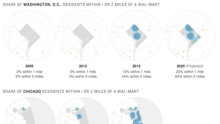
Today’s piece comes via my co-worker and is about the growth of urban Walmart stores. The article is from NPR and includes a nice series of small multiples of store locations in three select cities: Washington, Chicago, and Atlanta. In full disclosure, I live about two blocks from one of the urban Walmarts in Chicago. So go figure.

The growth of urban Walmarts

Credit for the piece goes to April Fehling, Tyler Fisher, Christopher Groskopf, Alyson Hurt, Livia Labate, and Ariel Zambelich.

Tree Maps

Spring is the time for the blossoming of cherry trees. Philadelphia has its own cherry blossom festival, but Washington’s is even bigger. The Washington Post put together a small infographic about the the trees, the symbolism, and the reason behind the presence of Japanese trees in the capital of the United States.

But, mostly I get to say we have a good example of a tree map.

Tree map
Tree map

Credit for the piece goes to Samuel Granados.

Military Hardware

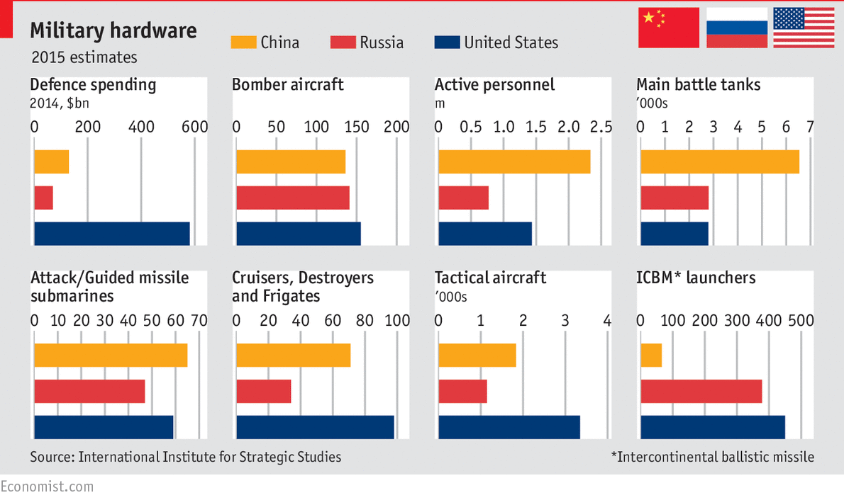
Earlier this week we looked at Ukraine’s loss of Debaltseve. Today we look at a piece from the Economist that compares the military hardware of the United States, Russia, and China. These are the mere datapoints on quantity, not quality. But it still illustrates fairly well why we should not fight a land war in Asia.

Comparing the numbers

Credit for the piece goes to the Economist’s Data Team.

The American Shopping Mall

This past weekend Al-Shabab, the Al Qaeda affiliate based in Somalia, threatened shopping malls in the United States, Canada, and the United Kingdom. This threat carries a certain amount of weight given the deadly attack Al-Shabab launched against the Westgate Shopping Mall in Nairobi, Kenya a few years ago.

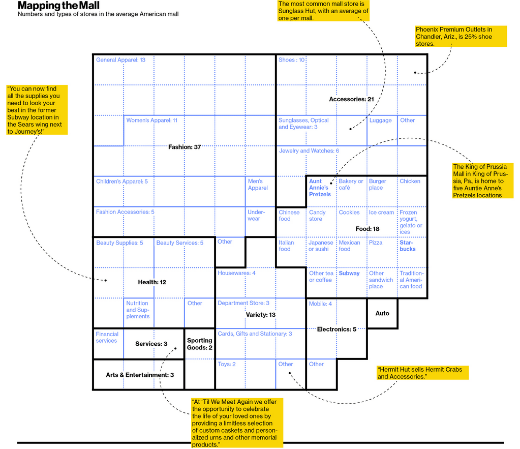
So what to look at today? Well, a few weeks back a colleague sent me a link to a Bloomberg article about the American shopping mall. The article examines the makeup of stores, the people shopping, and the regionalisation in the food court(s). On a personal note, I was glad to see that King of Prussia received a mention.

Auntie Anne's in KoP? I'd rather Philly Pretzel Factory
Auntie Anne’s in KoP? I’d rather Philly Pretzel Factory

Credit for the piece goes to Dorothy Gambrell and Patrick Clark.